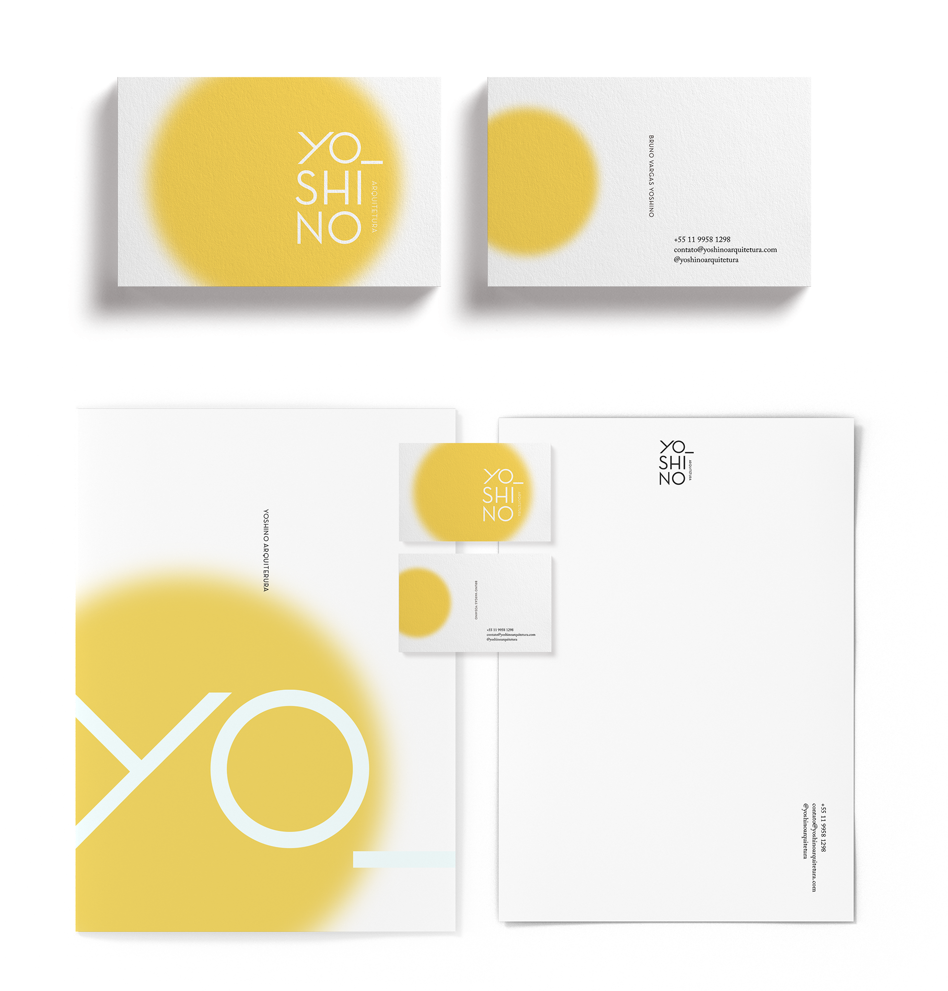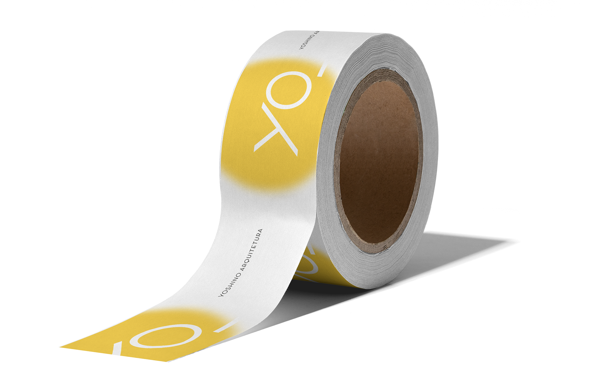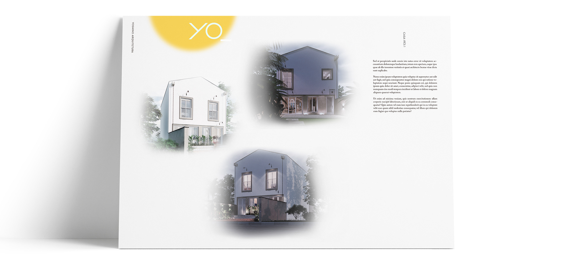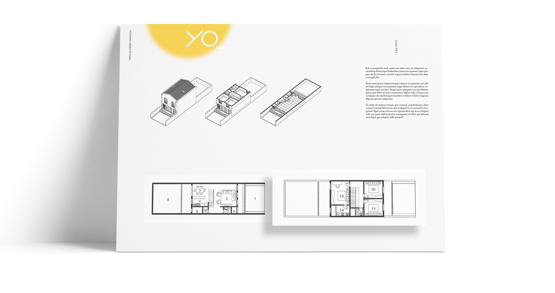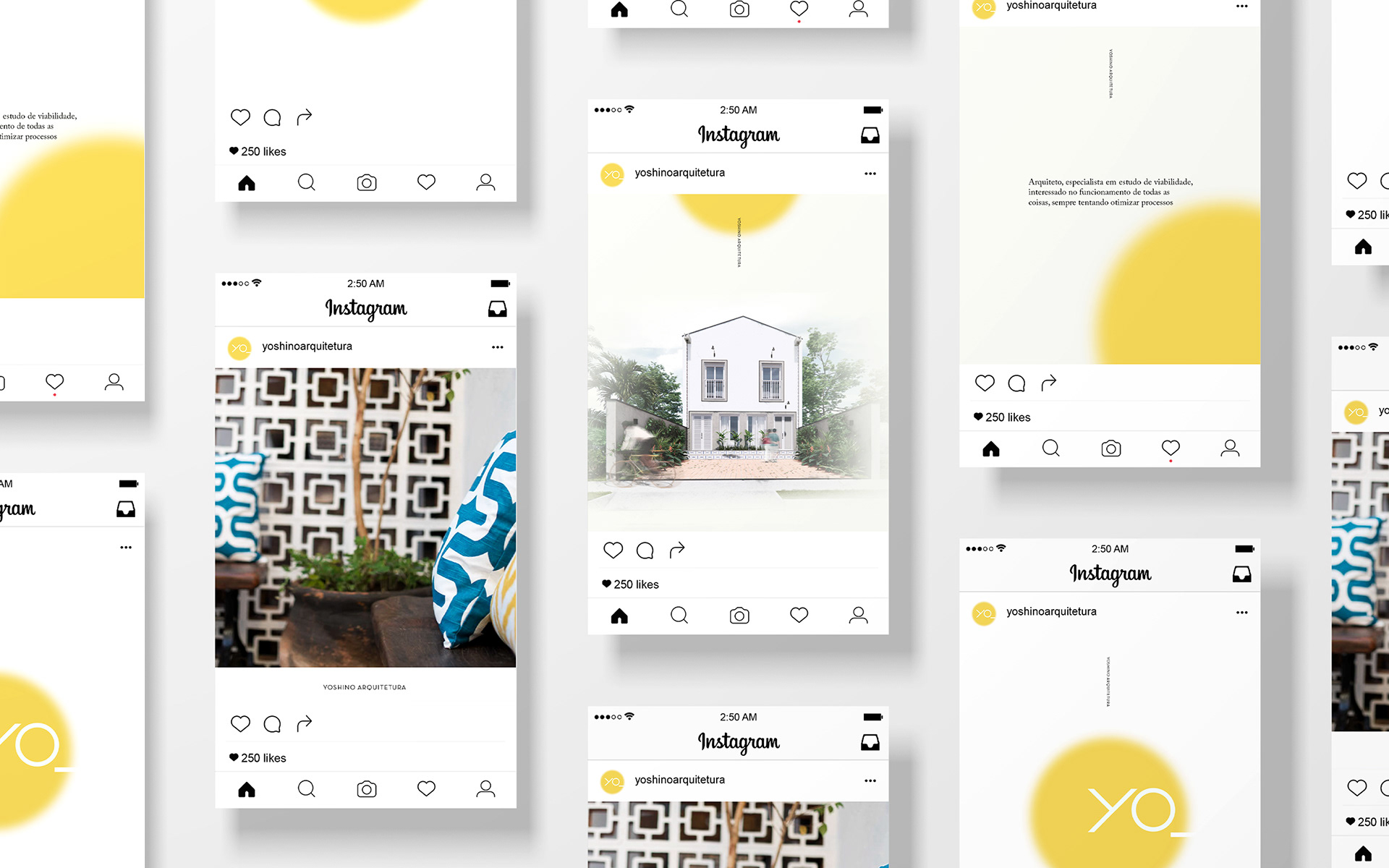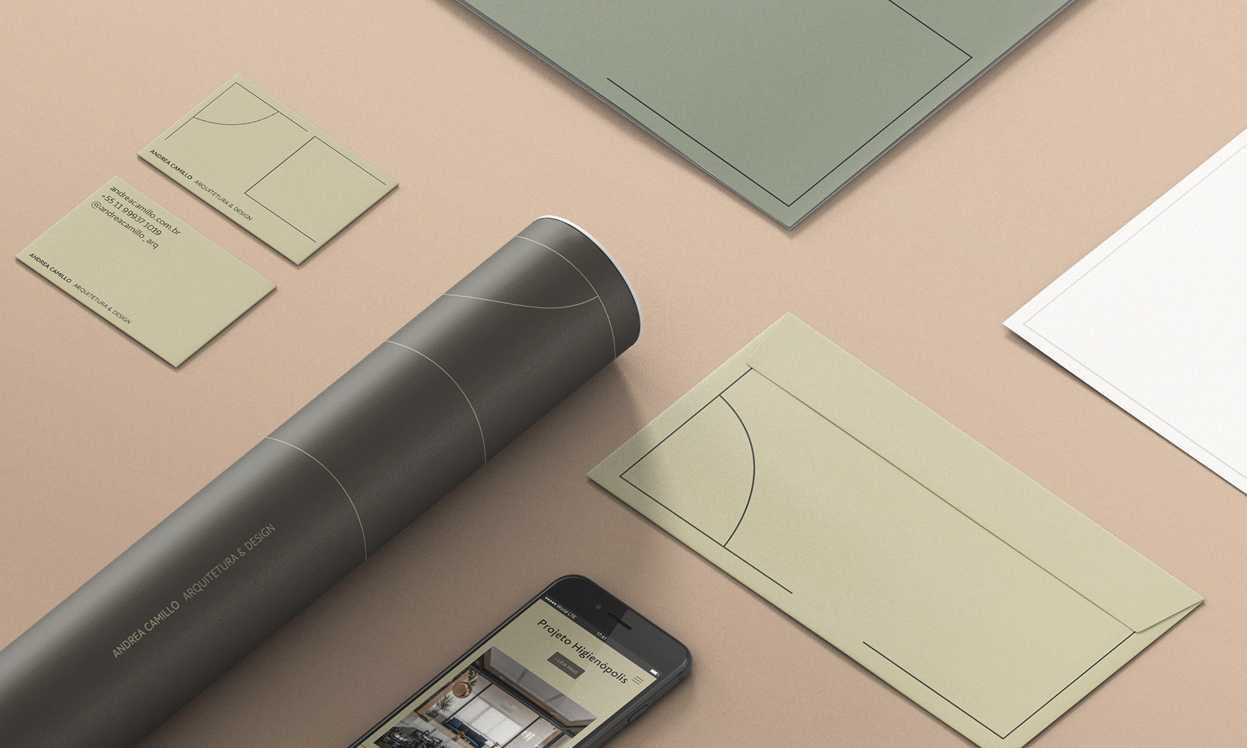
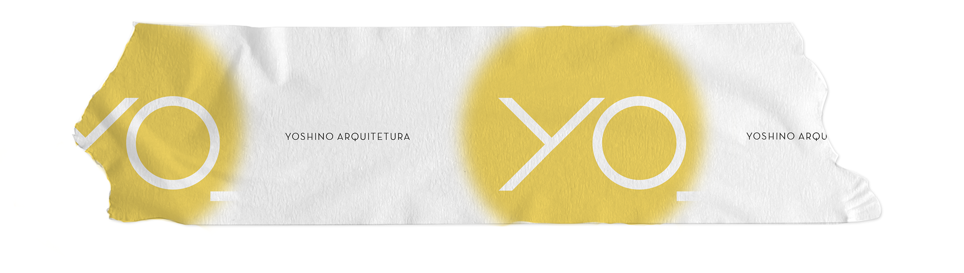

Branding for an architecture studio in São Paulo. As the architect has Japanese and Spanish origins, we decided to highlight the first syllable of his name Yoshino, Yo (I, in Spanish), as a brand concept, complemented by the circle inspired by the Japanese rising sun. The application of the circle in 'spray graffiti' was chosen as a symbol of the hyper-urban focus of Yoshino's work. The construction of the YO was precise, with the Y being formed at a 90o angle to its base. The O is also a perfect circle, reinforcing the simple geometric figures and lines so important in architectural design.
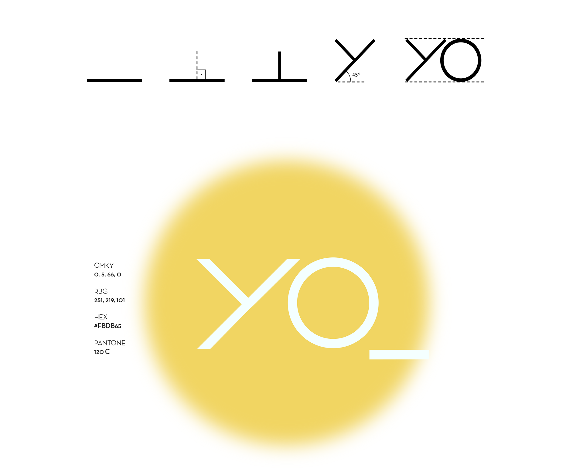
The choice of palette - white, black, gray and yellow - was made conscientiously, bringing yellow as a point of light, which highlights the brand and completes it.In this brand, white spaces - like empty spaces in architecture - are extremely important, bringing the value of contemporary Japanese minimalism to its presence.