The website project for Cielo Sustainability - the largest Brazilian brand of payment devices - was designed with help of the exclusive My Dear Studio UX-UI method. It consists of 5 phases:
1. Strategy, 2. Content, 3. Structure,
4. Wireframe, 5. Visual Design
In the Strategy phase, we define audiences and ways to reach them, creating a map of the uses and paths of the website. The focus here was finding an ease and practical way to access all the content. This, in fact, structured the creation of Content. So, after all the content produced and approved by the client, we move on to the Structure phase, which is nothing more than making the layout, the separation of sections and thel content, to be presented in the best way for the user.
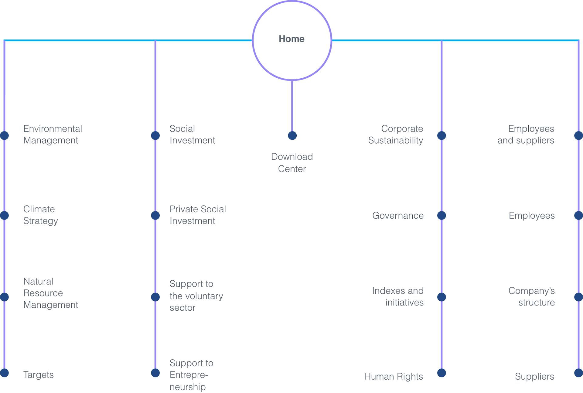
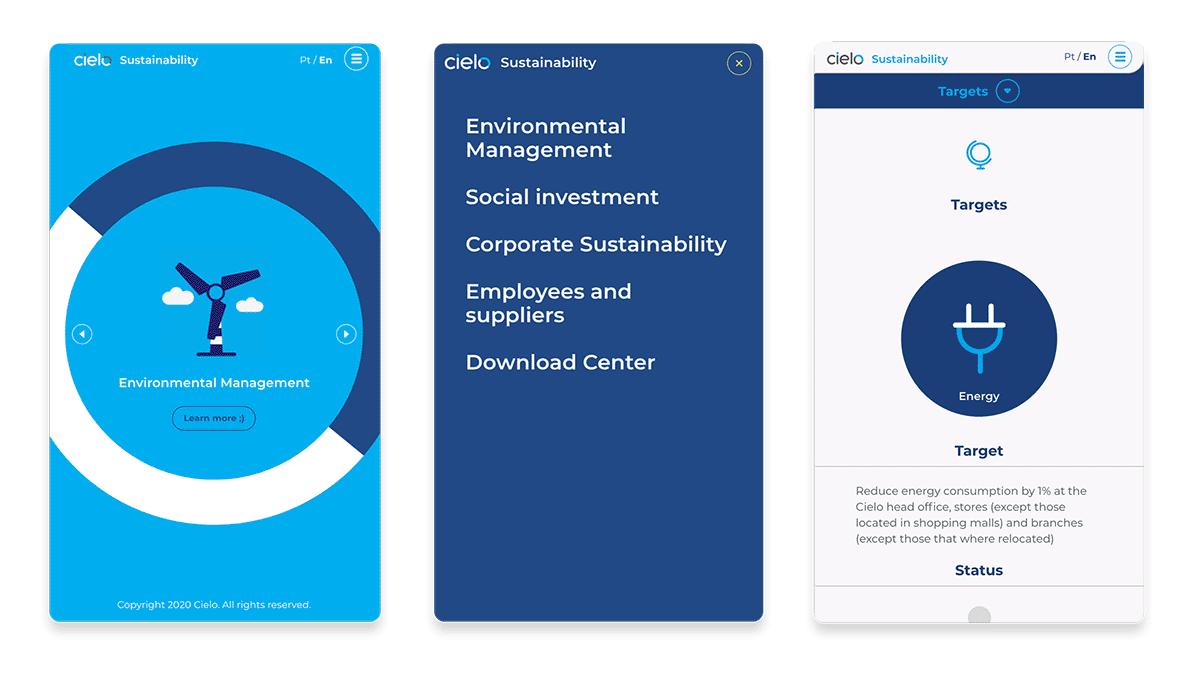
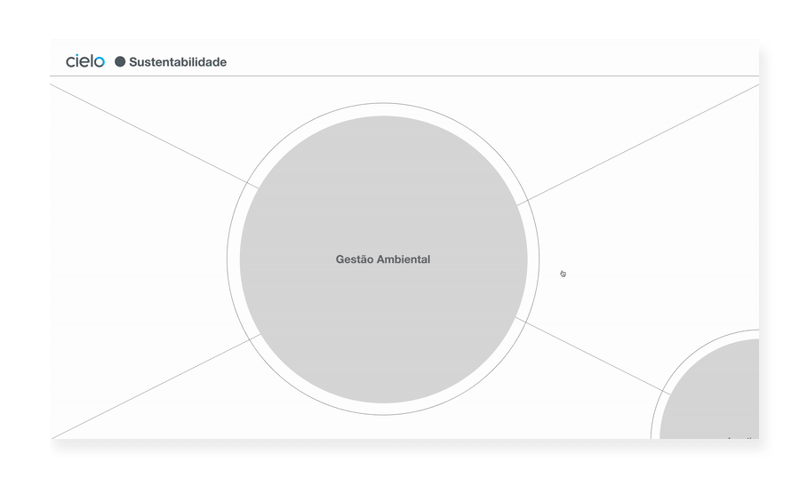
From the Structure, we made the skeleton, the Wireframe, which already shows the site as a blueprint, structured and functional in its navigation, but without the design elements that make it unique.
.

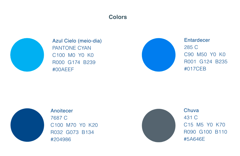
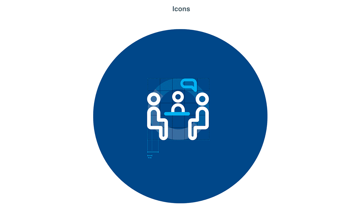
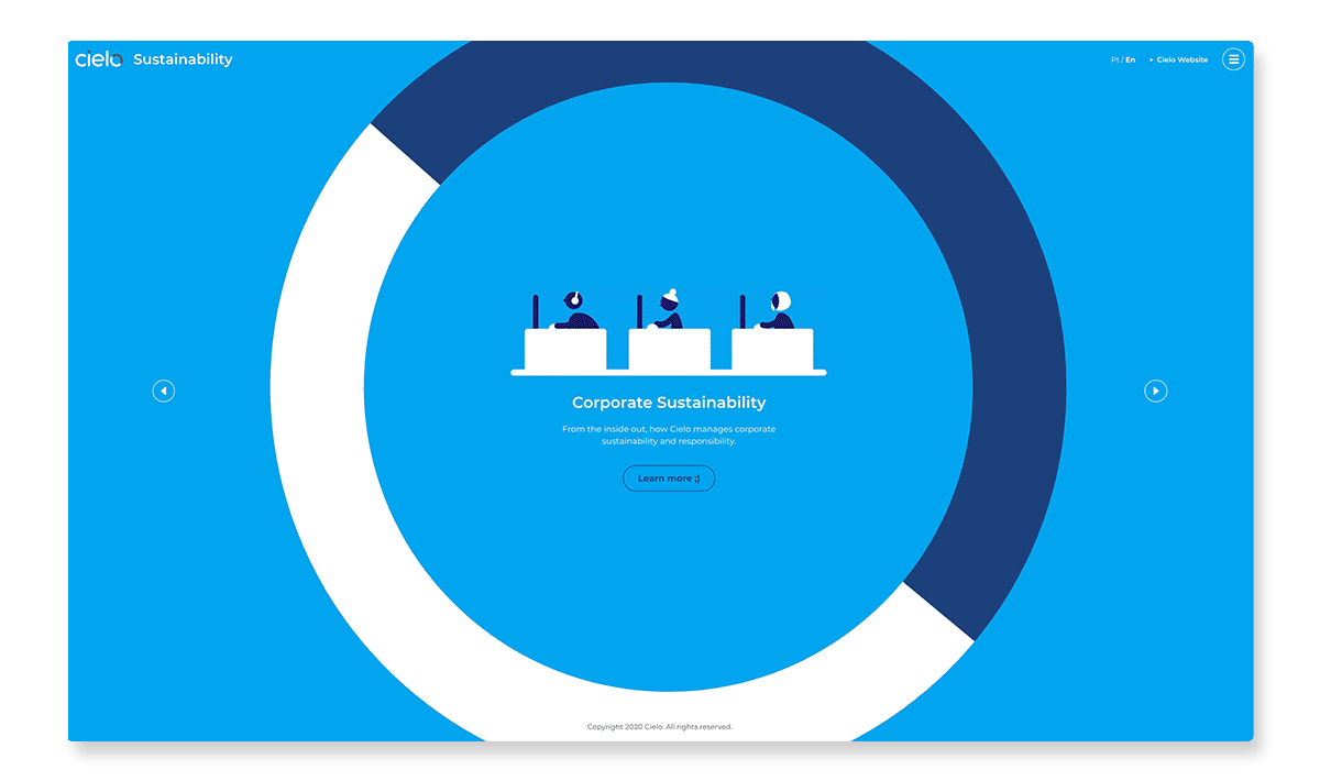
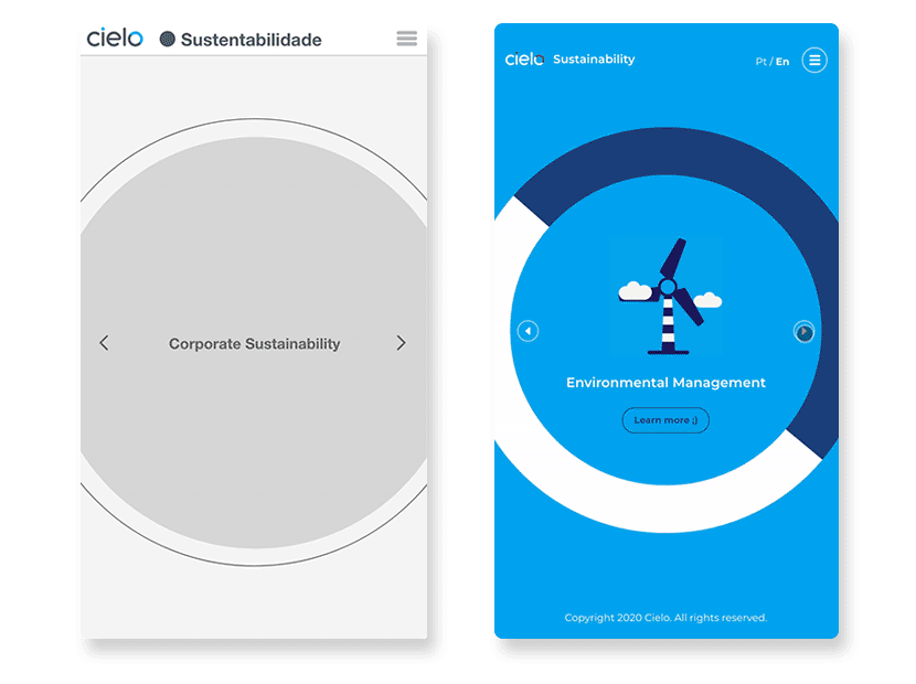
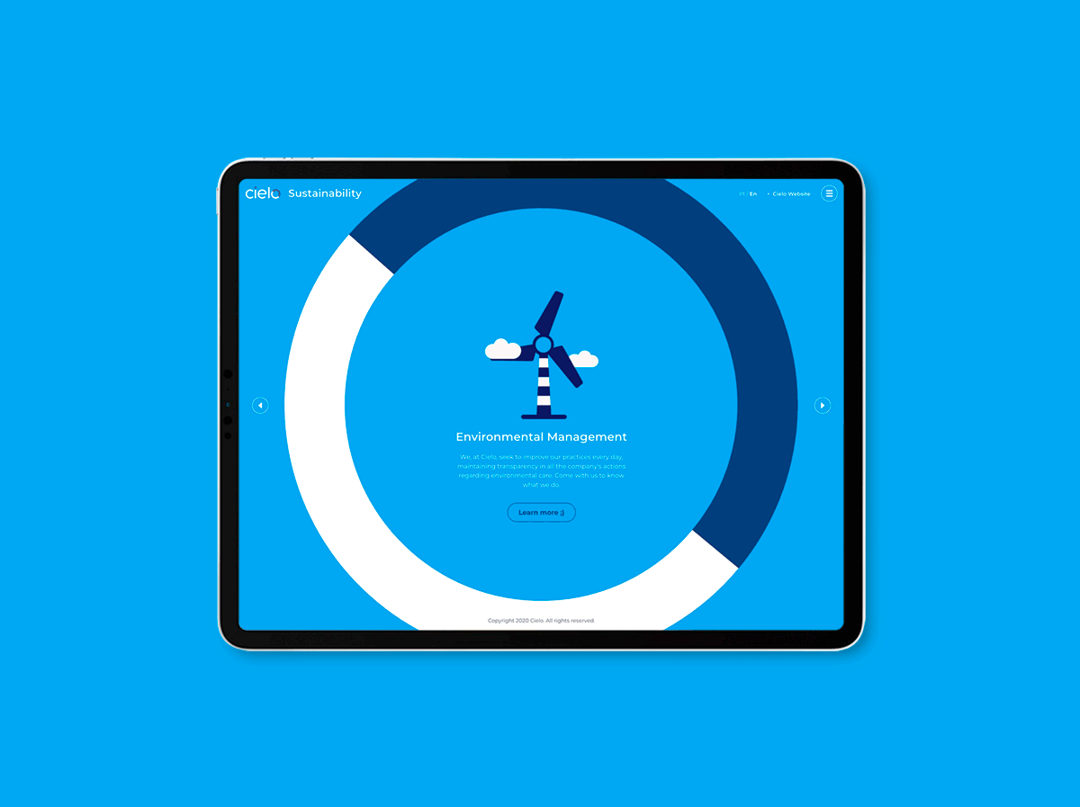
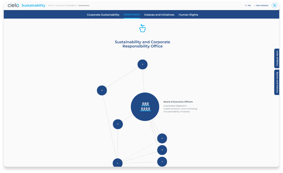
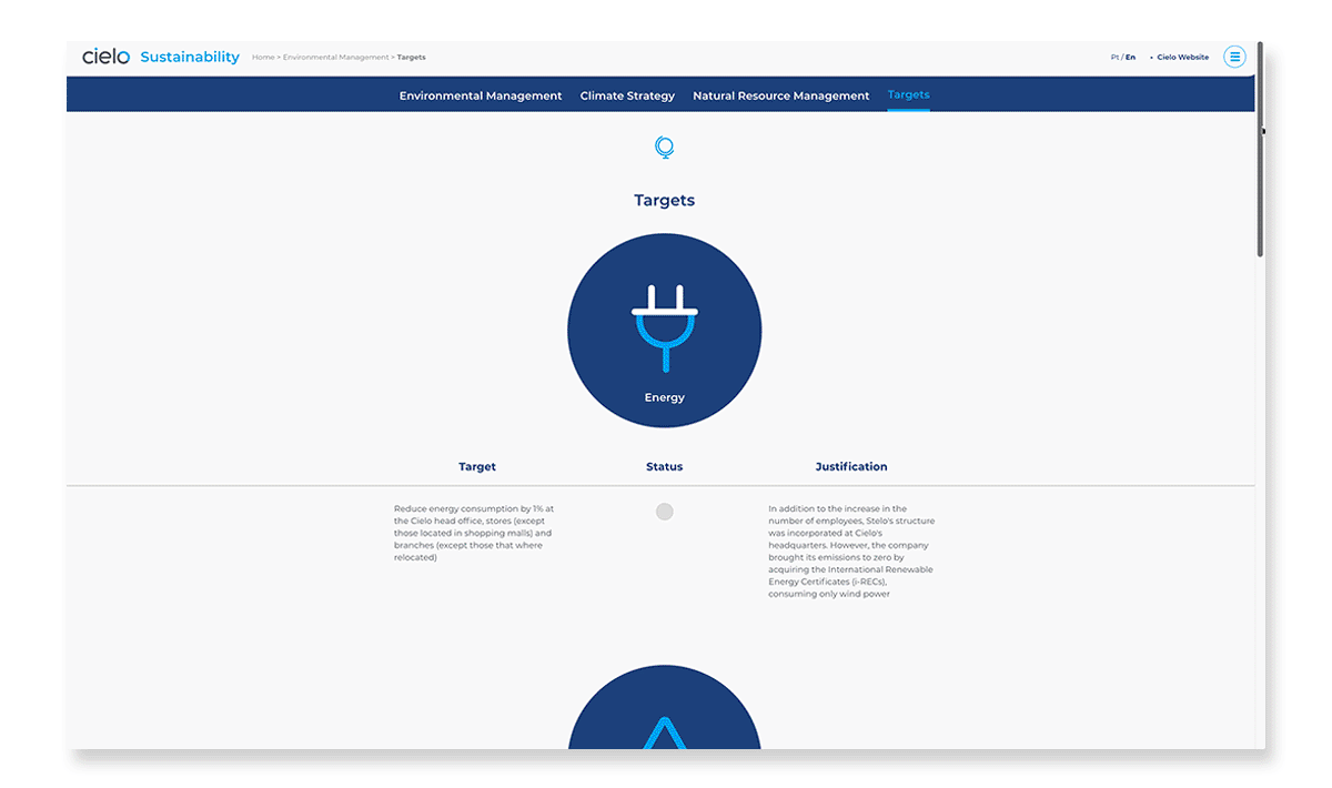
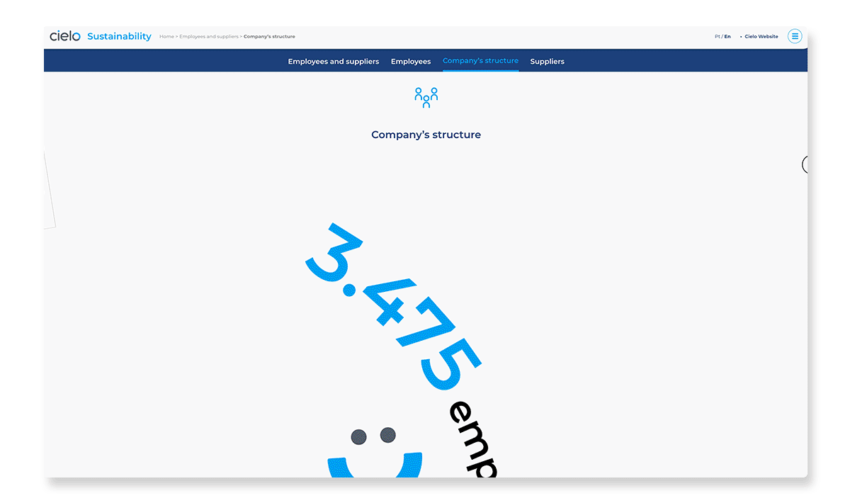
In Visual Design, then, the Cielo Sustainability website gained colors, icons and movements. It also gained its own typography, structuring weights and amounts.
The site also follows the entire new Visual Guide Cielo (Almap), reinforcing the brand’s presence after its redesign.
Everything tailored to be practical, easy to navigate and, of course, to be able to grow in a sustainable way. :)