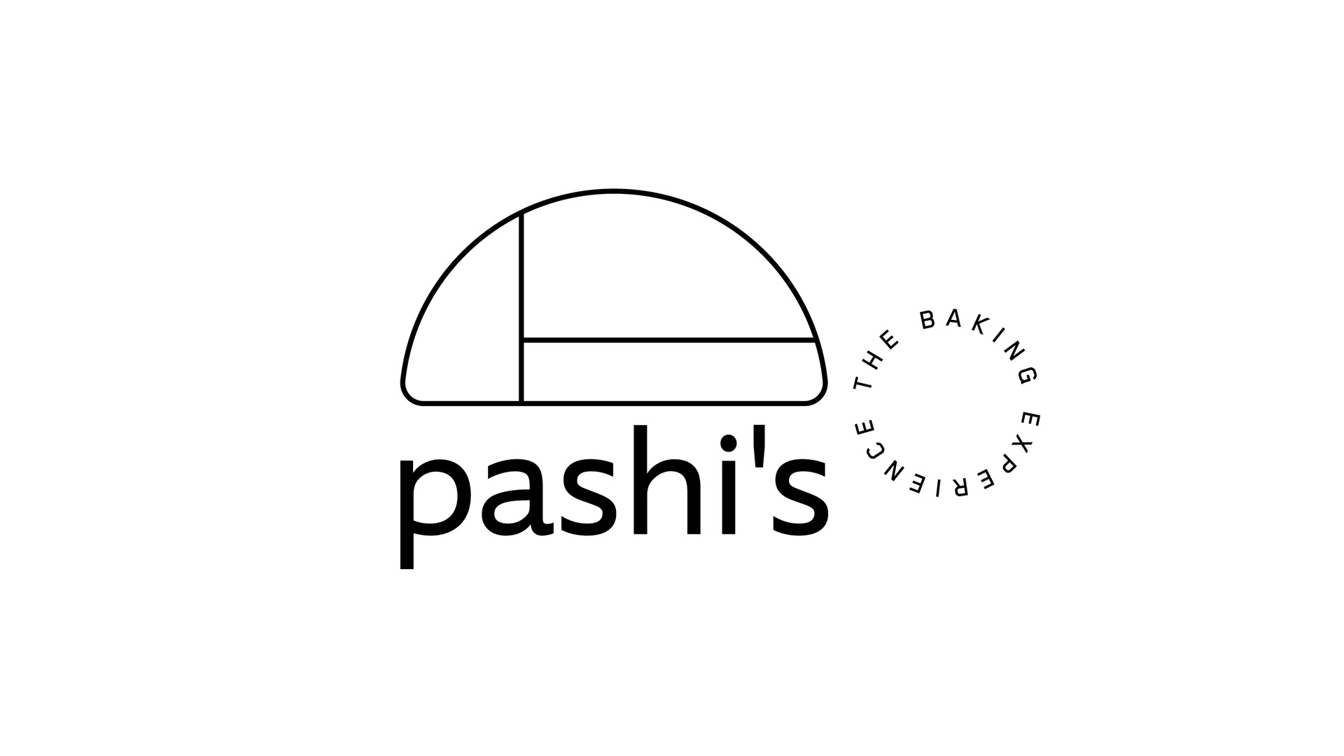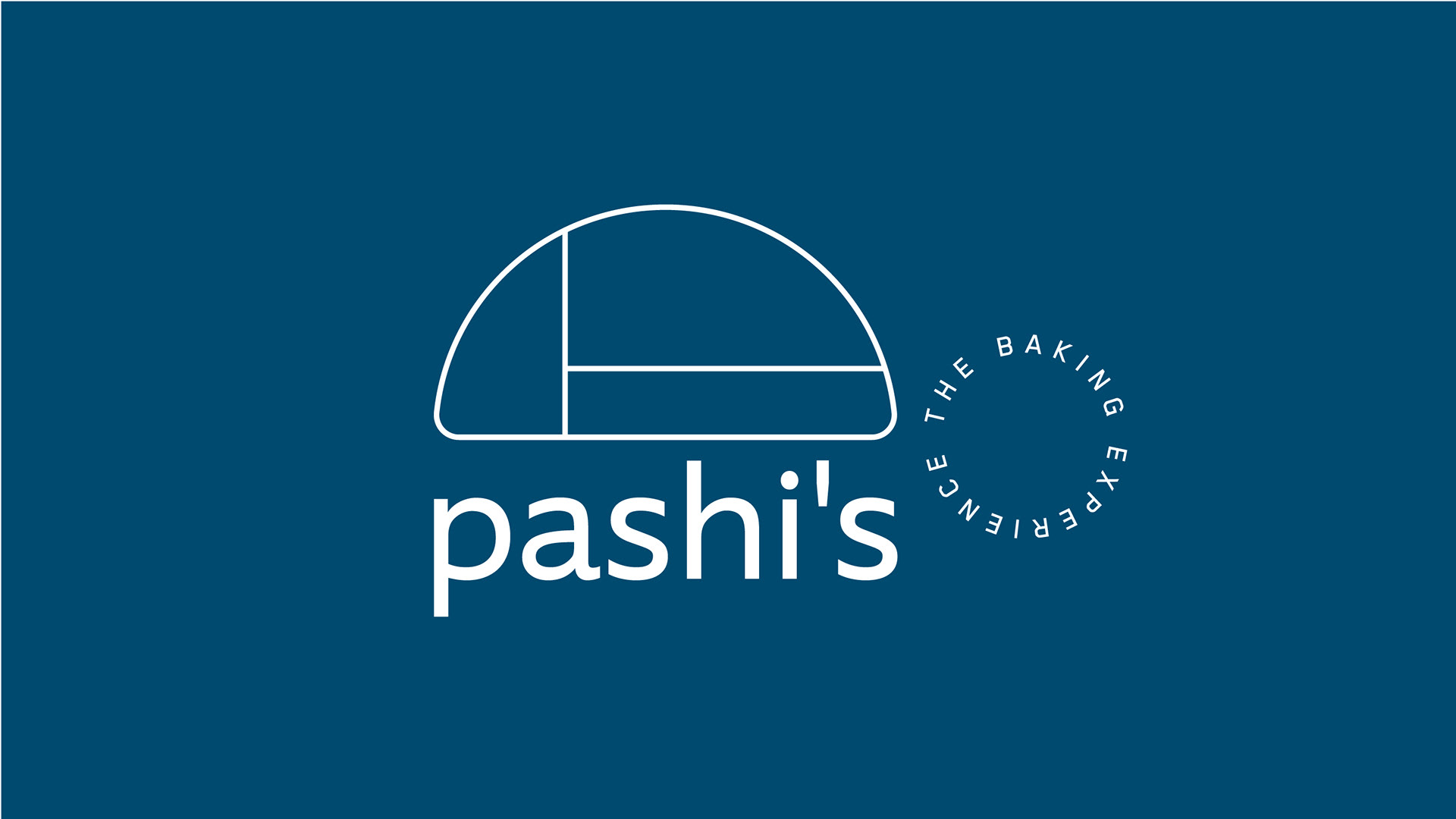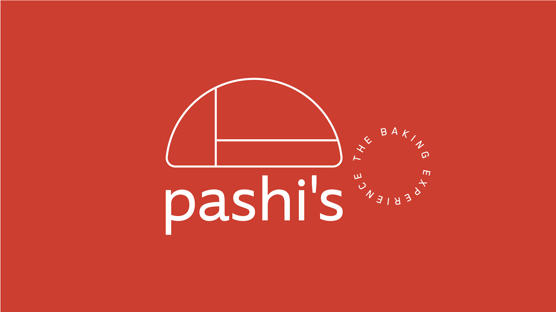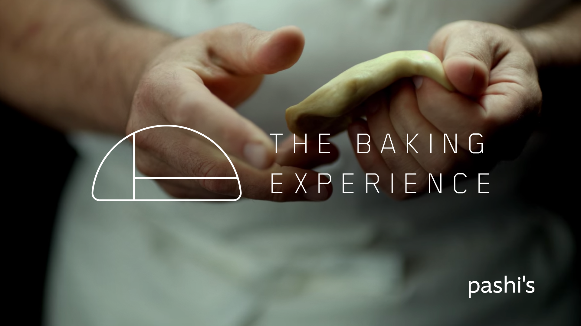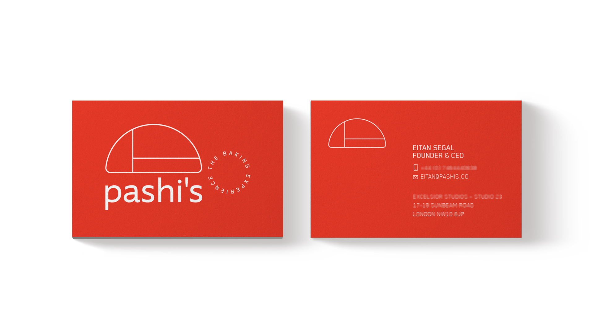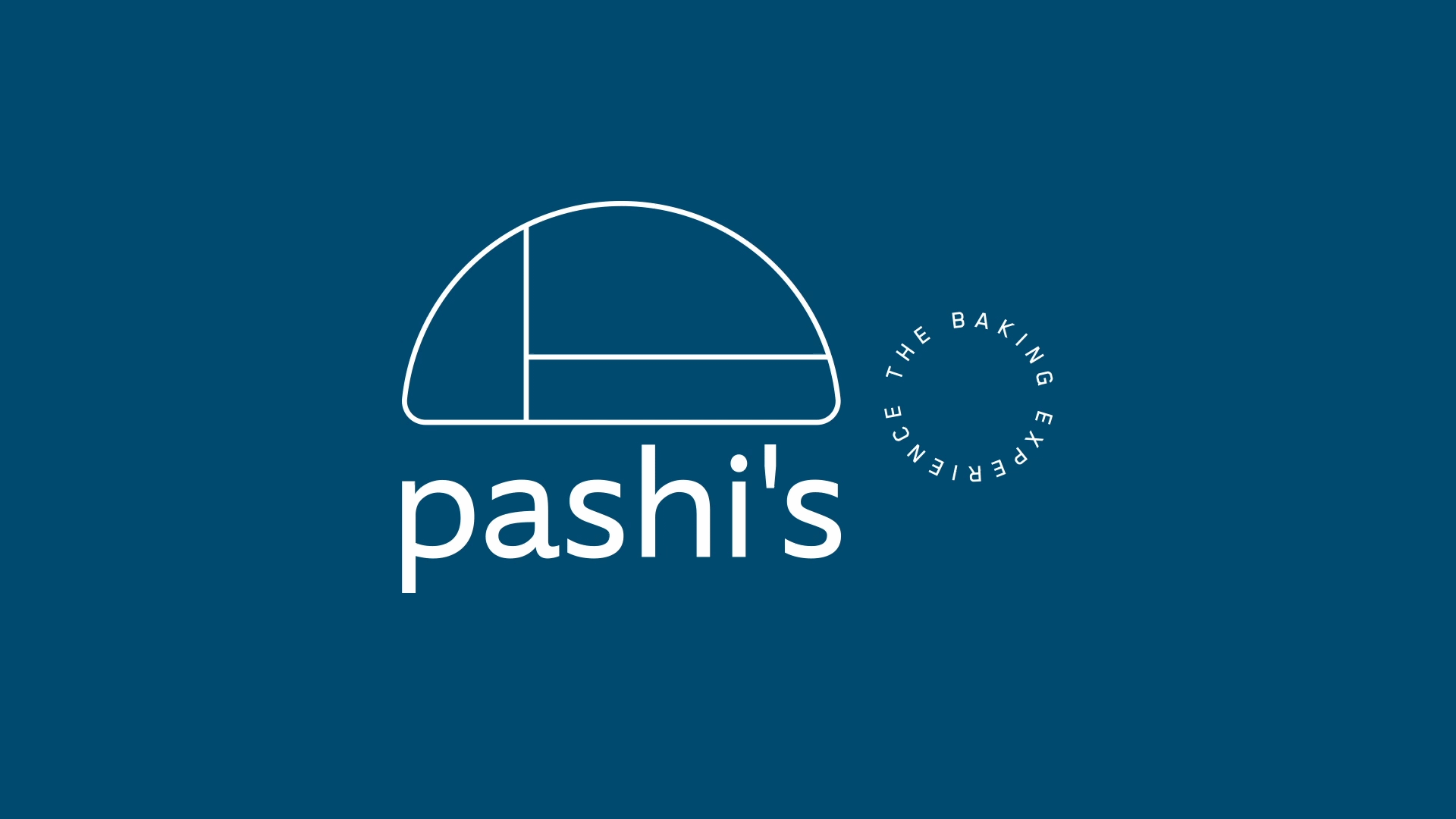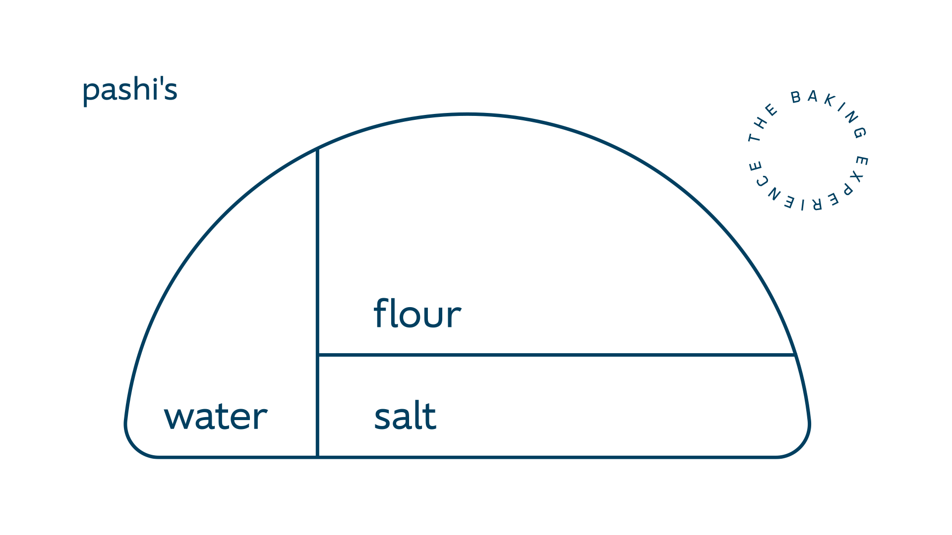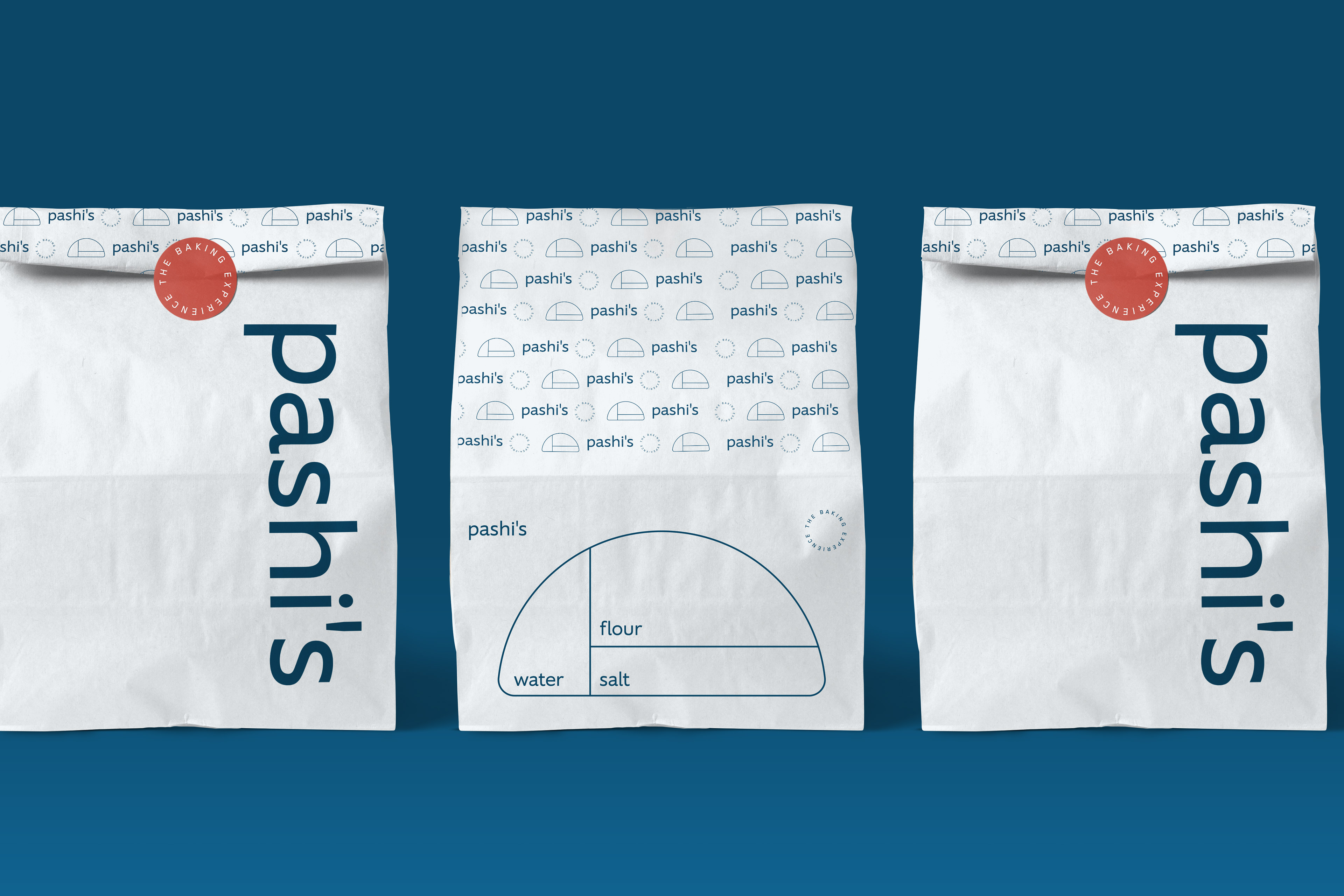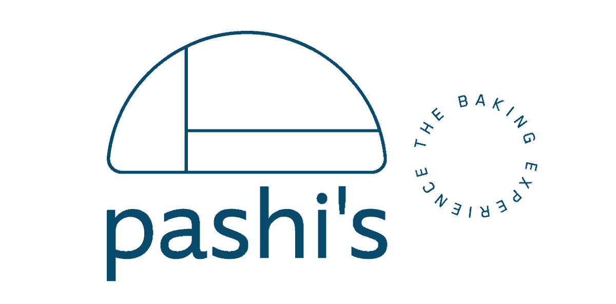
Symbol: we created the Pashi’s symbol from a cross-section of a sourdough bread. From the ‘loaf’, we design the cutouts of the ingredients ― flour, water and salt ― using the Fibonacci sequence as inspiration. The logo has fine and delicate lines, gaining a little weight in applications on smaller surfaces. The symbol is also related to the idea of formula ― typical of the lab experience ― and recipes. It is a simple and fine brand, which has total synergy with the owner's personality.

Type: using the Supra Regular font in lowercase, we created a modern brand, looking like a startup from the year 2020 - what it really is. The name complements our unique symbol and still receives support of the baseline applied Blender font in a circle design: The baking experience. The baseline confirms the concept of a lab, playing with the possibilities of the bread creation from few ingredients
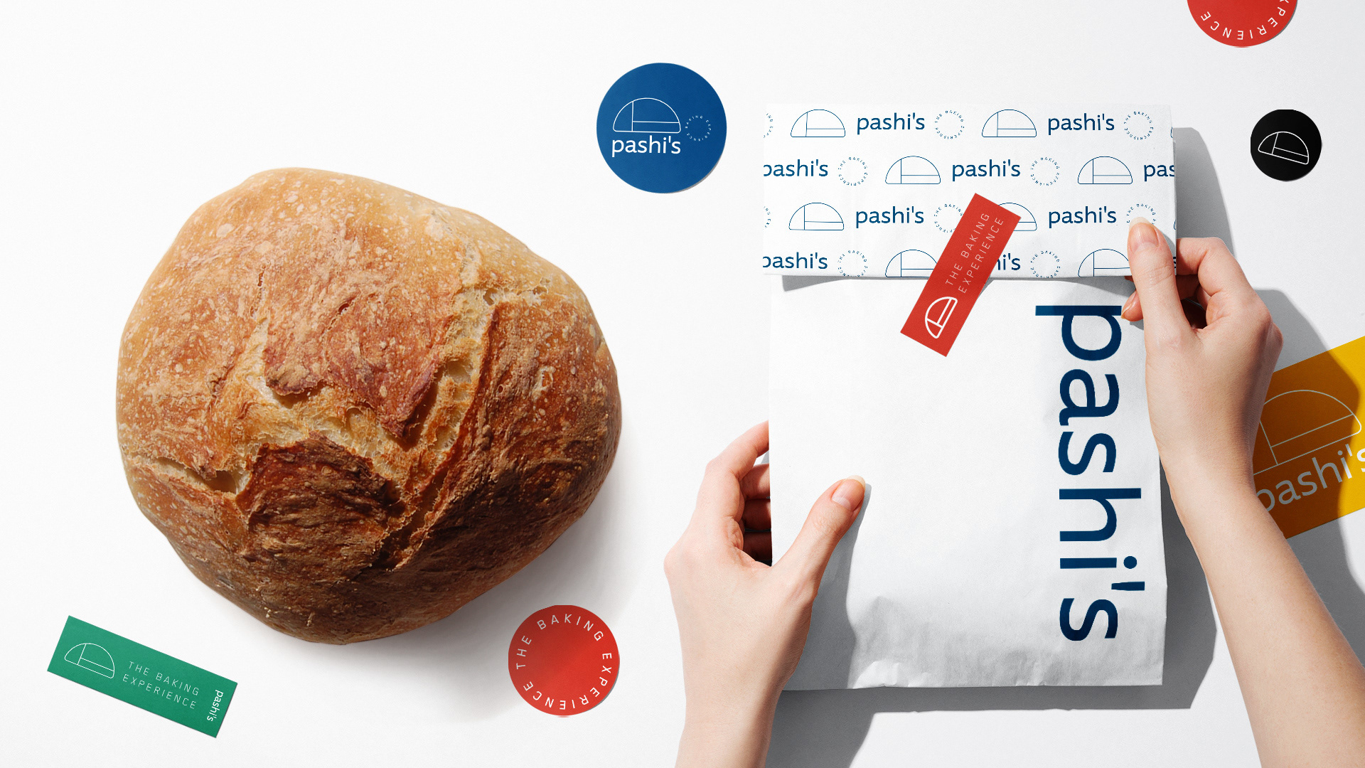
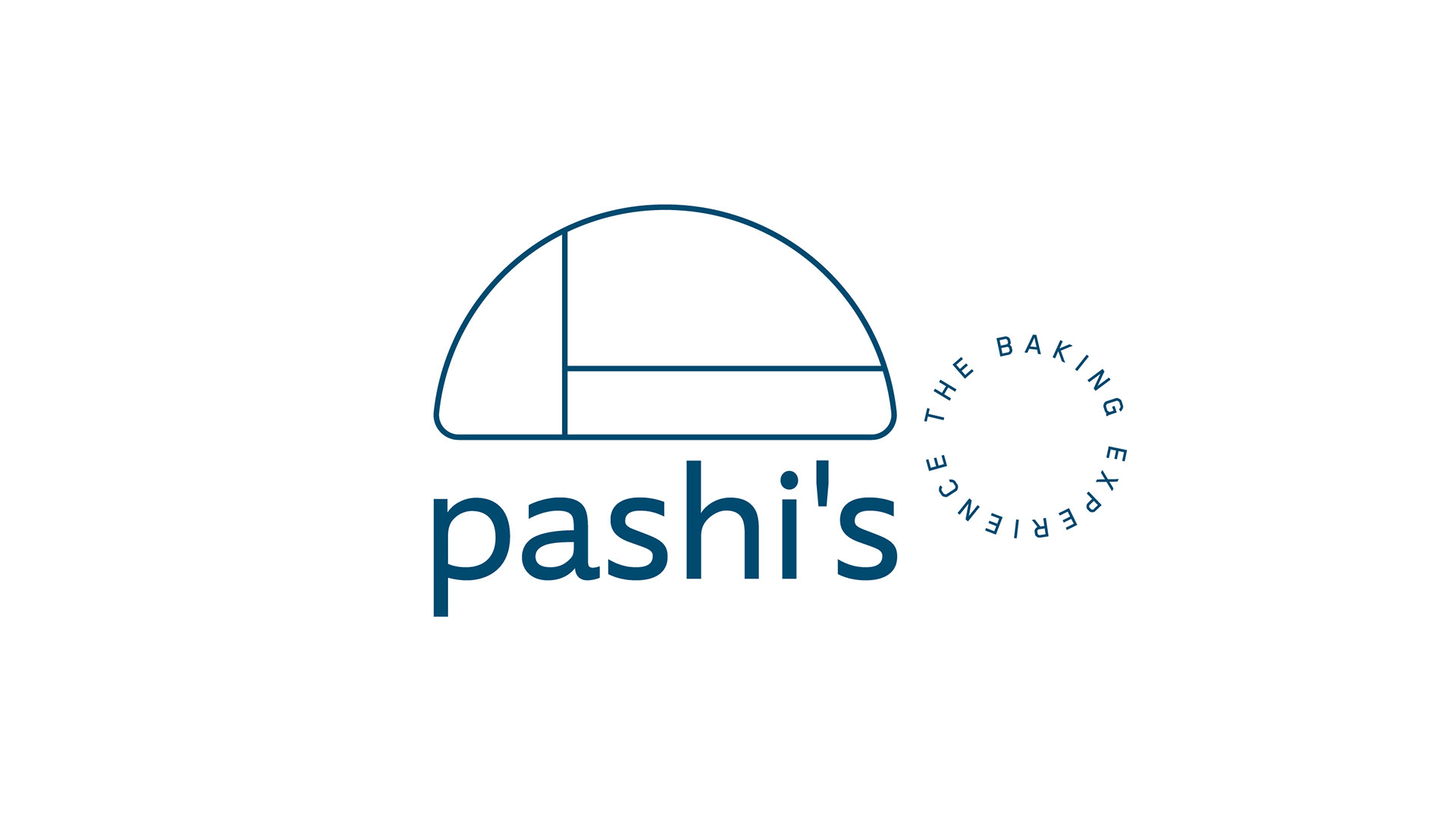
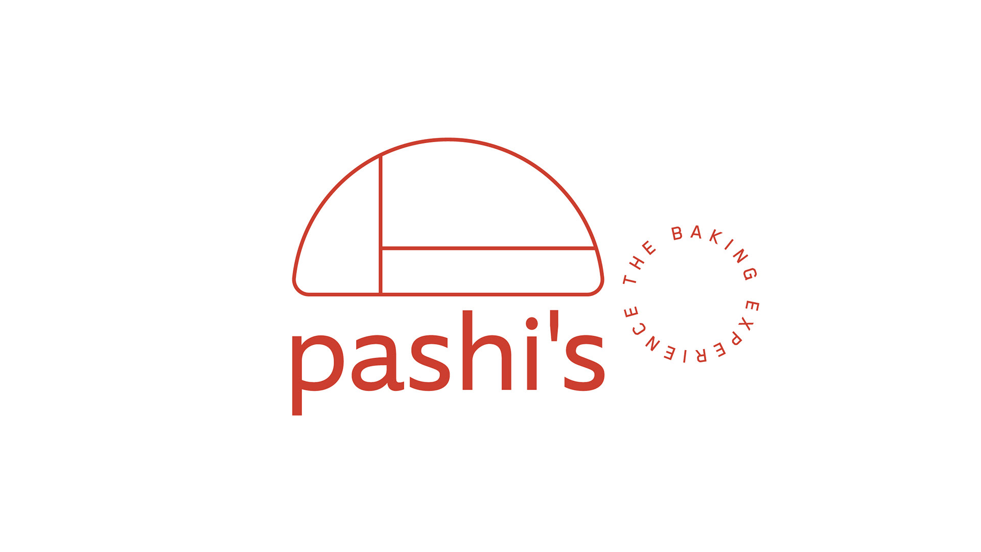
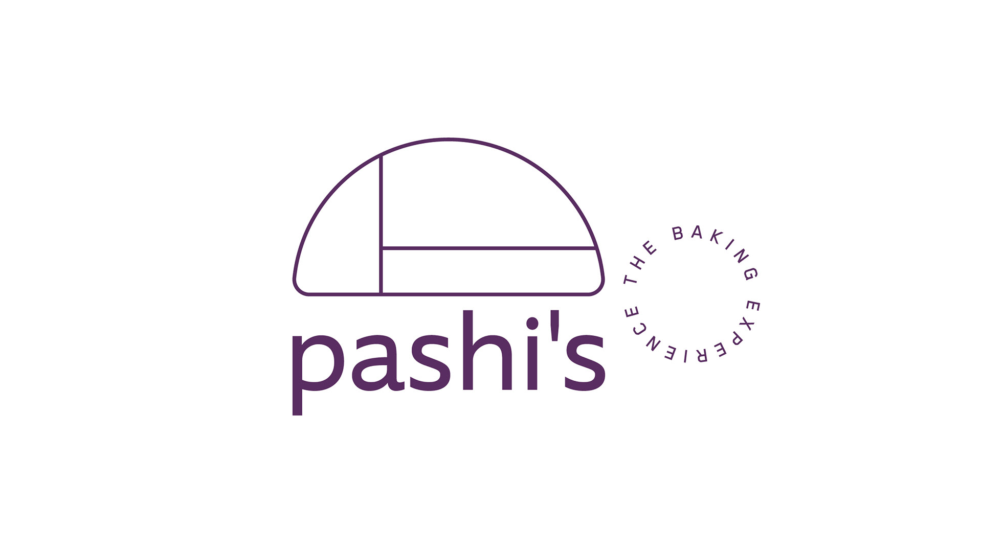
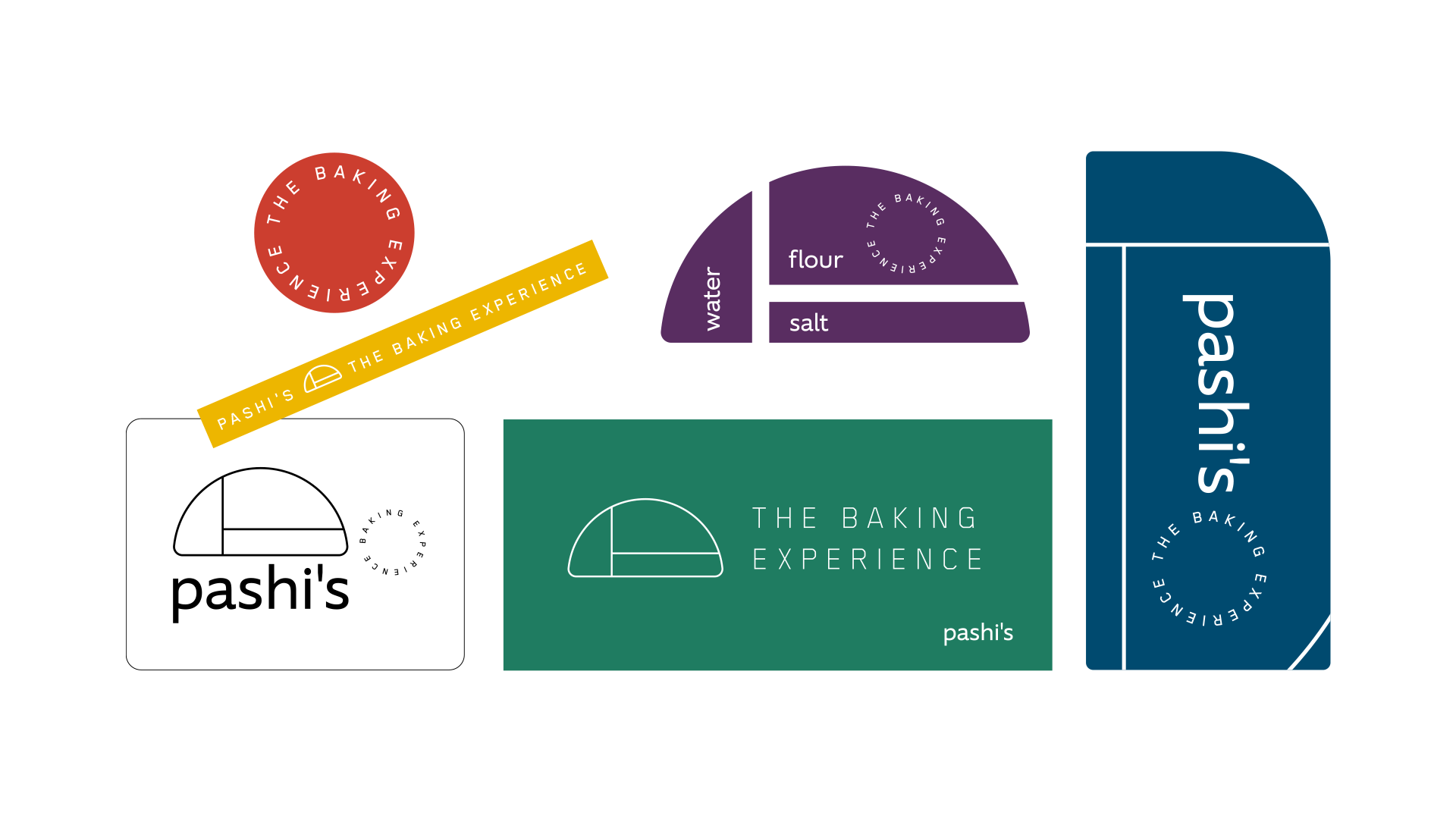
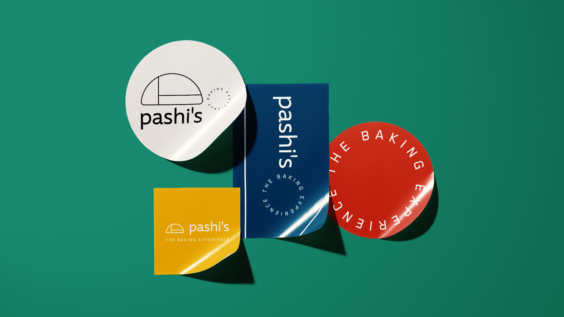
Colors: to complete the fundamental trio of creation of the Pashi’s bakery universe, we use a color palette based on jewel tones. Elegant tones continue to bring bright to the brand, without obvious colors. The use of colored labels in the launching moment was a strategic way to make possible the presence of all the elements with the best cost benefit for a brand that is born in the middle of the 2020-21 pandemic.