Challenge
Create a modern visual identity that represents the essence of the coffee that the brand work with: best beans, carefully selected from small producers of excellence in Brazil. The job was to create a logo, identity and easy packaging for the first batches of roasted beans.
Create a modern visual identity that represents the essence of the coffee that the brand work with: best beans, carefully selected from small producers of excellence in Brazil. The job was to create a logo, identity and easy packaging for the first batches of roasted beans.
Solution
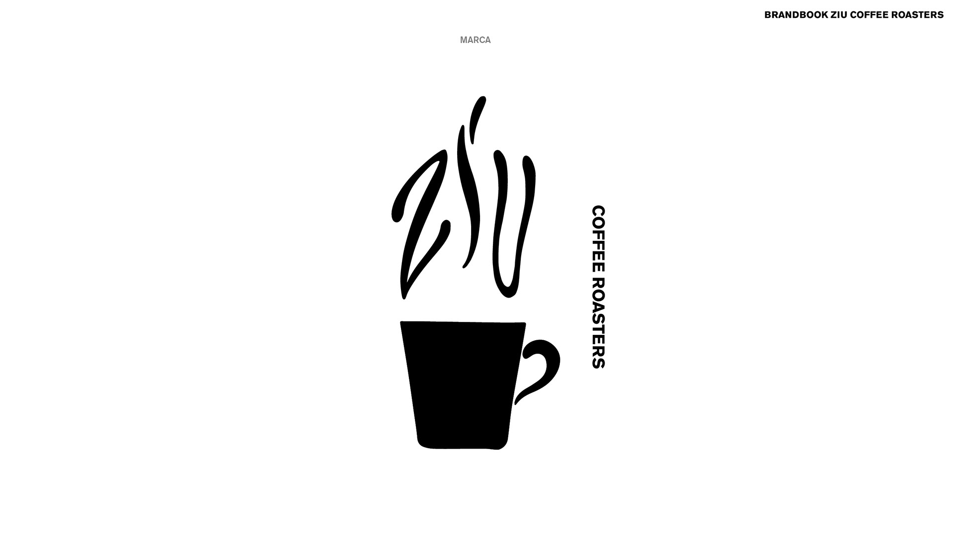
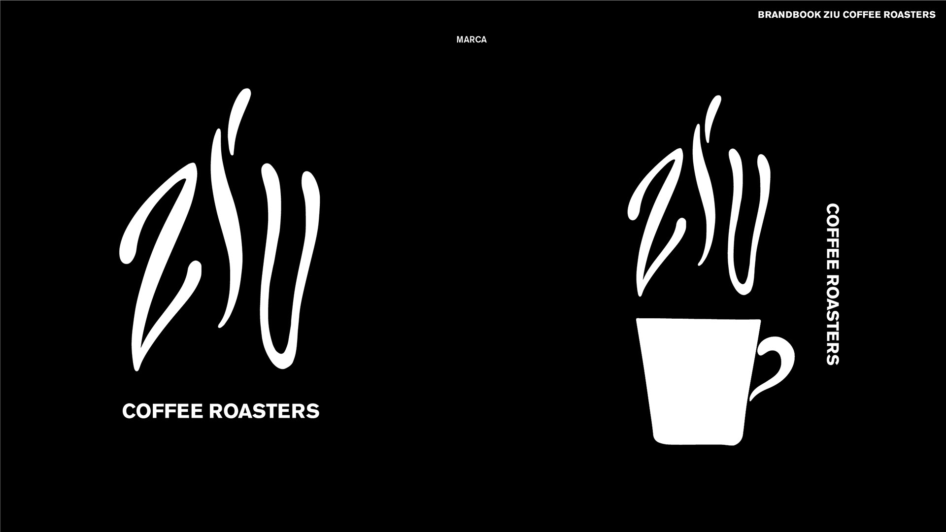
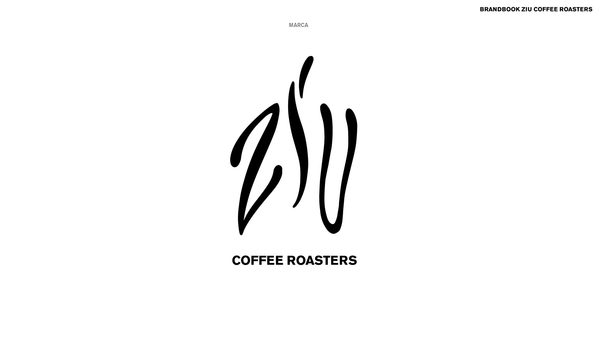
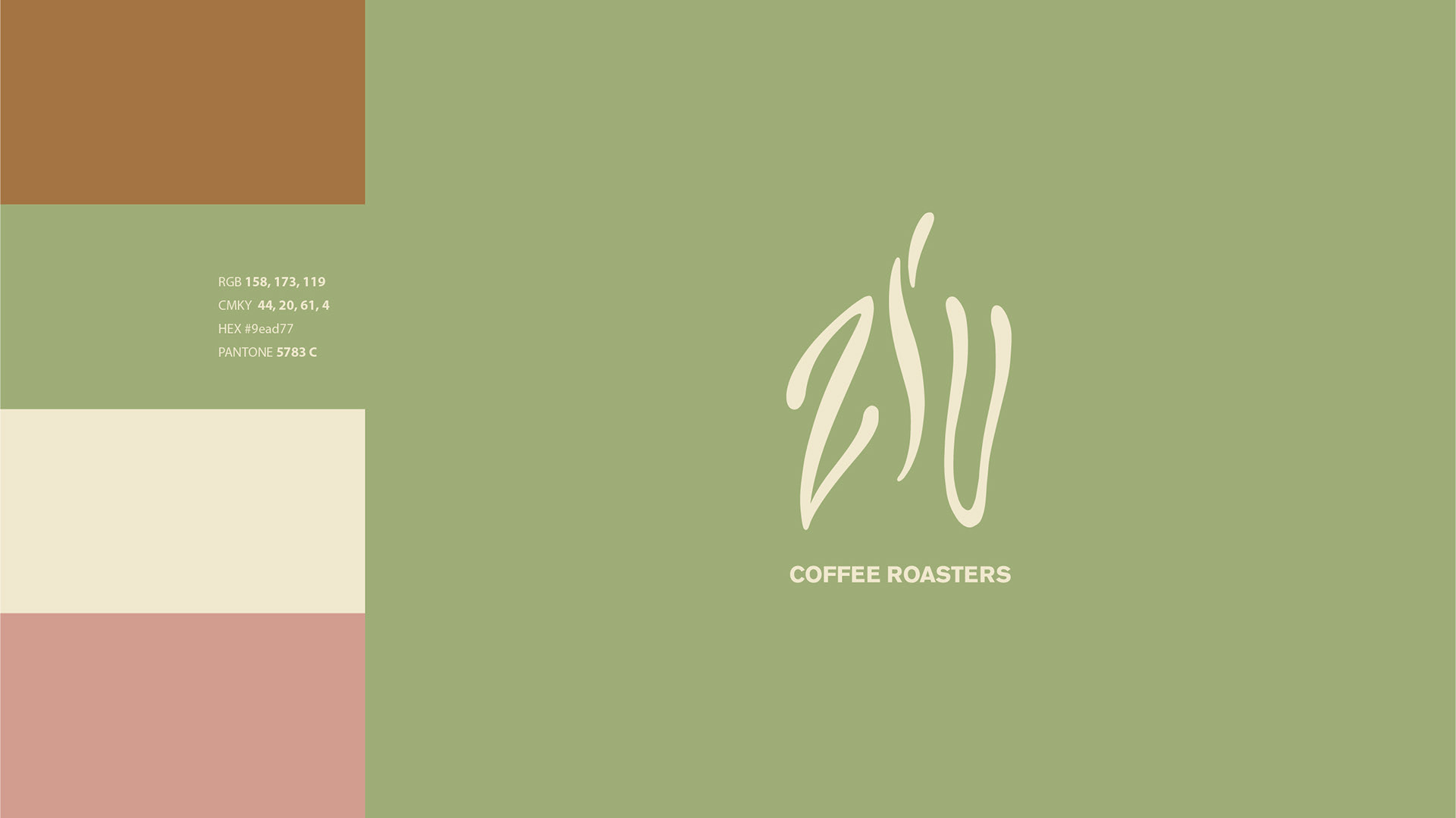
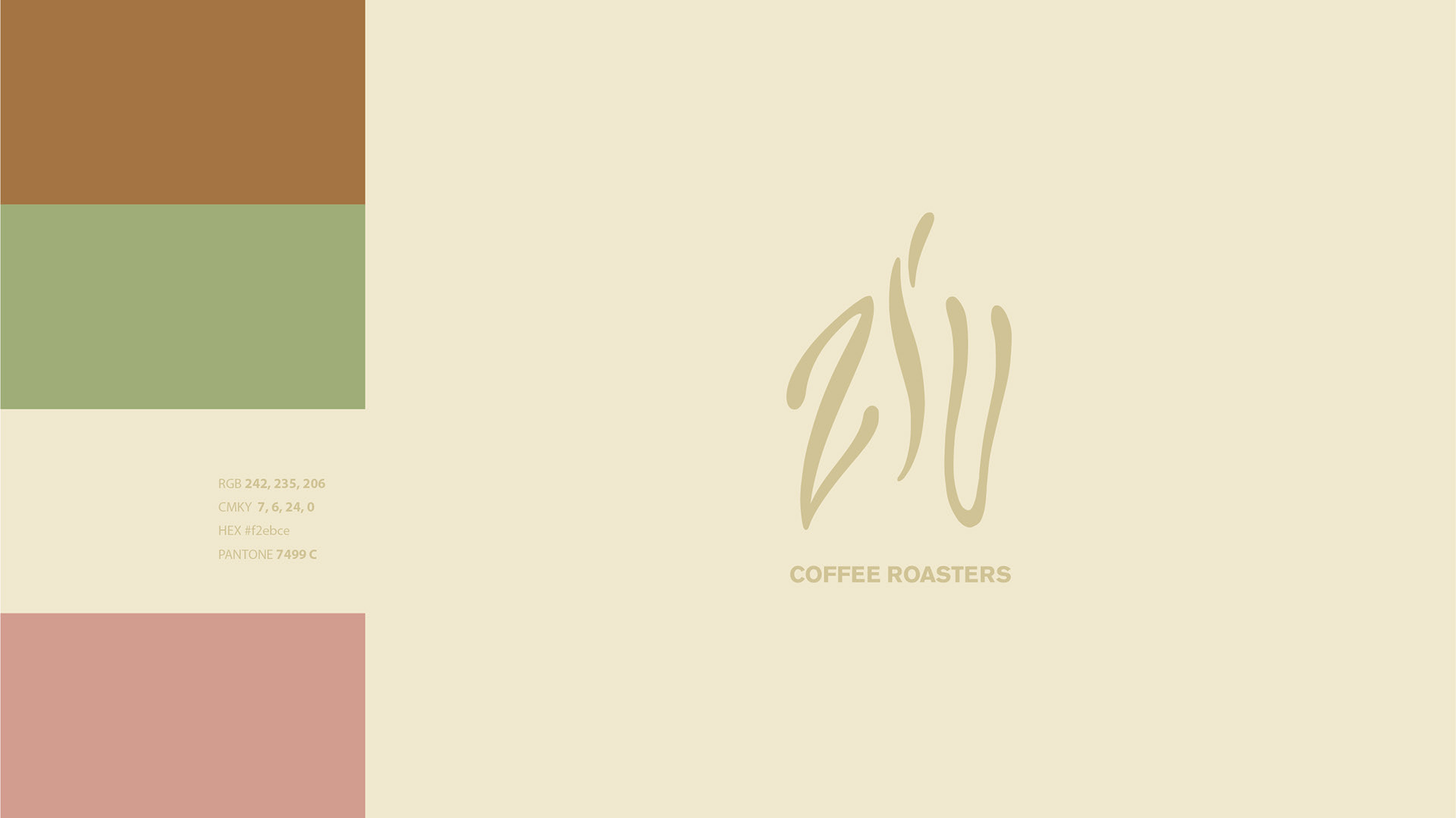
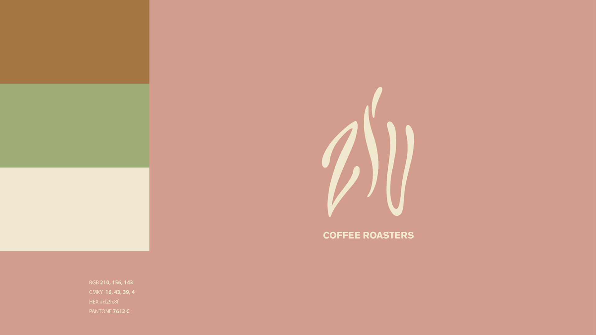
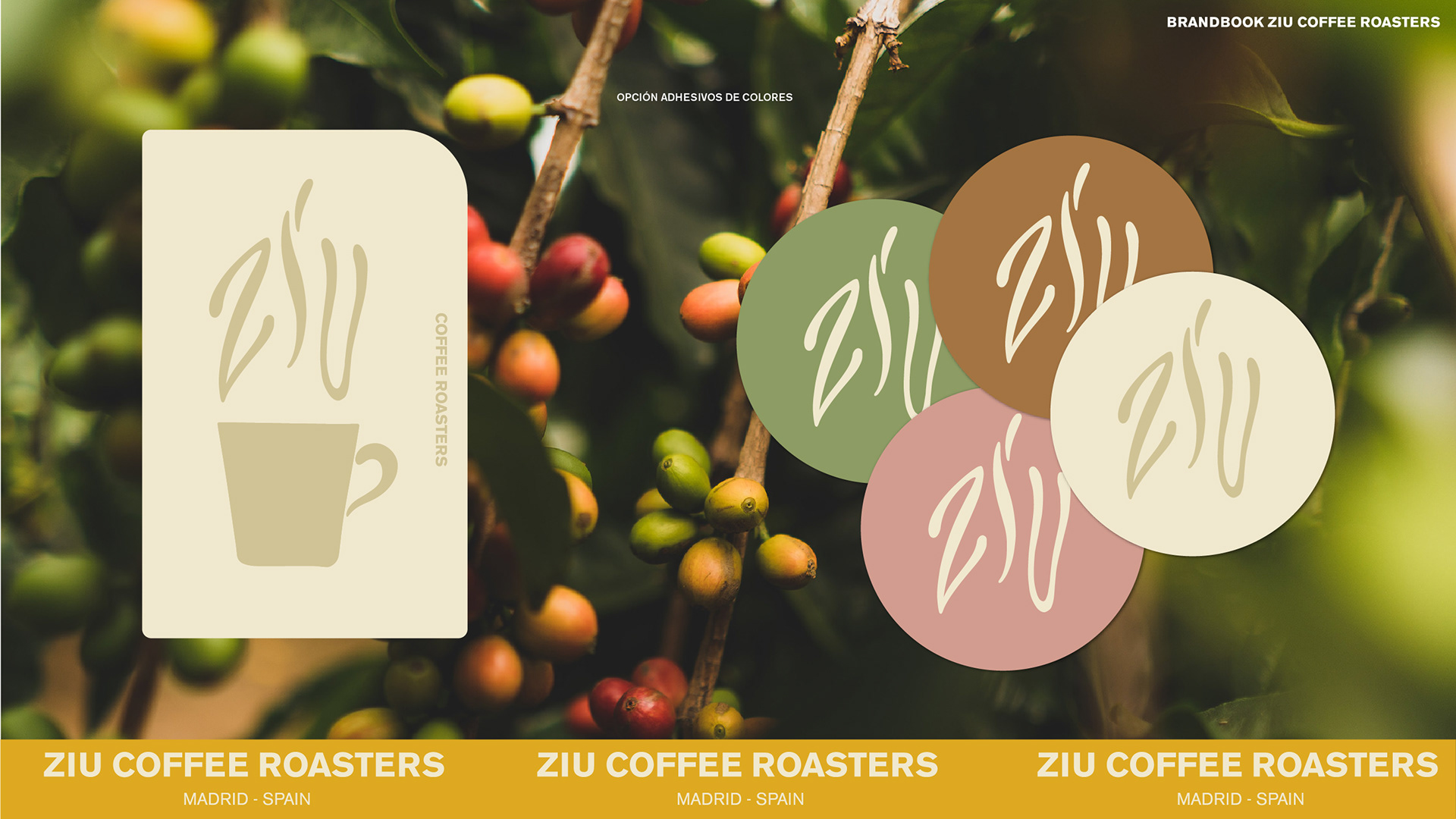
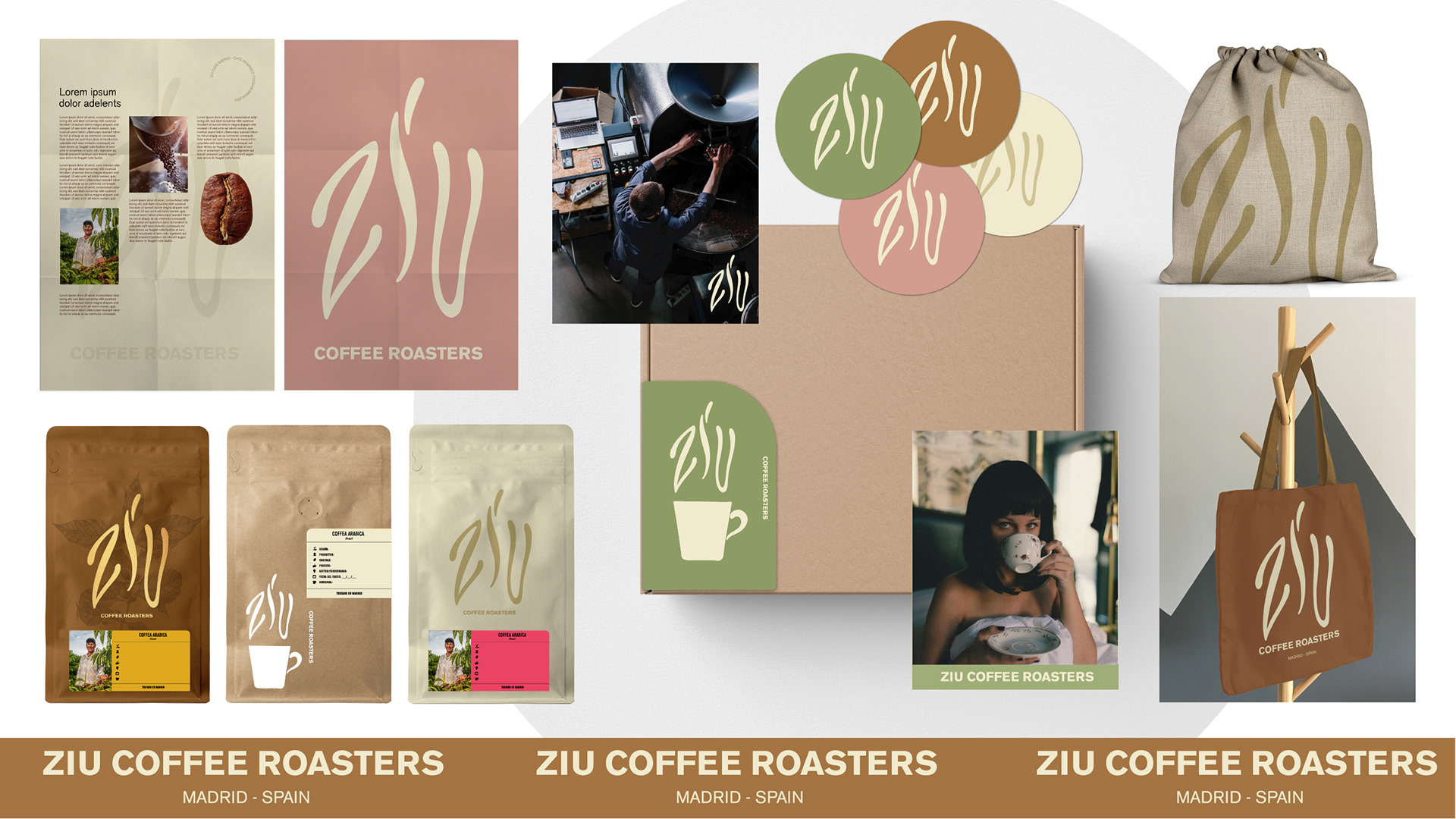
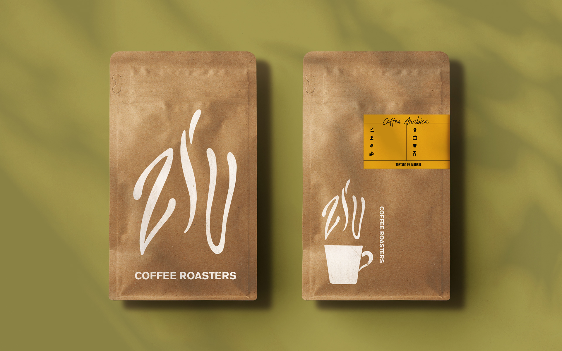
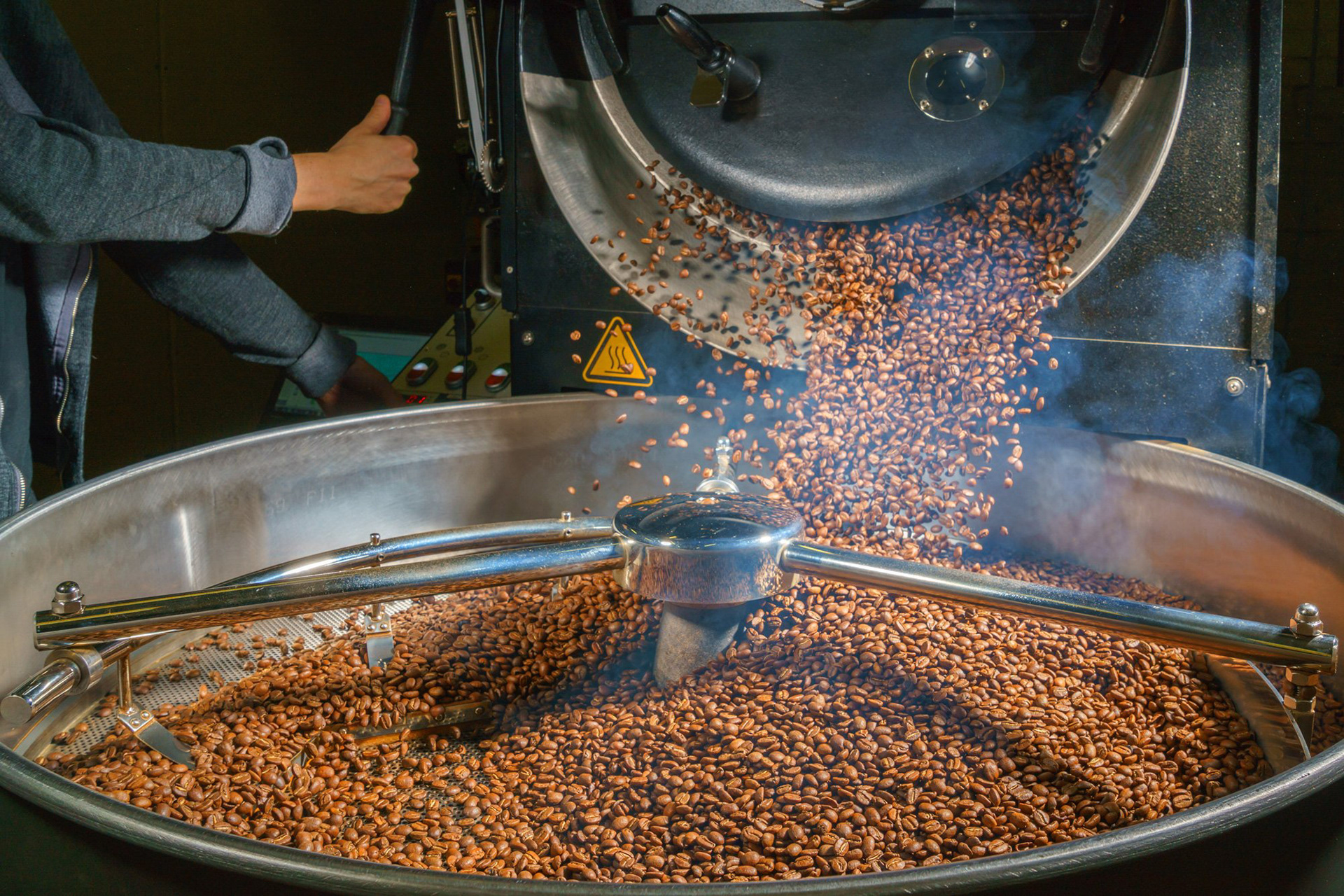
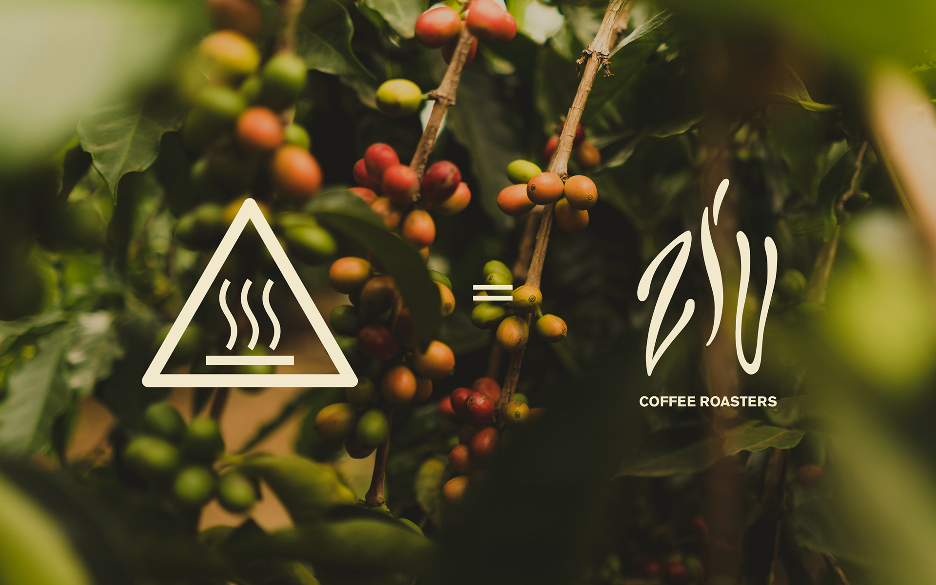
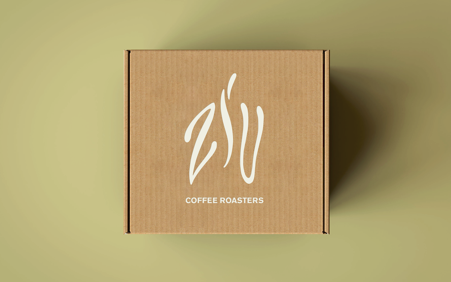
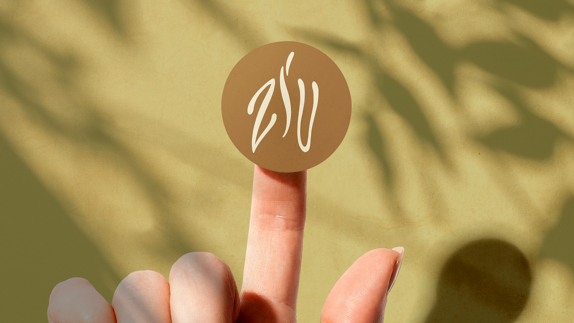
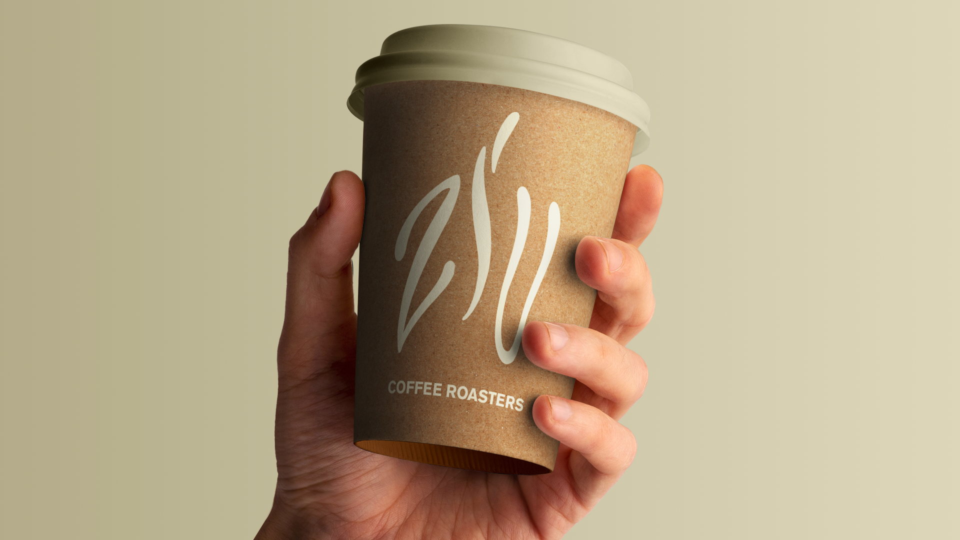
To create the brand for Ziu coffee roasters, we start with synesthesia, the senses that are awakened in this roasting and grinding process. We focus on the main one: the aroma of coffee. The three letters inspired an organic movement, so we developed a handwritten logo in lettering, simulating the movement of smoke - which is present from roasting to enjoying the drink. The symbol also refers to the functional hot symbol present in all roasting machines.
To create the brand for Ziu coffee roasters, we start with synesthesia, the senses that are awakened in this roasting and grinding process. We focus on the main one: the aroma of coffee. The three letters inspired an organic movement, so we developed a handwritten logo in lettering, simulating the movement of smoke - which is present from roasting to enjoying the drink. The symbol also refers to the functional hot symbol present in all roasting machines.
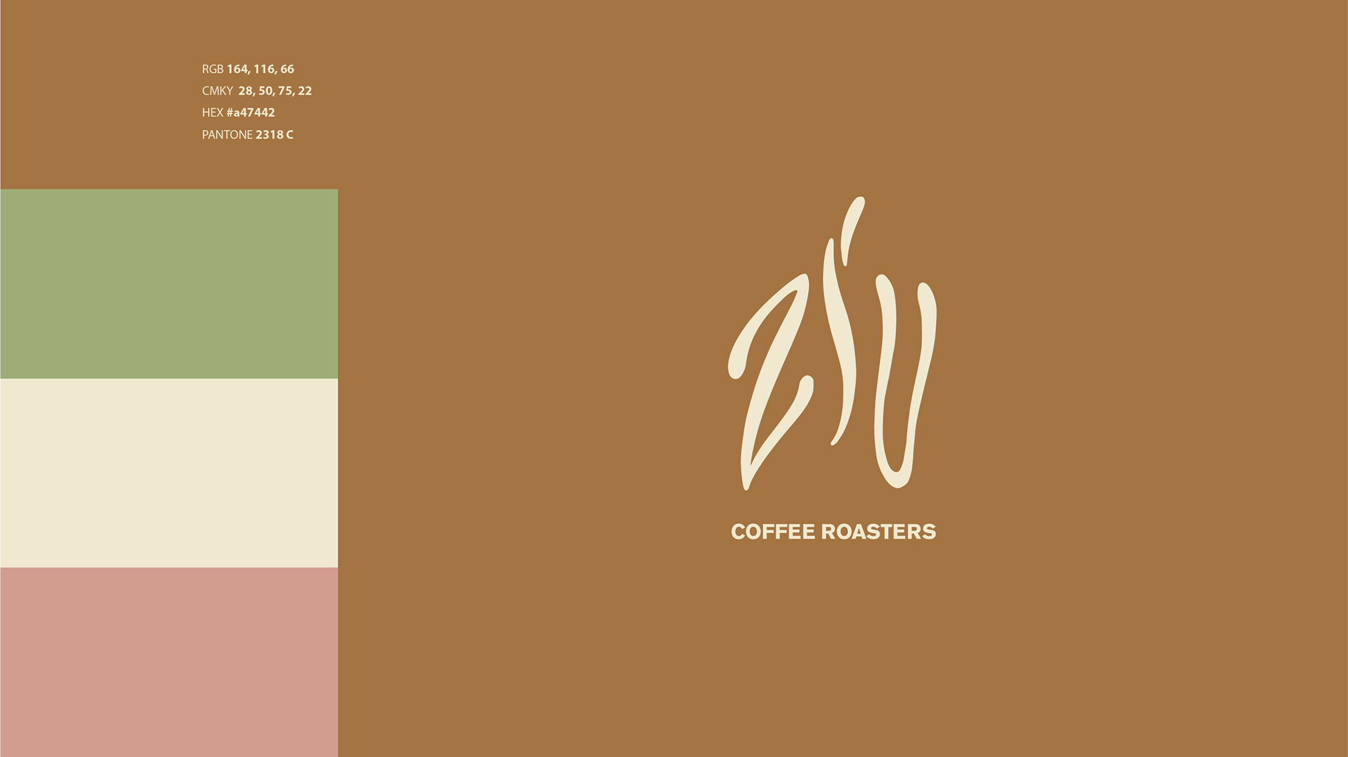
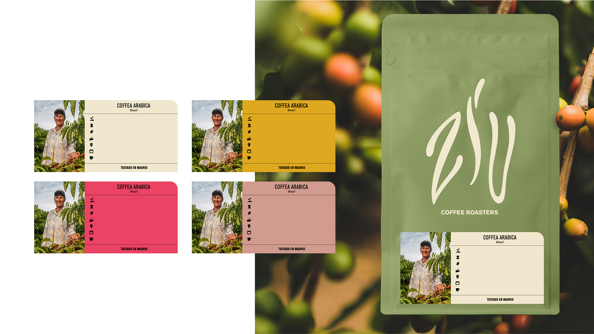
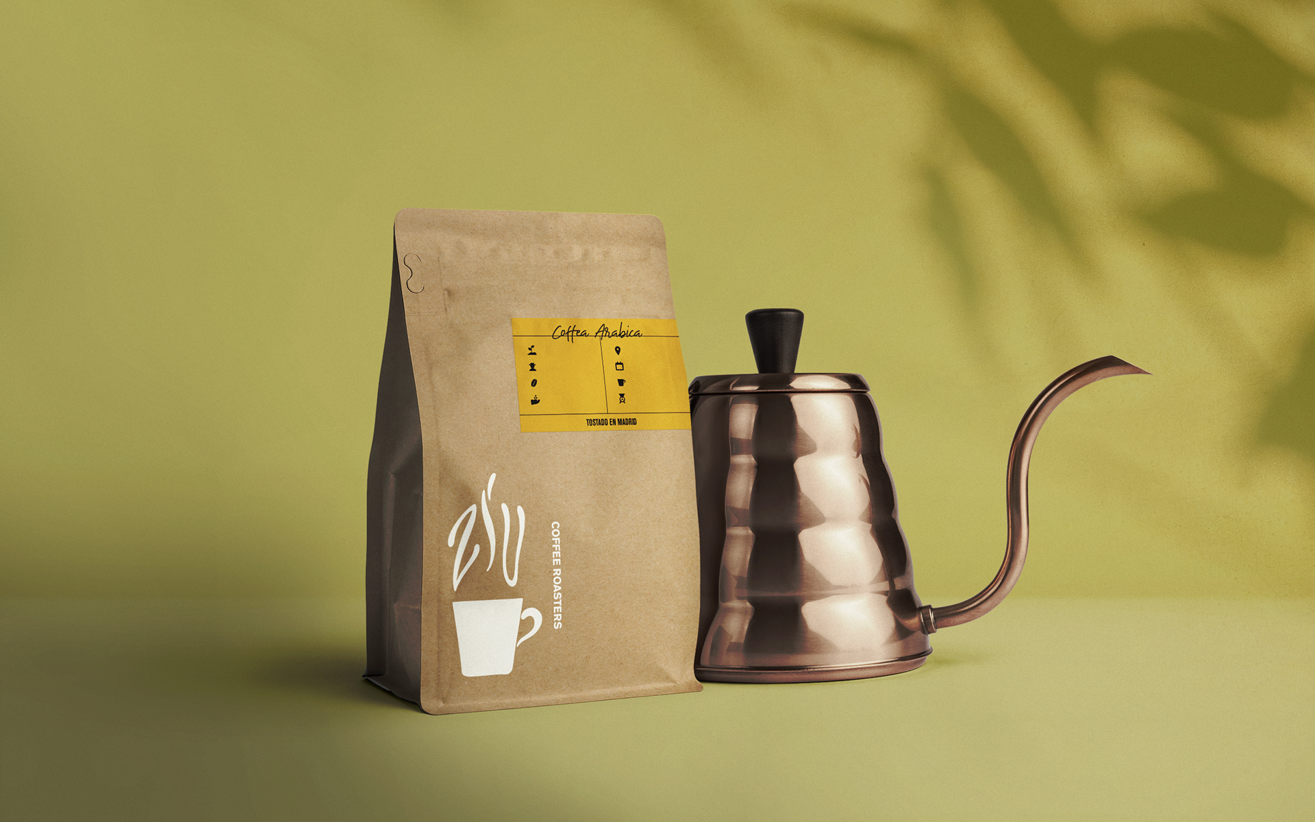
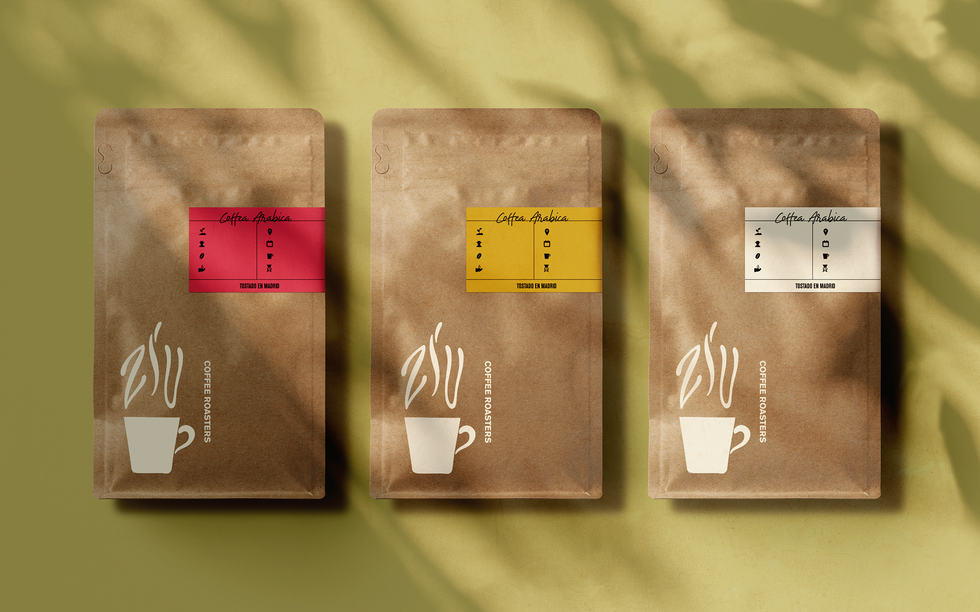
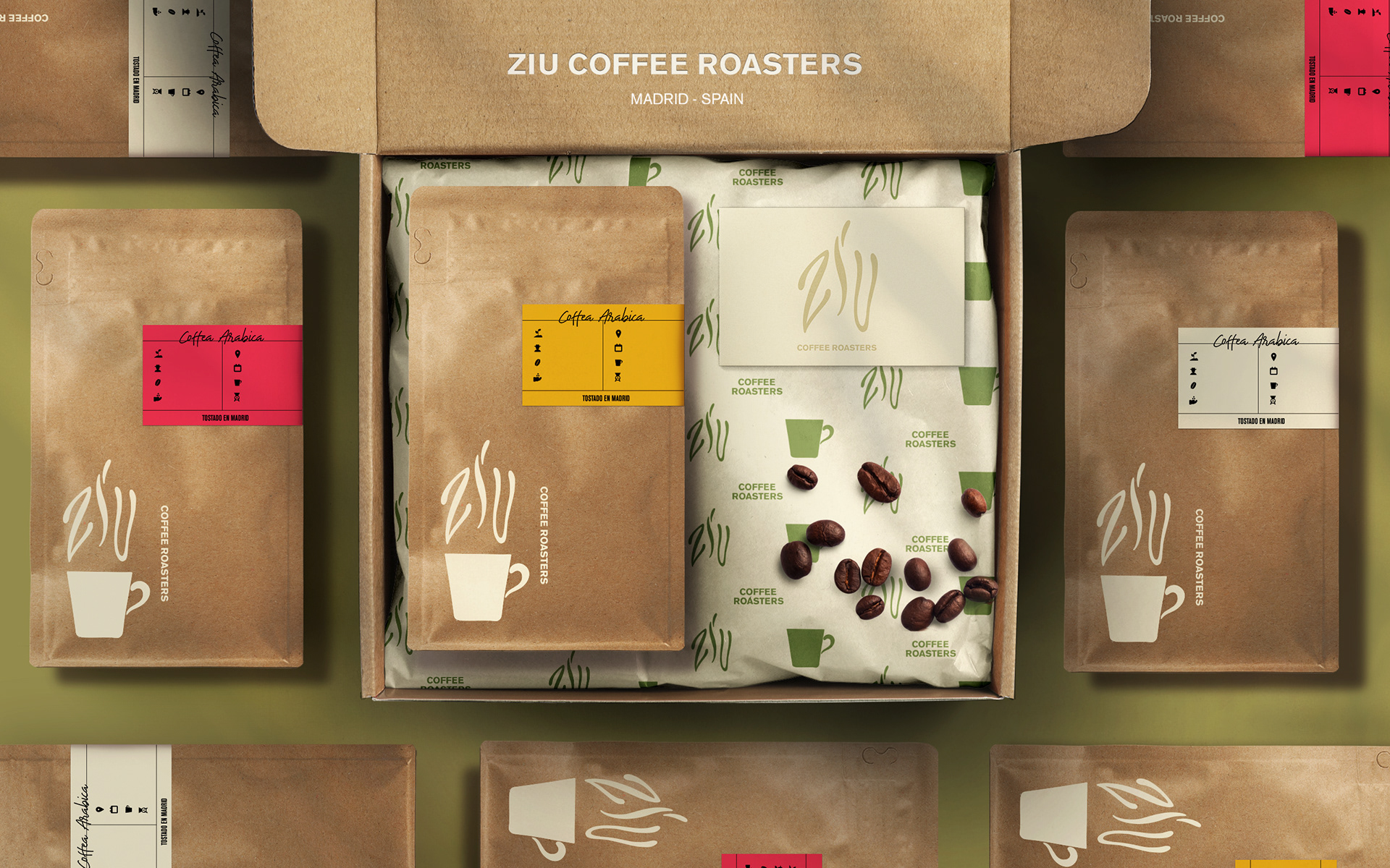
For the colors, we moved away from the traditional very dark coffee tone and went to the plant natural tones in its various presentations and the caramels, which are more realistic for the drink in its premium form.
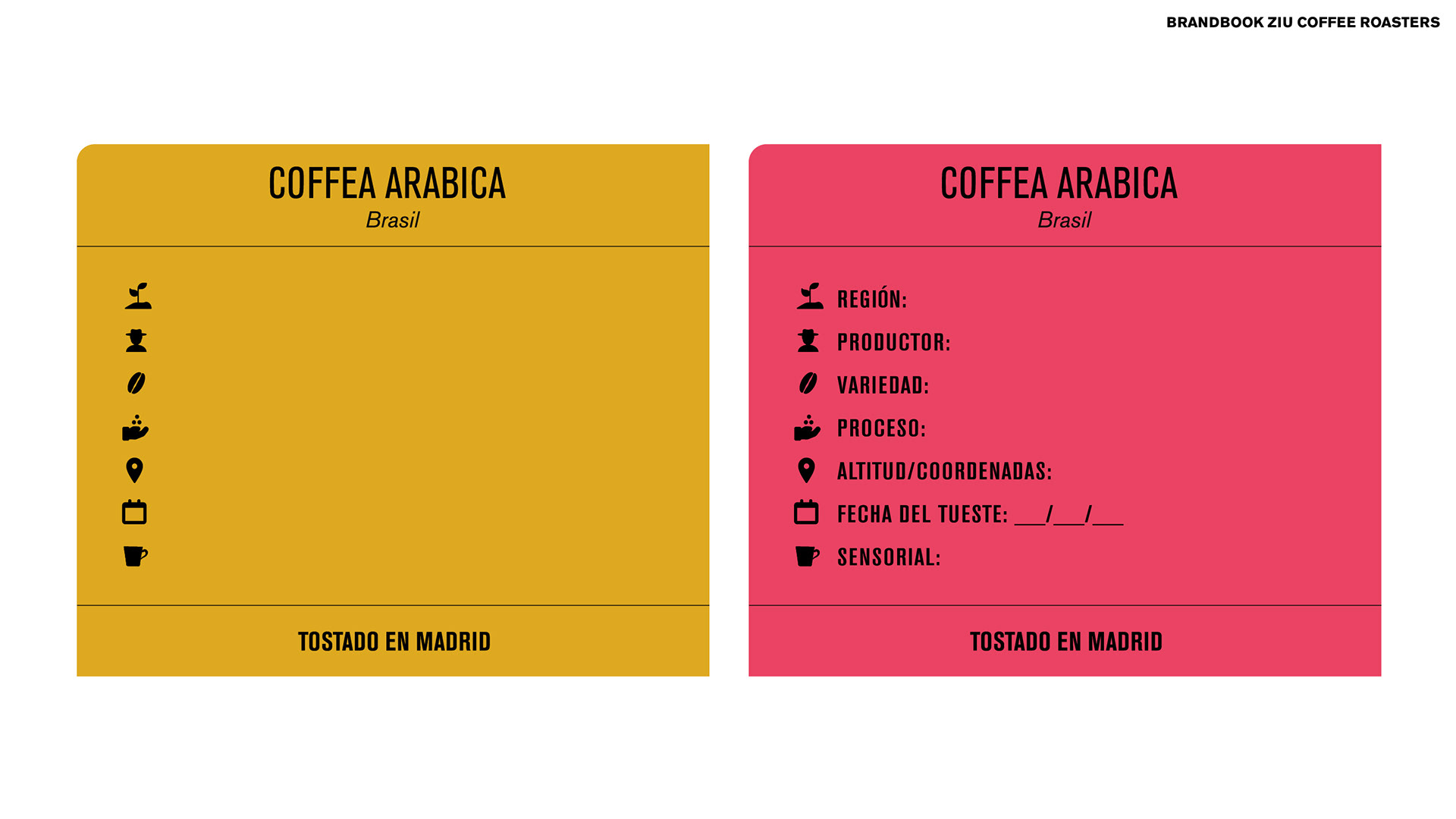
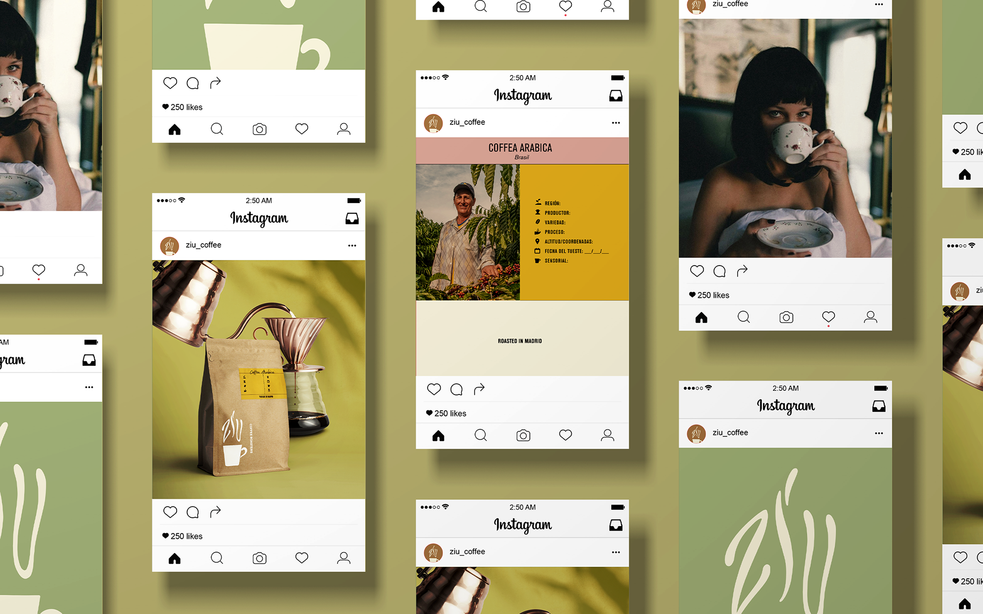
For packaging, we initially opted for the budget-friendly option of recyclable craft envelopes and stickers in the brand's colors (a brighter palette) to differentiate each type of coffee. In the future, recyclable colored packages will take the lead in the brand's packaging.
Lettering: Cauê Gottardi