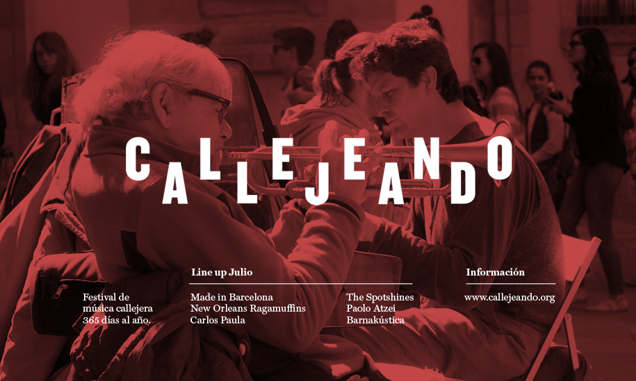
Challenge
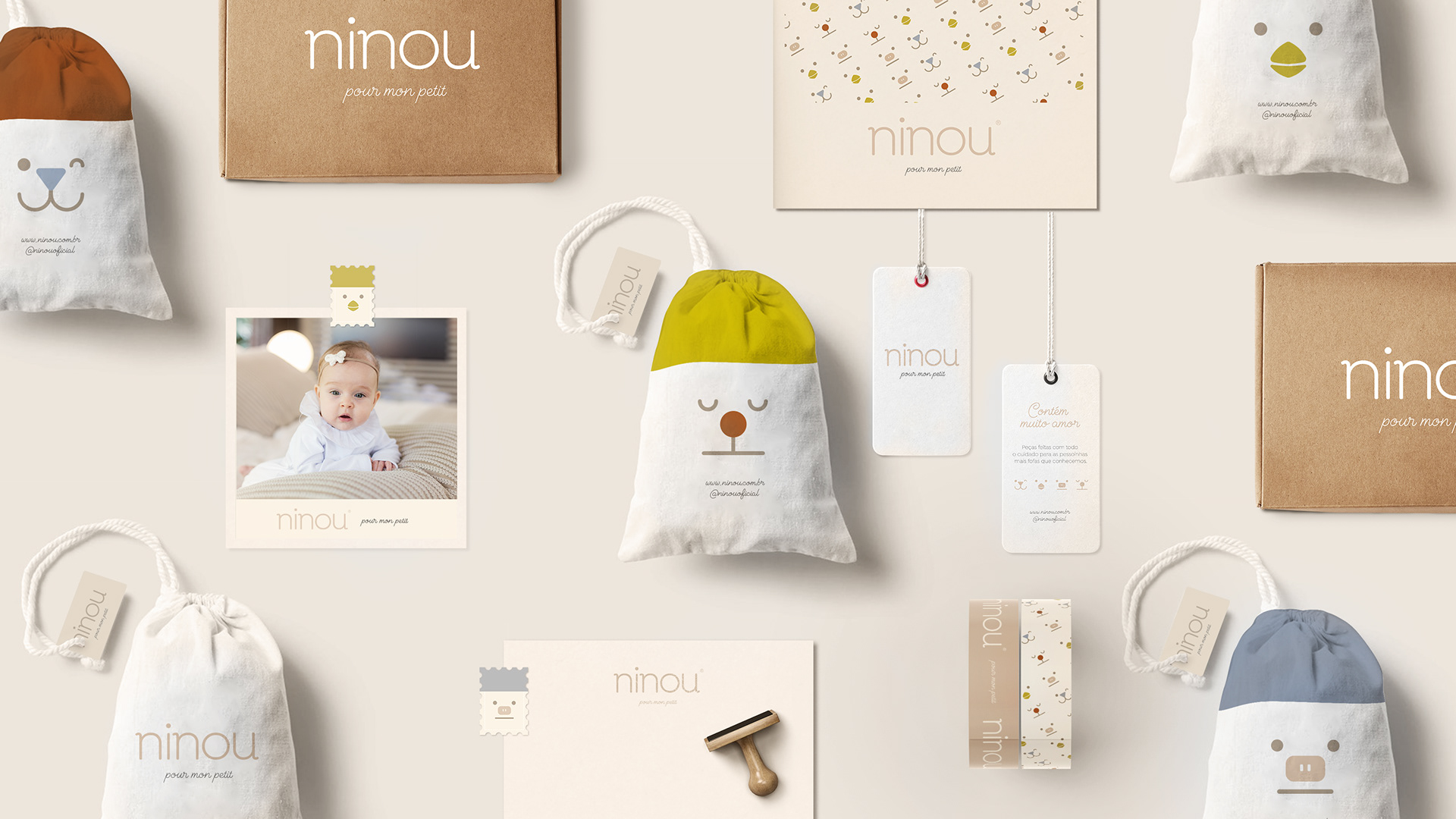
Create name and visual identity for a baby and toddler’s brand that intends to consolidate itself in the Brazilian market with unique, timeless pieces that do not follow the trends of fast fashion. Ninou makes pieces to be kept as a souvenir for life.
Solution
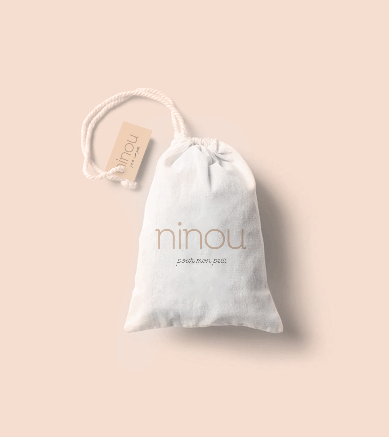
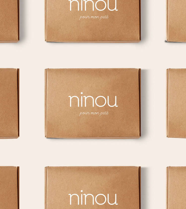
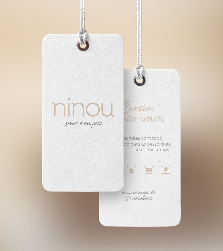
In naming, we create a solution that met both the desire for a premium name, with reference to French fashion and meaning for the brazilian market. A simple name, with French pronunciation, but that in its Brazilian version also makes sense (NinU - french nickname / NinOU - a nap).
For the tagline, we also use a French sentence, but easy to understand: Pour mon petit (for my little one), which already has in its signature the affection and care present in all process of design.
For the tagline, we also use a French sentence, but easy to understand: Pour mon petit (for my little one), which already has in its signature the affection and care present in all process of design.
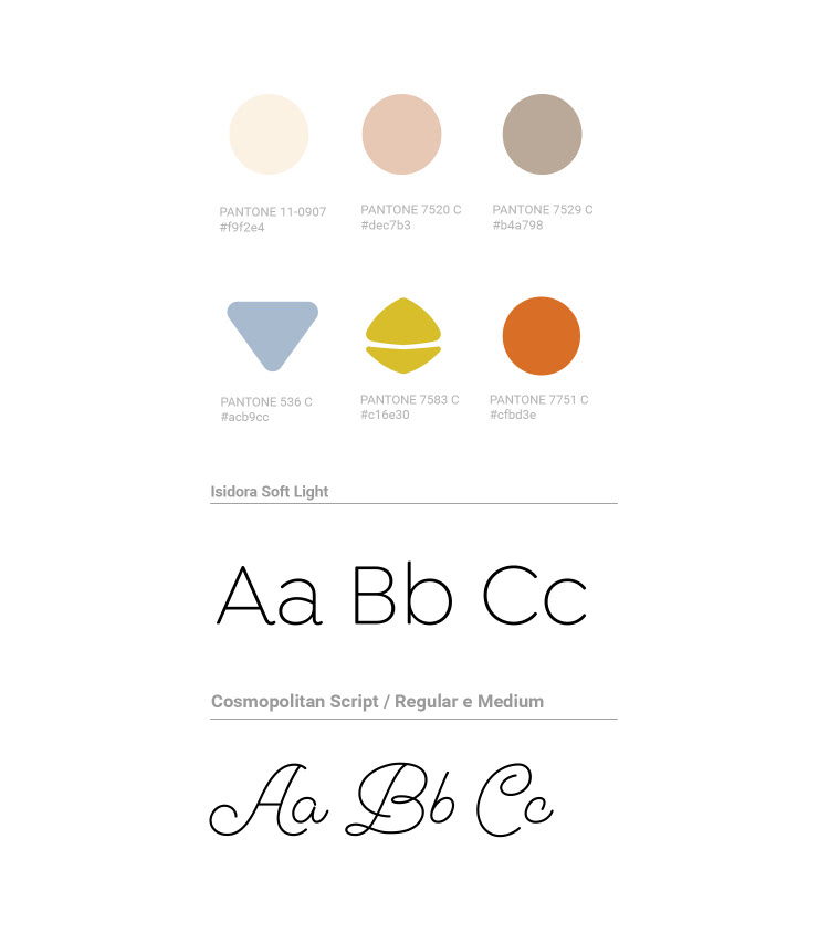
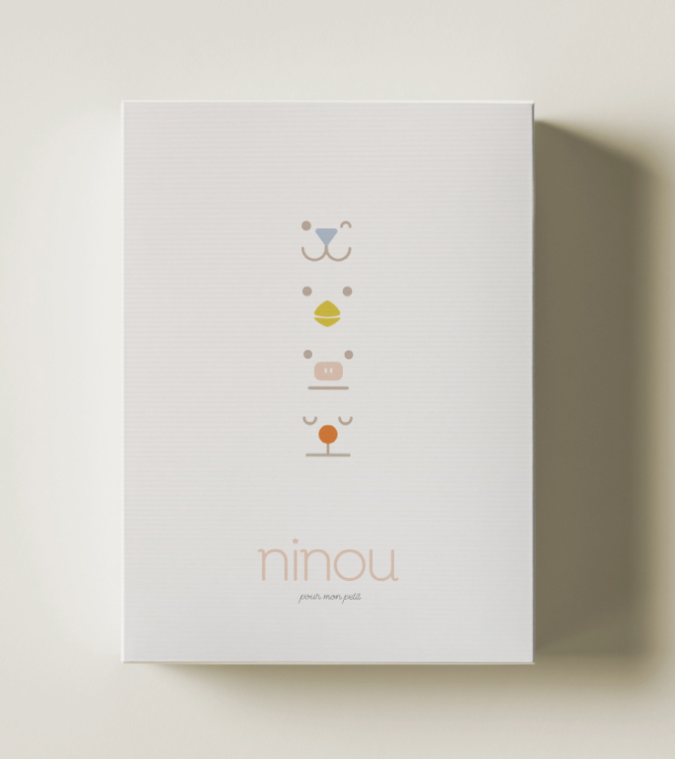
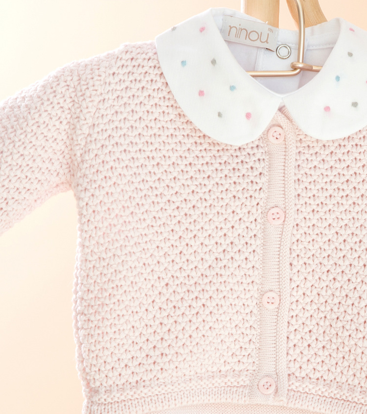
In visual identity, we opted for the construction of a modern logo, with clean typology in lower case. The parallelism between the Ns and the U was reinforced by the font’s choice.
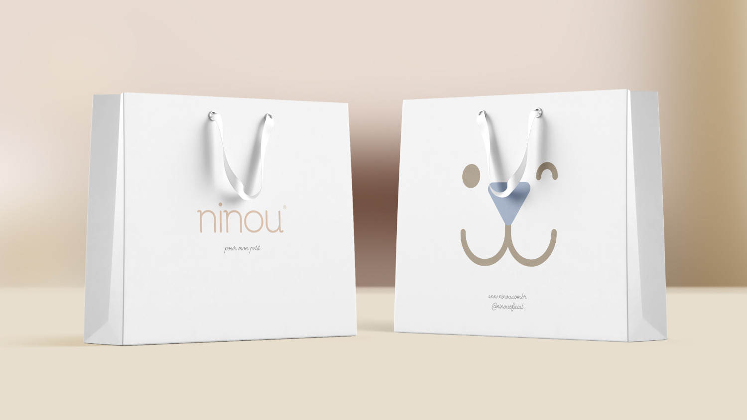
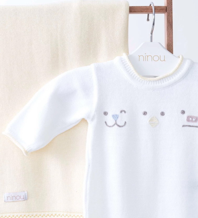
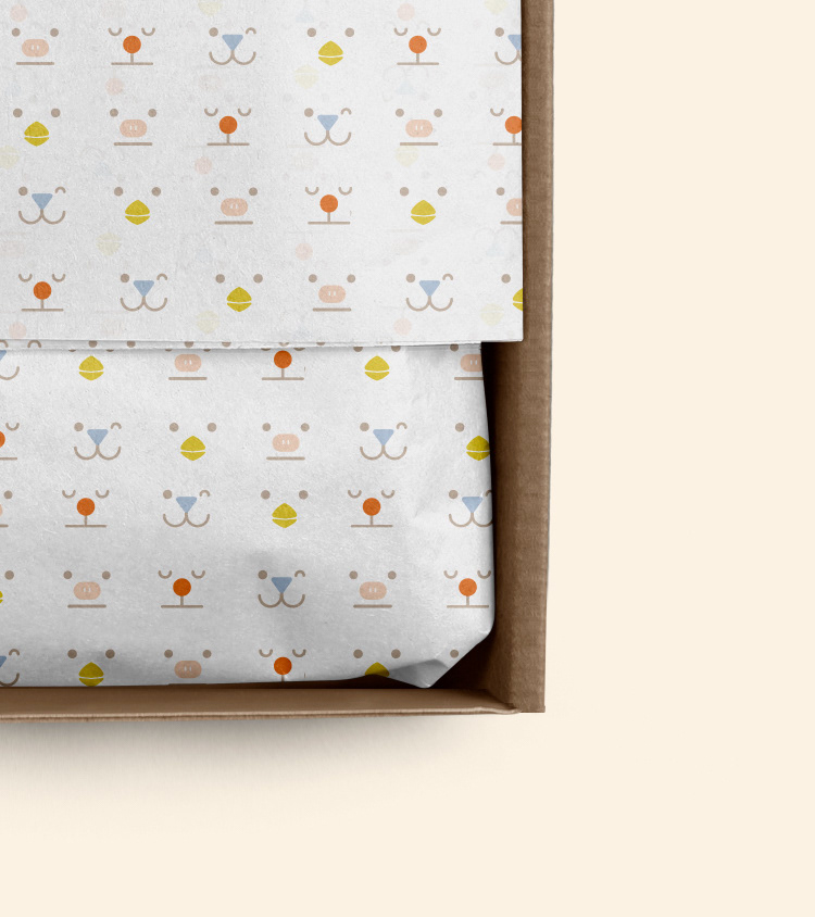
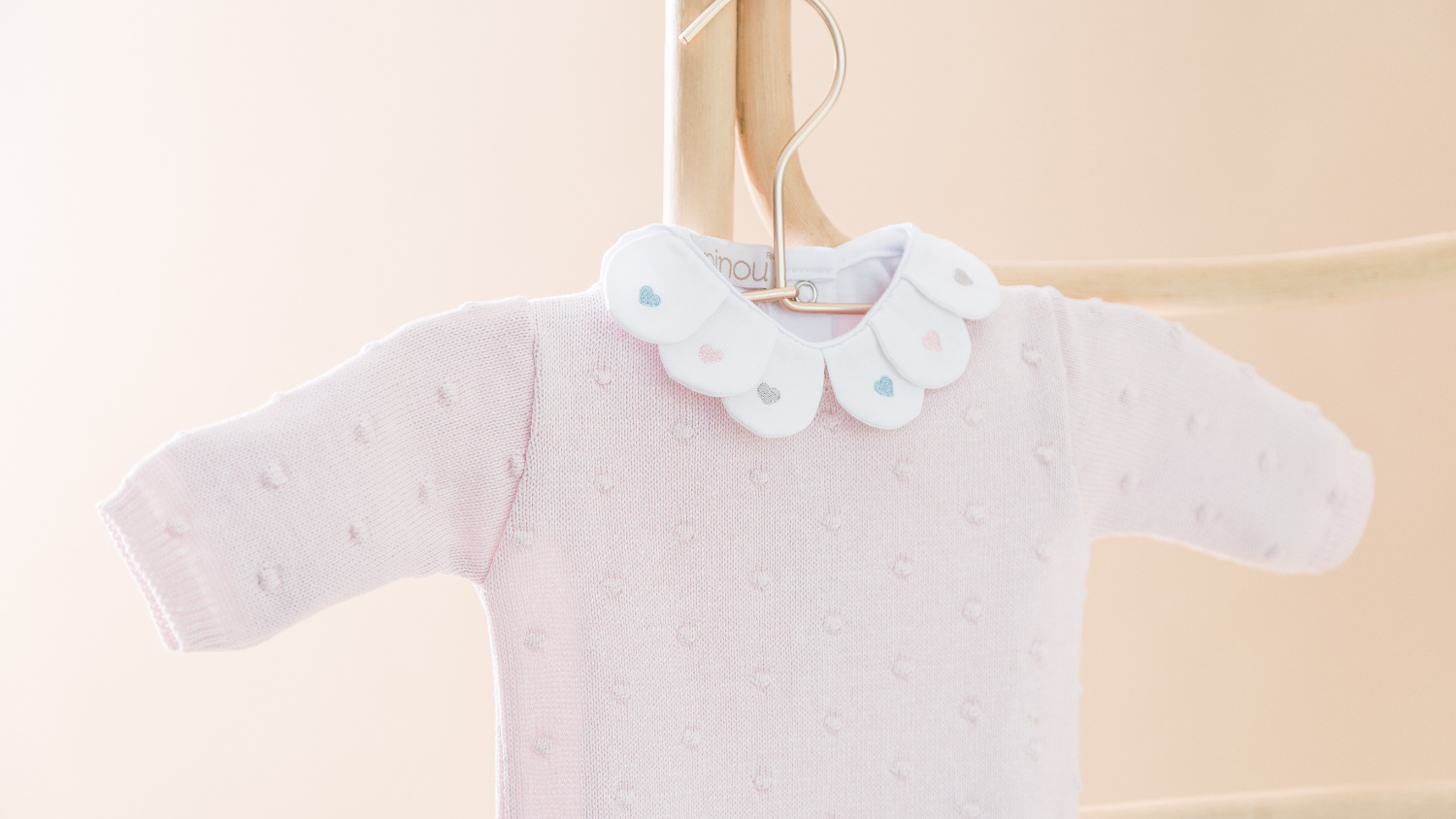
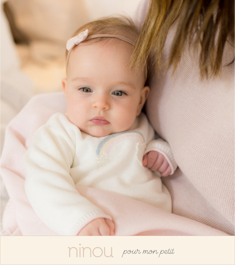
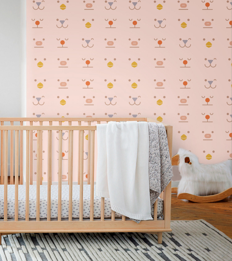
As an identity support, we developed a classic palette (in grays, pinks and subtones of primary colors) and also developed four muzzles with playful expressions that support the identity, appearing alone, with color aid, in groups of 4 and in patterns. These minimalist characters reinforce their identity and, at the same time, bring the children's universe closer, multiplying their presence in packaging as well as in the communication universe and even marking their presence in pieces of clothing, to reinforce Ninou's presence in the minds of their consumers.
As an identity support, we developed a classic palette (in grays, pinks and subtones of primary colors) and also developed four muzzles with playful expressions that support the identity, appearing alone, with color aid, in groups of 4 and in patterns. These minimalist characters reinforce their identity and, at the same time, bring the children's universe closer, multiplying their presence in packaging as well as in the communication universe and even marking their presence in pieces of clothing, to reinforce Ninou's presence in the minds of their consumers.
Graphic Production: Thiago Monaco
Client: Ninou . Industry: Fashion . Discipline: Naming, Identity, Digital