A brand that is a spotlight beam on those who produce content.
To create the brand for Farol Agency, we chose to design a visual identity based on the beam of light. And here both beams: that that comes out of Farol and guides content producers in their careers, as well as a spotlight, which highlights these producers from above as the focus of the scene in a theater or on TV.
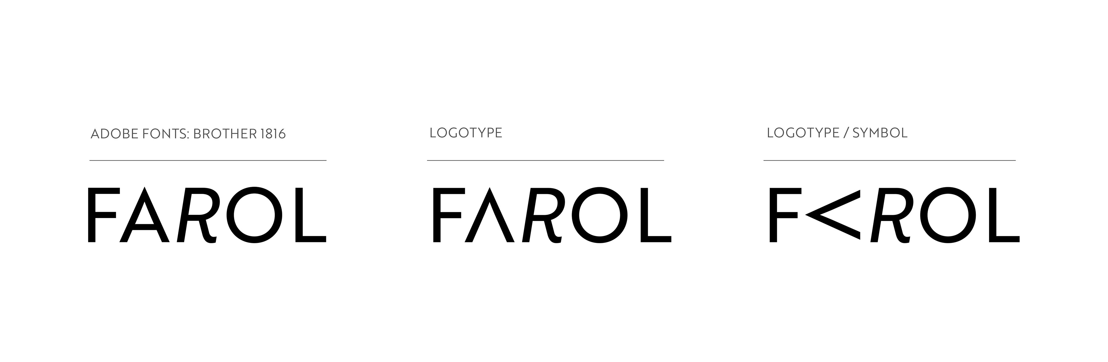
From a rotation of the A of the word Farol (lighthouse in English), we create the triangular shape that represents the spotlight beam. The letter A then became mobile in the brand's identity, ‘pointing’ the light in different directions. From the evolution of the light beams to a simple geometric shape, we assumed the triangle as our identity basic form, determining that the applications always happen in at least 3 colors of the palette, creating this way a younger and more dynamic identity.
To complete the identity, we design some visual ‘annoyance’ by presenting the R for Farol in italic. This choice gave movement to the brand, but also generated the visual discomfort that we would like to have to show how unique Farol's Agency proposal is.
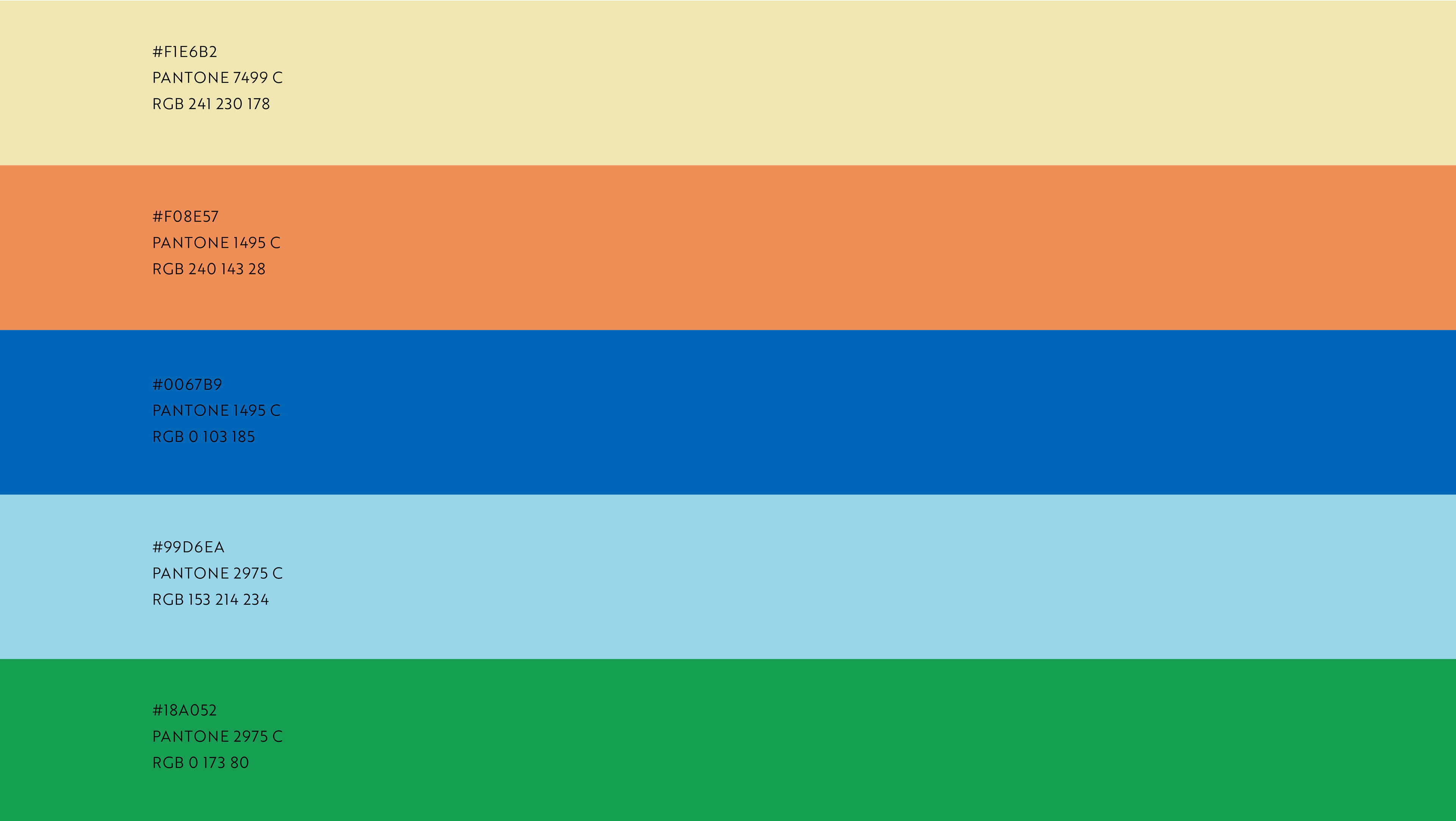
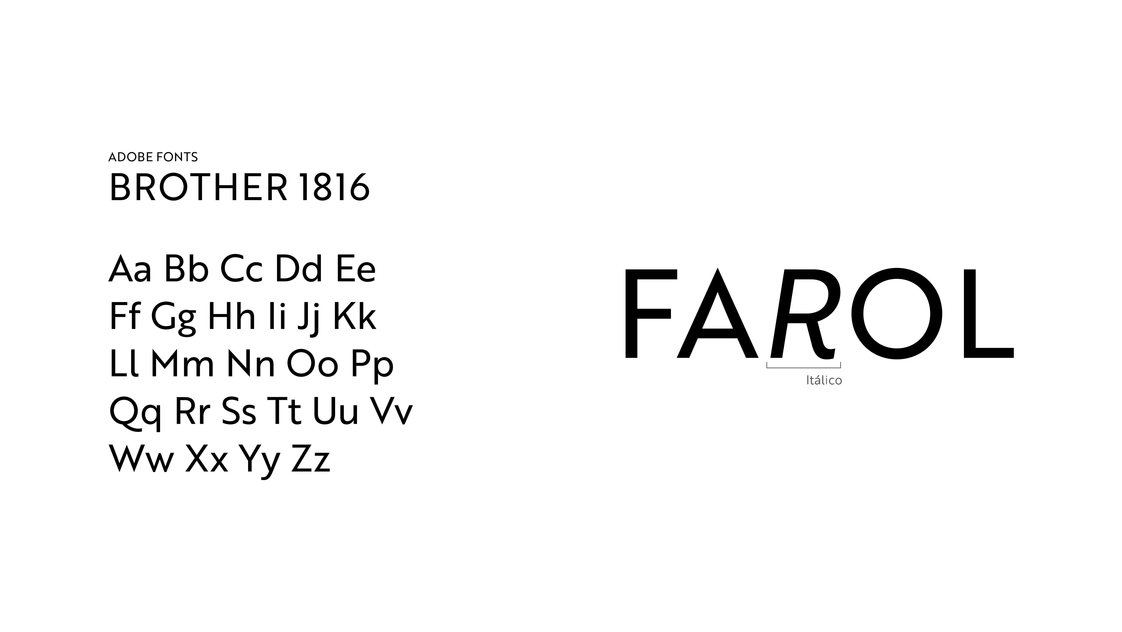
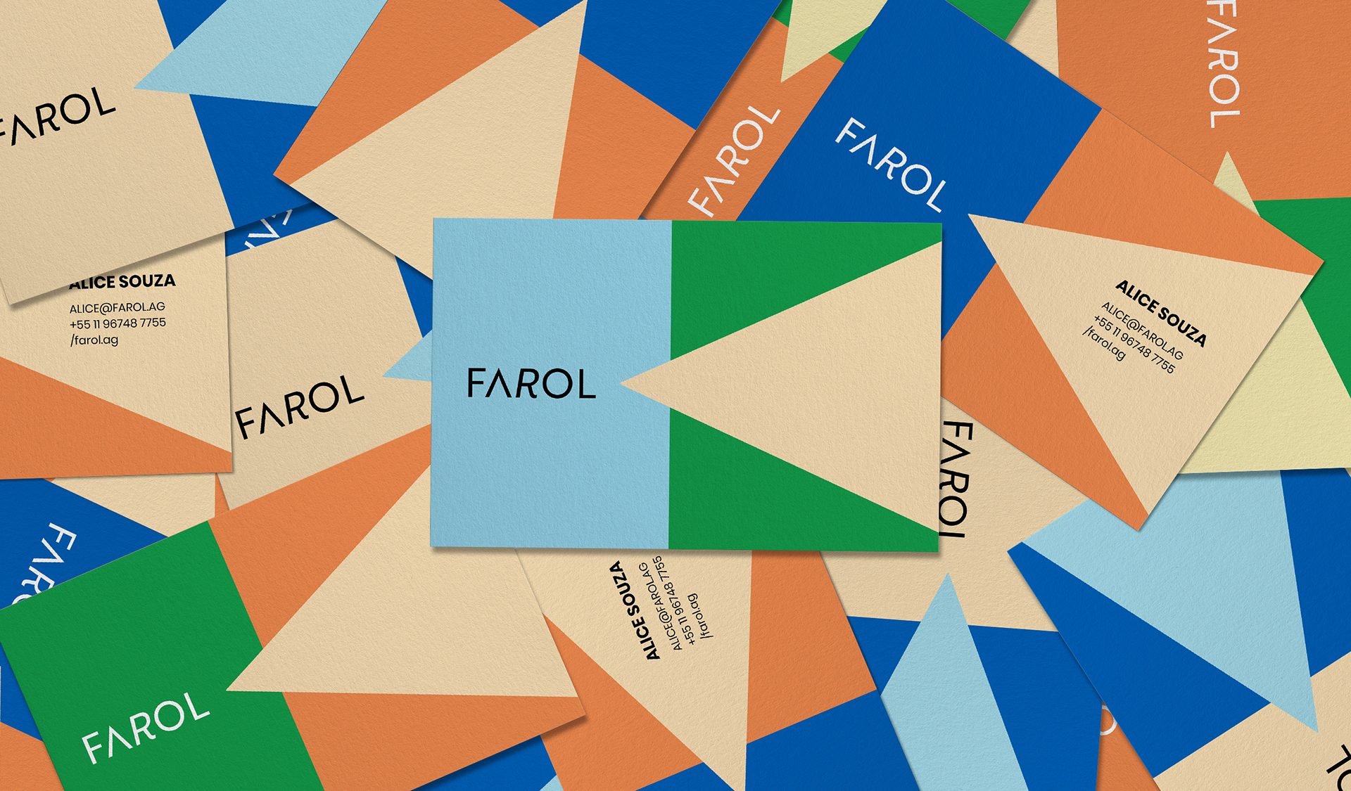
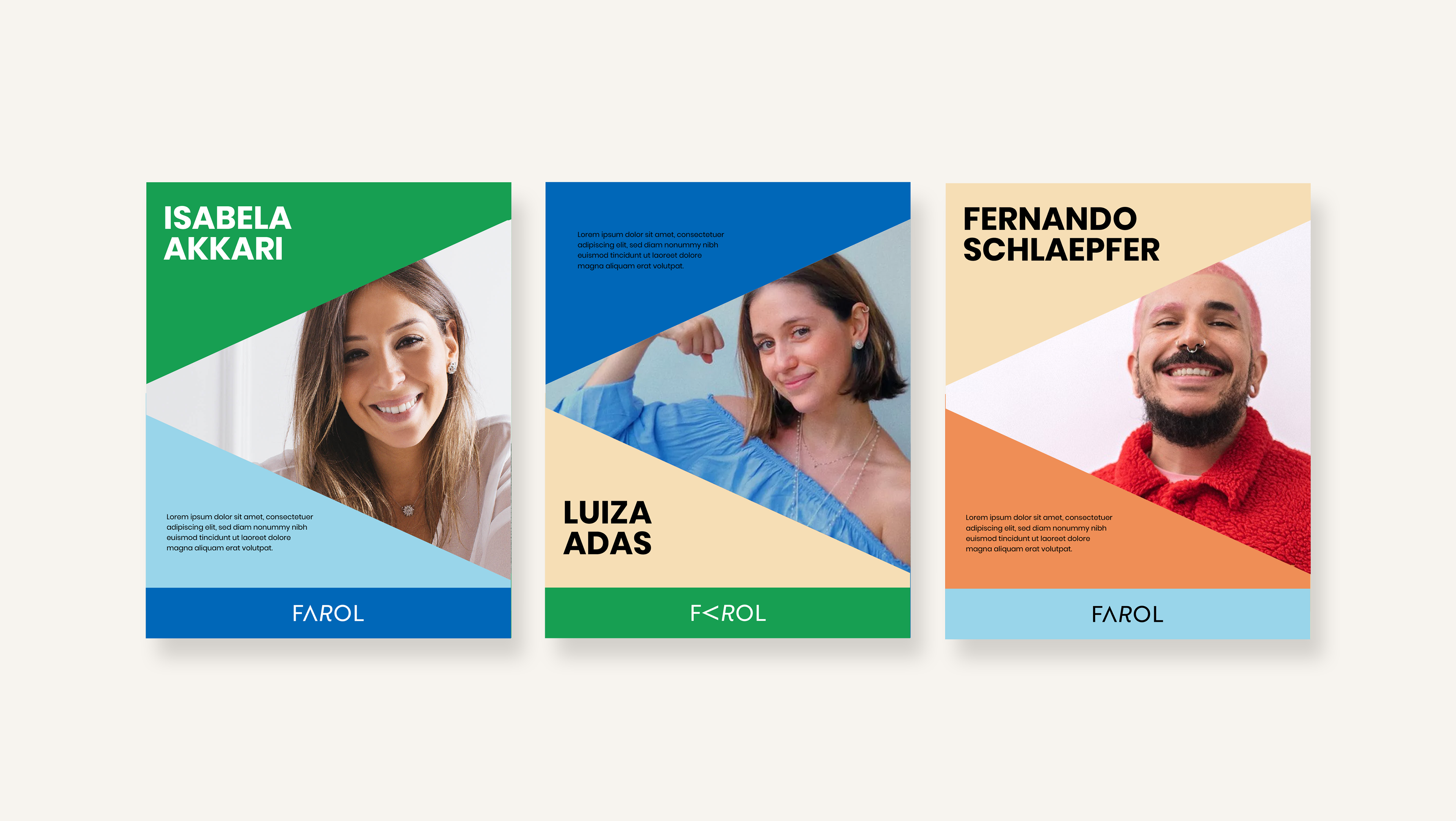
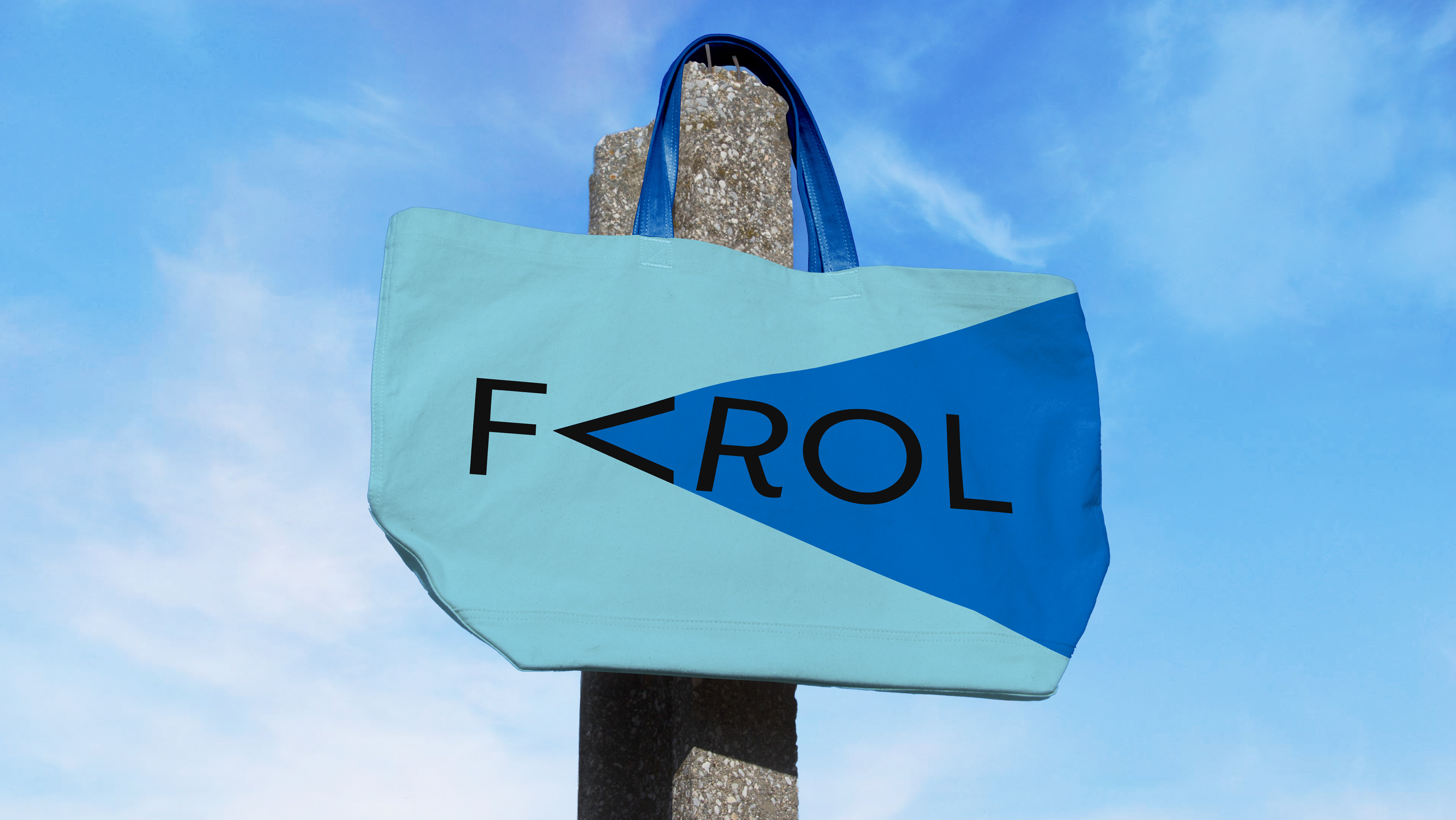
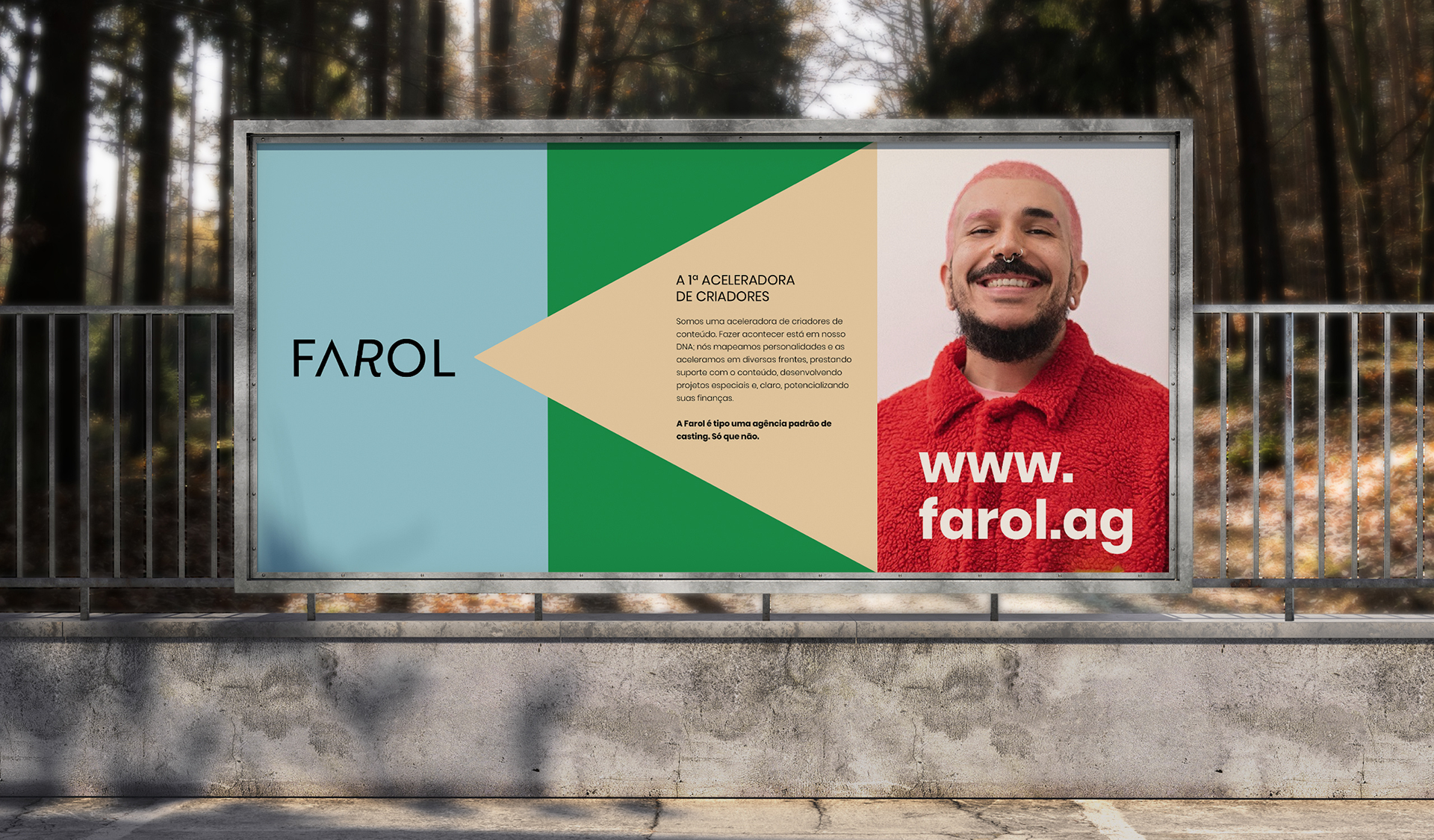
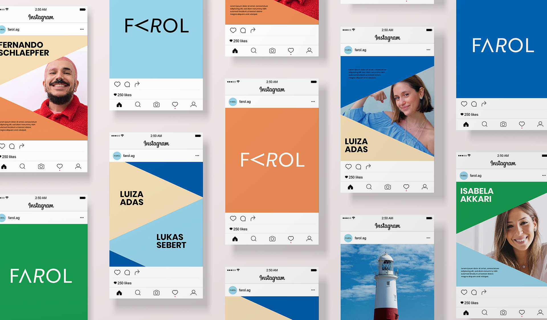
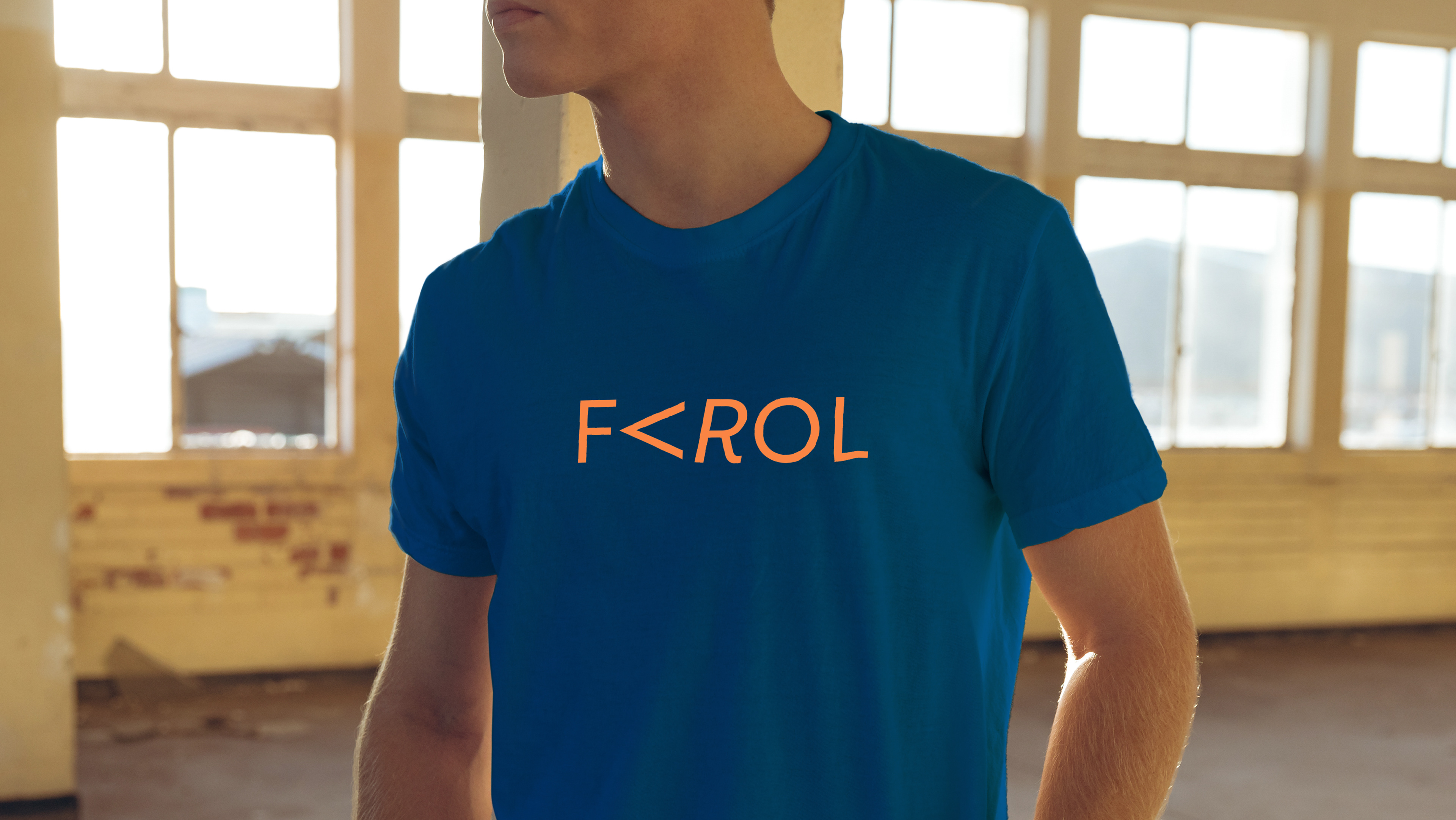
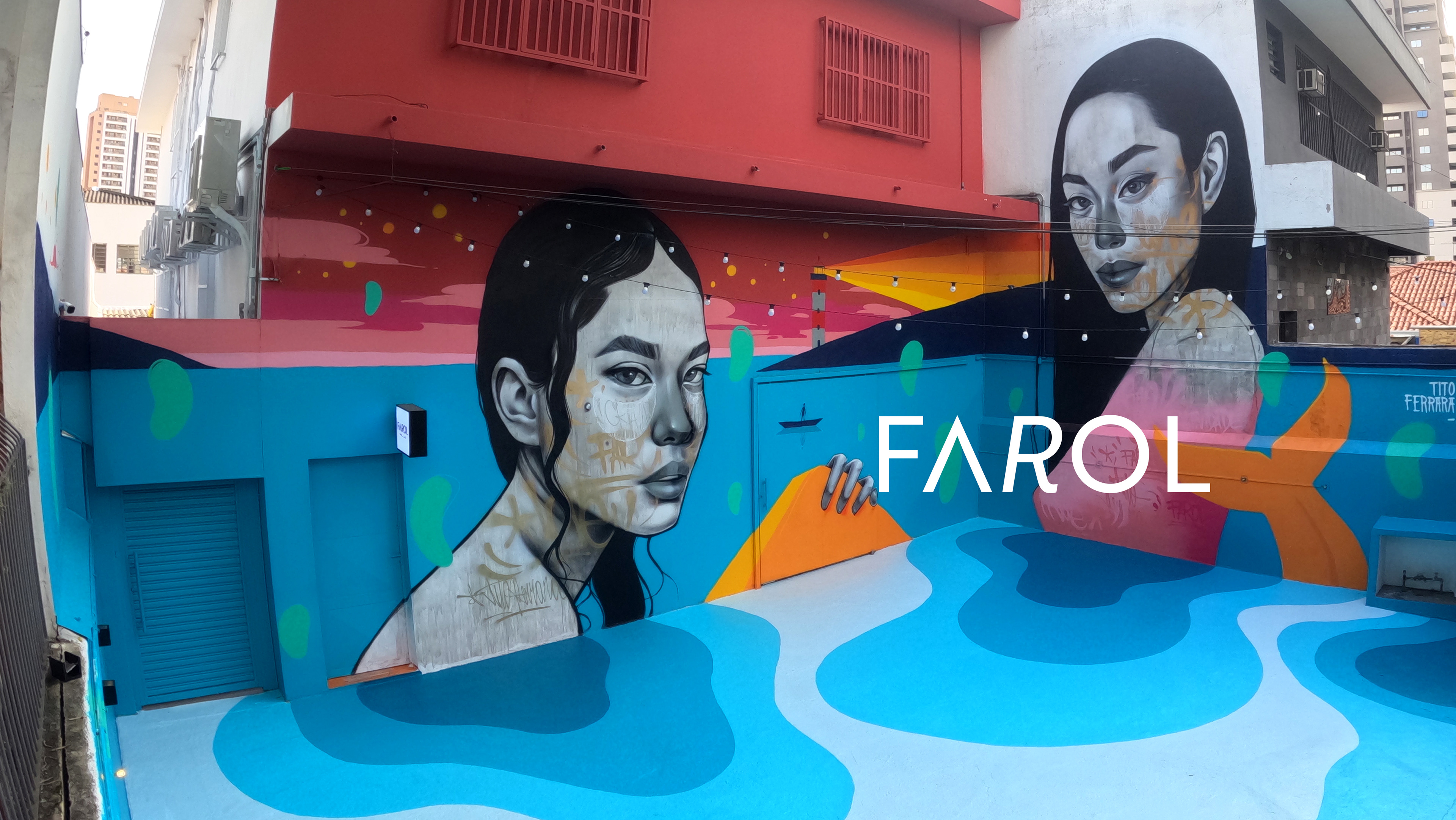
Illustration: Tito Ferrara