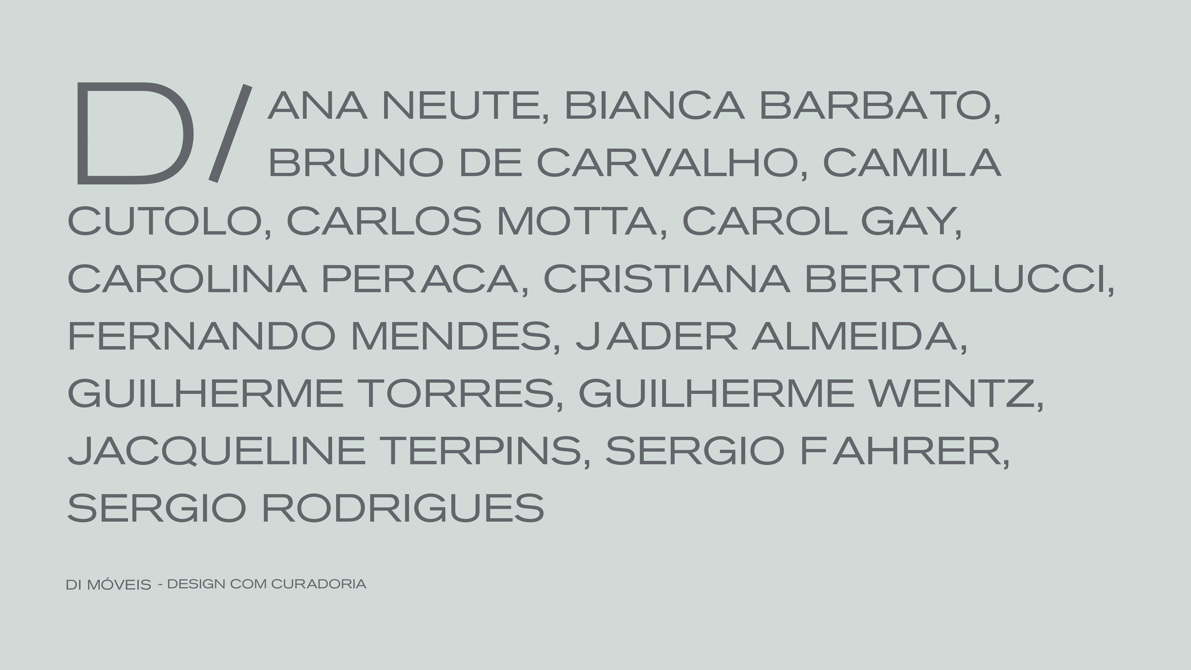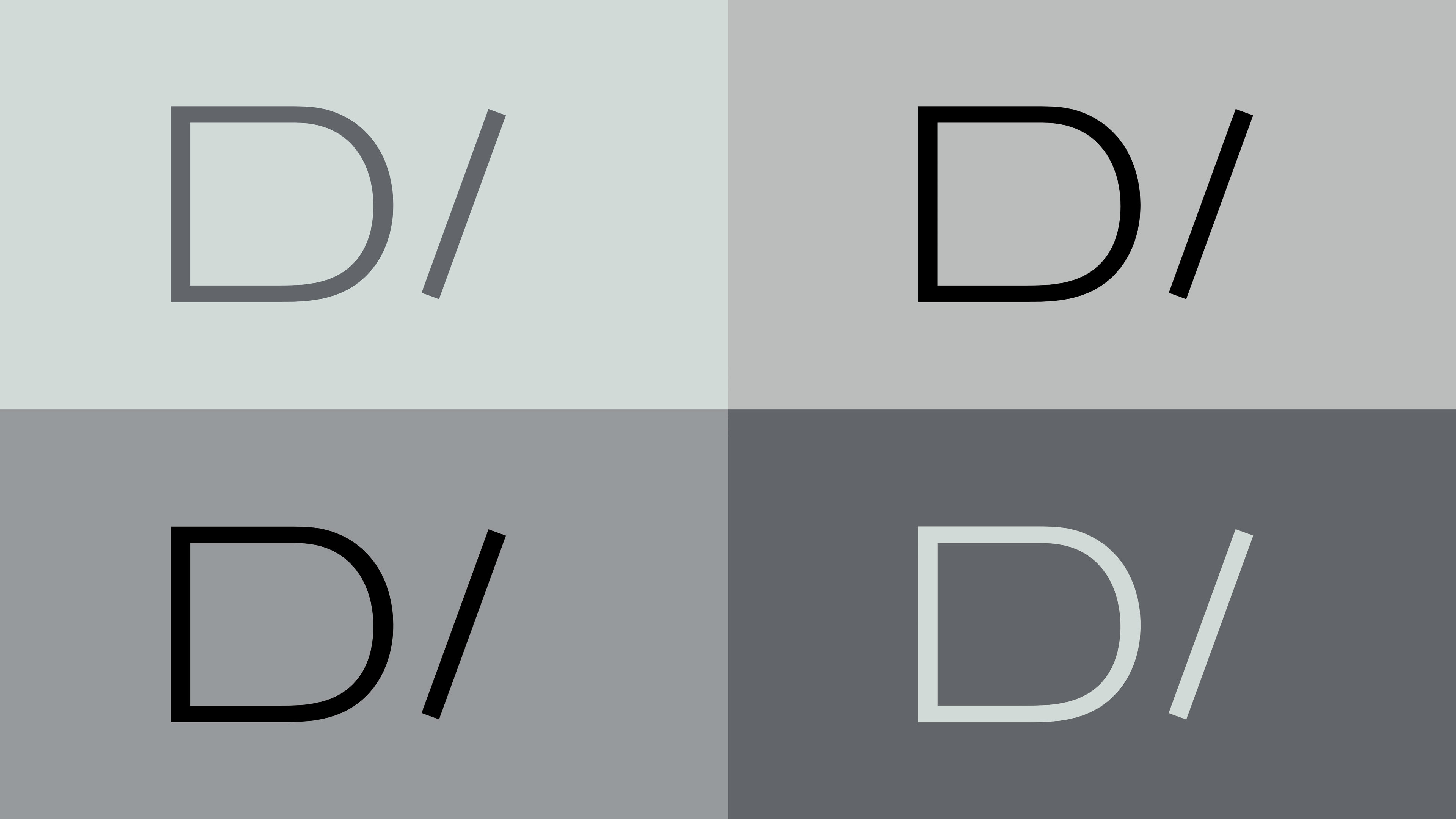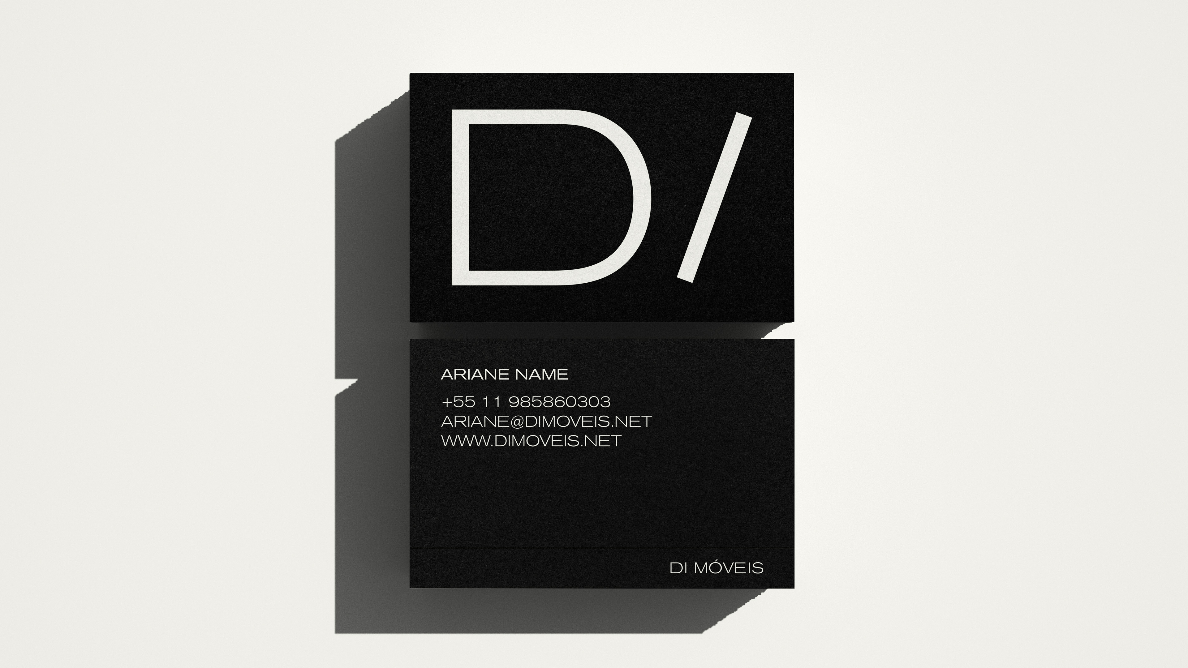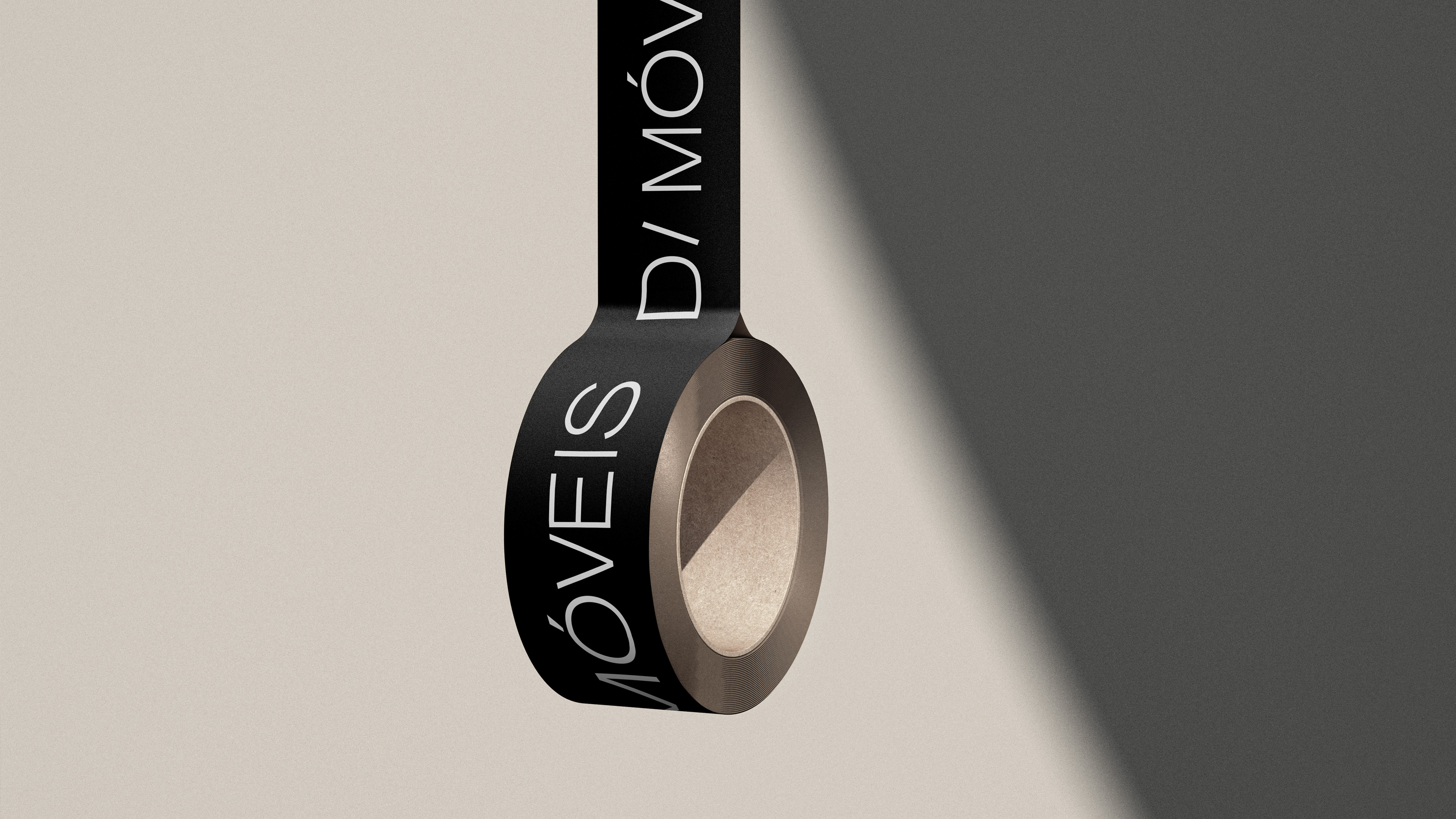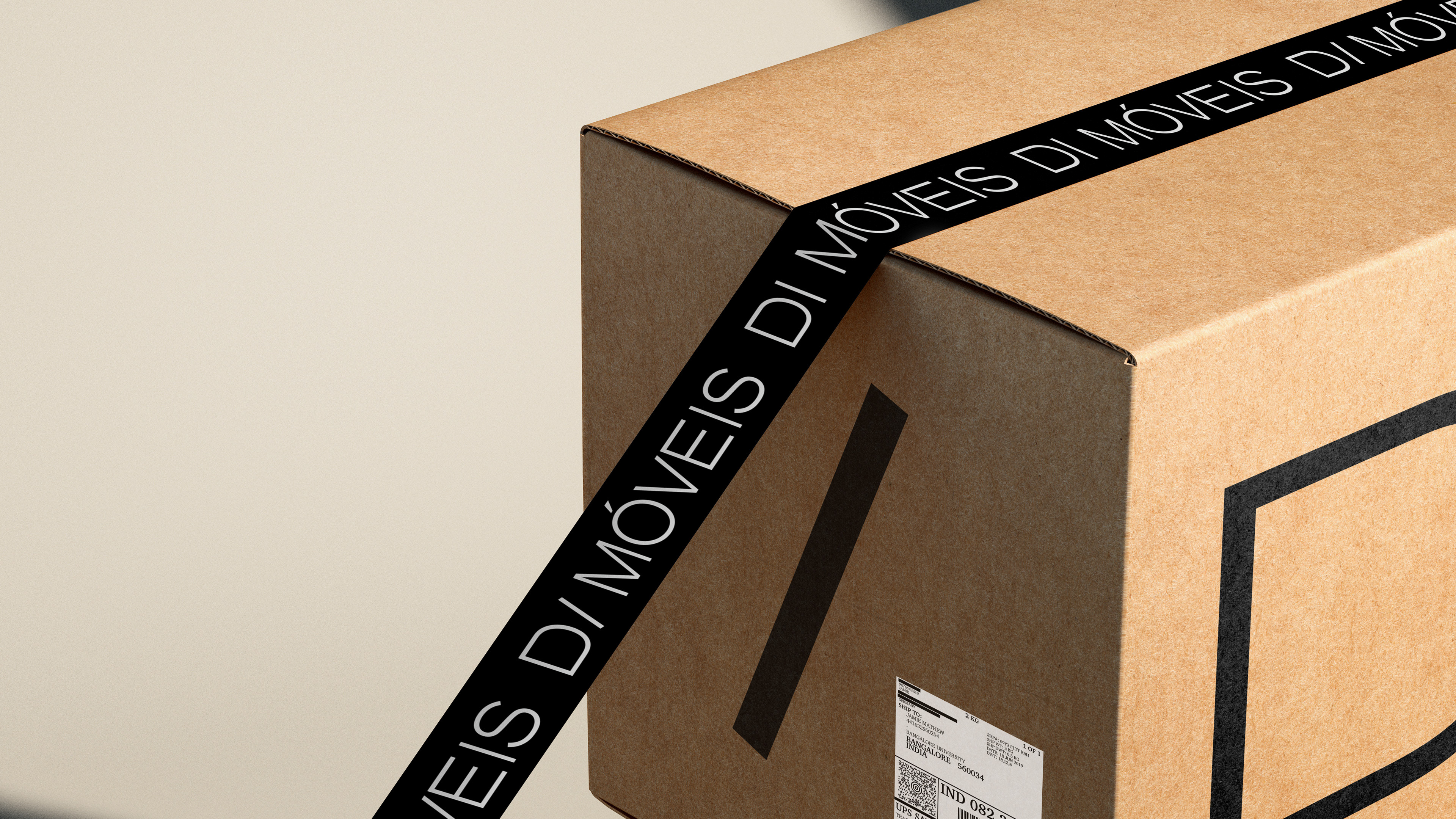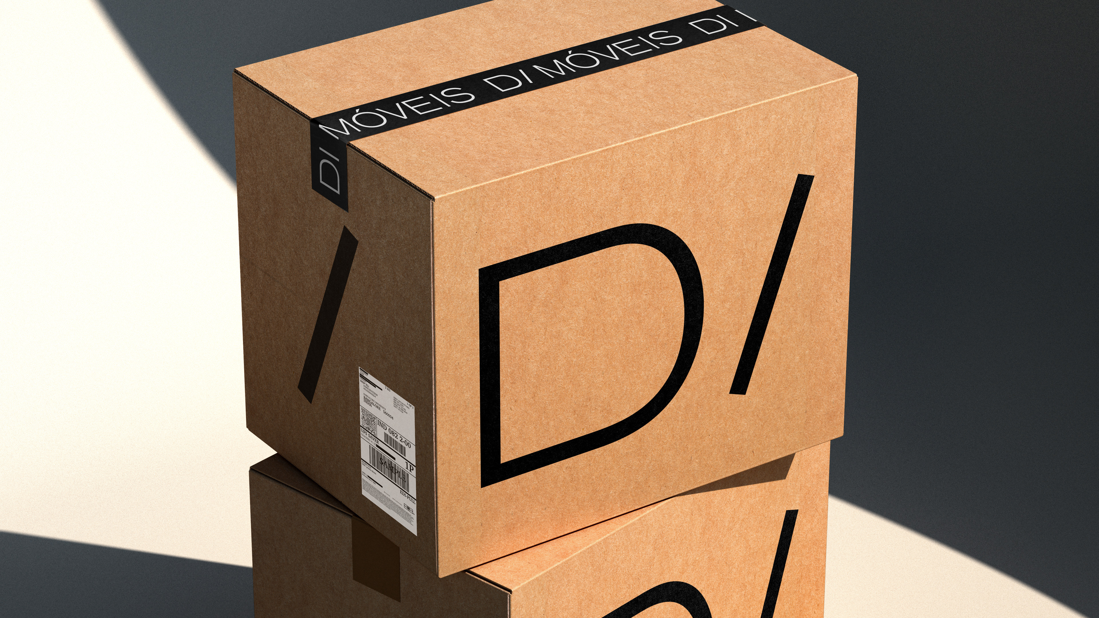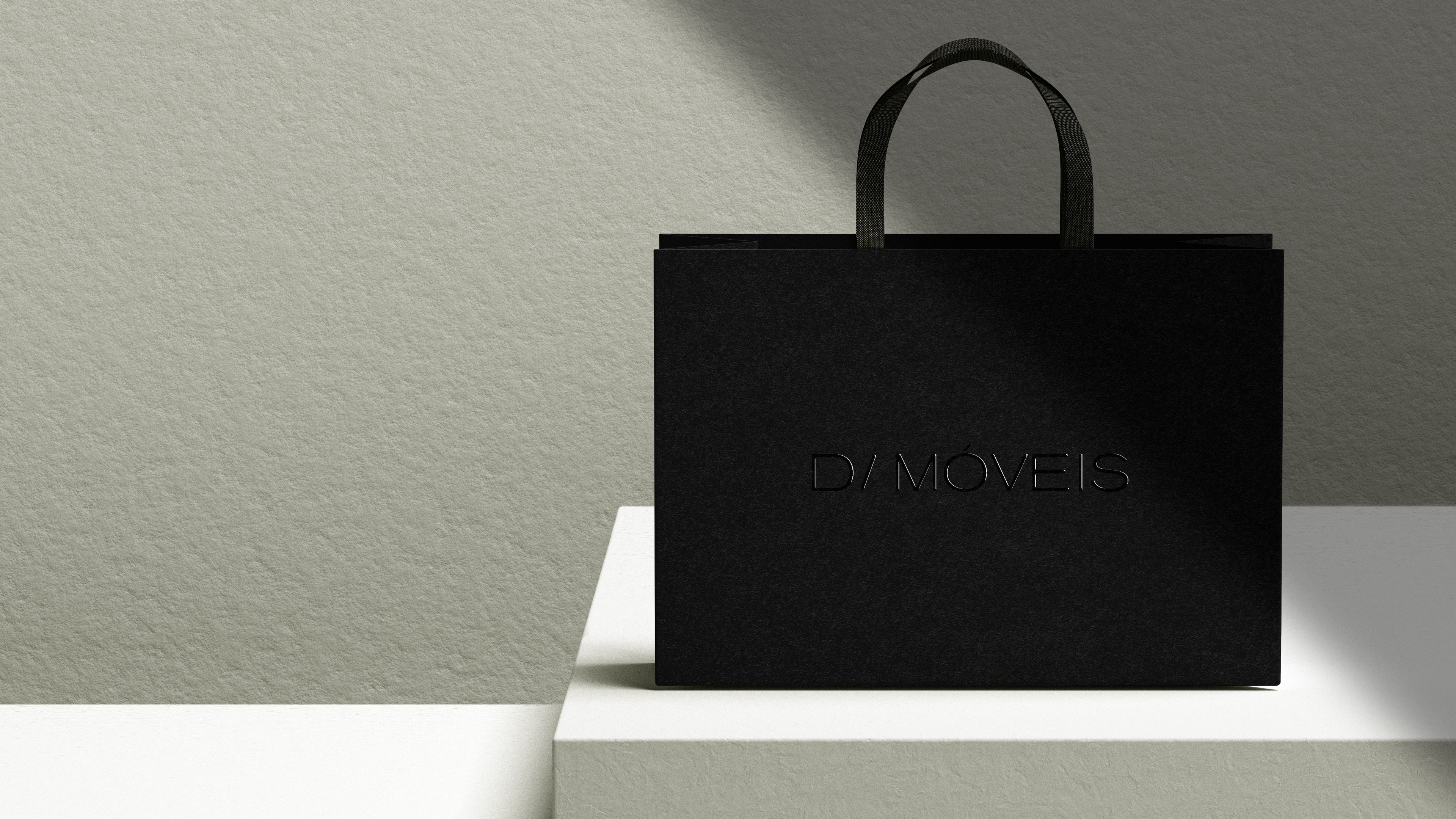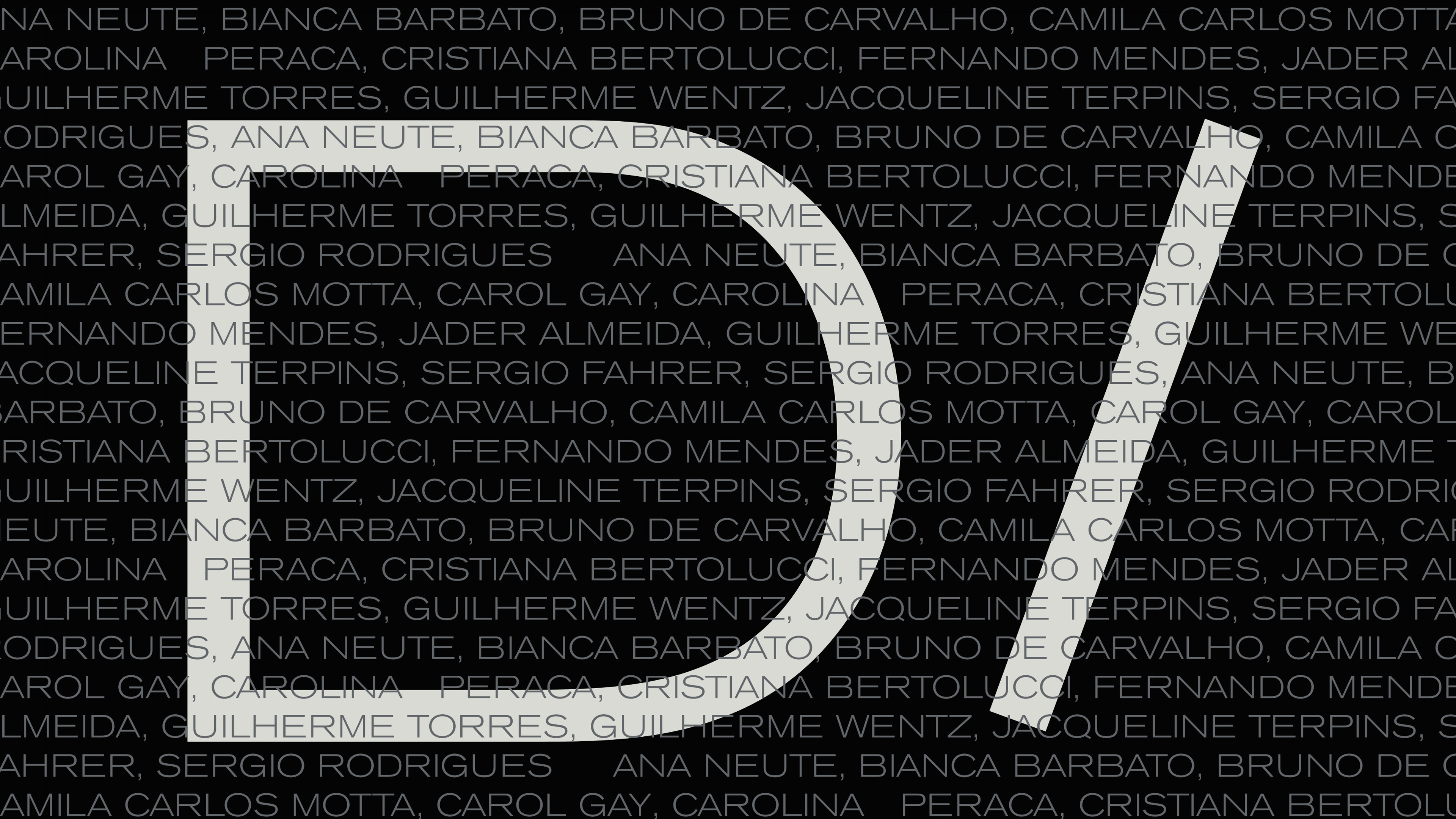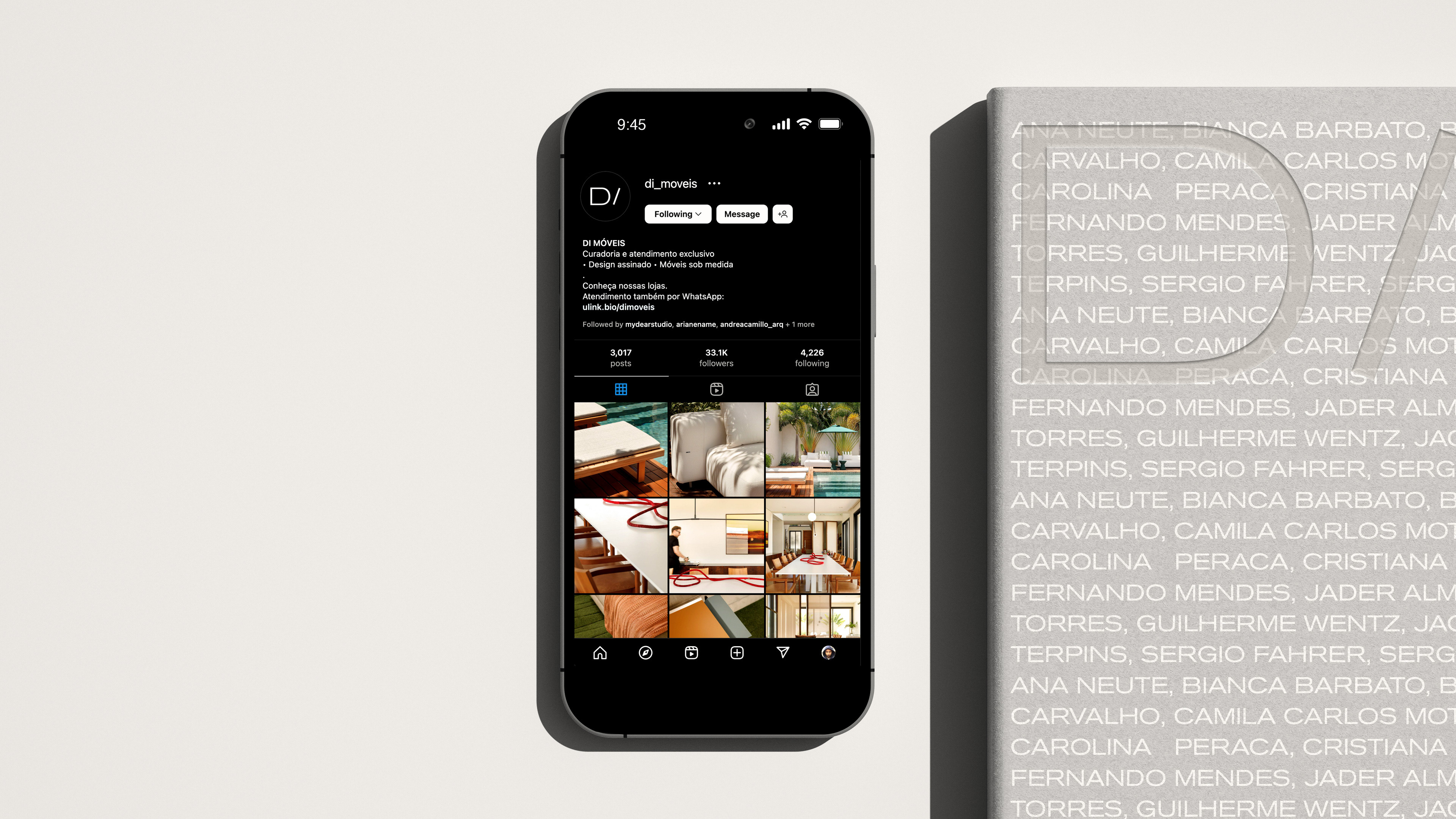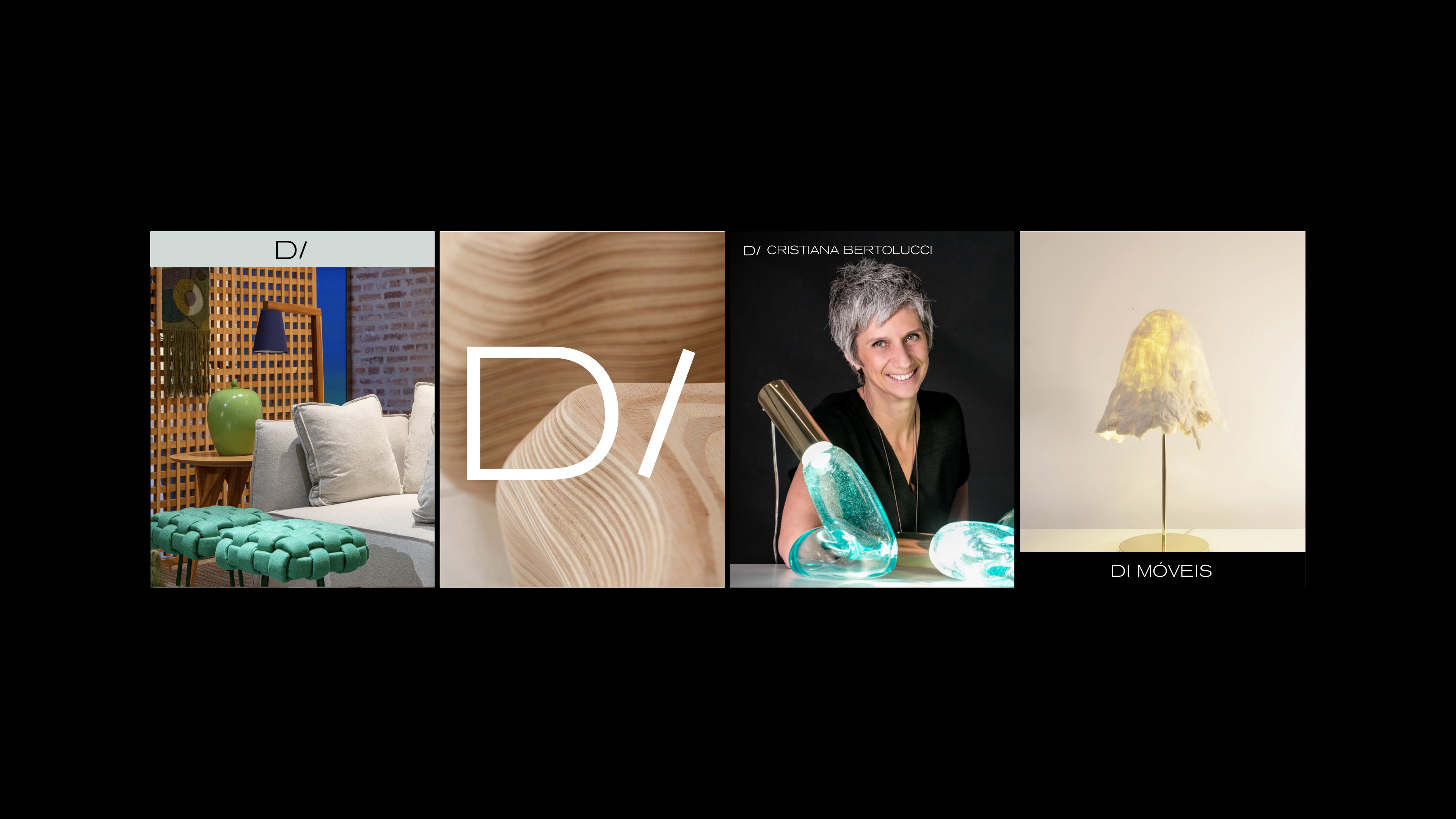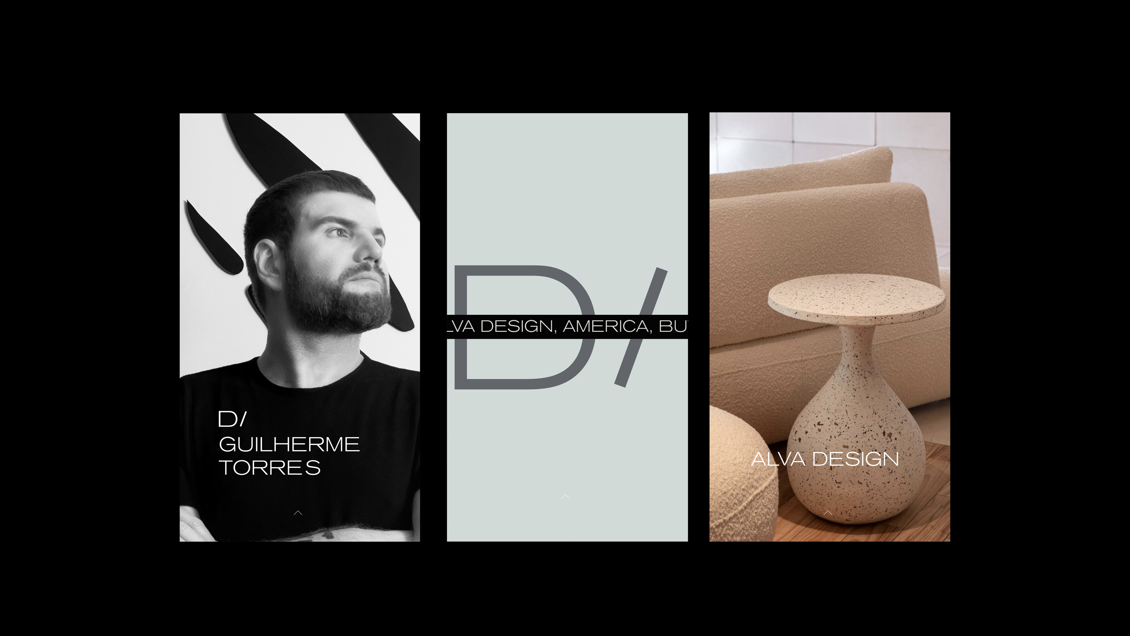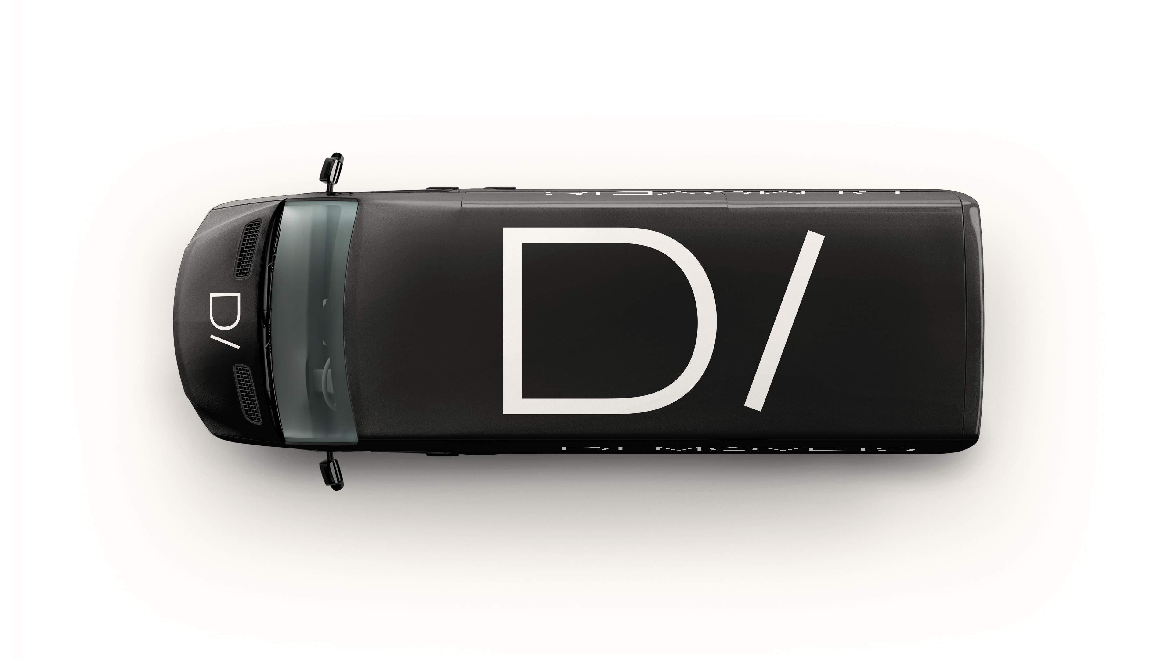
Di Móveis, a traditional store that curates the best in Brazilian furniture design, grew along with the first version of its logo. However, with the specialization for a more premium audience and the business’ expansion, a new visual identity became urgent and necessary. In this rebranding, the name Di inspired the creation of a logo that indicates the idea of a directory, focusing on the relationship with the designers’ brands and other creative boutiques. The identity in black, and white, summed with tones of gray, reinforces the idea of a neutral area, in which what shines is the prime design presented in the physical and digital spaces of the brand.