Challenge
Create a visual identity for the Brazilian brand Max Vitta, bringing the essence of the product to the communication.
Solution
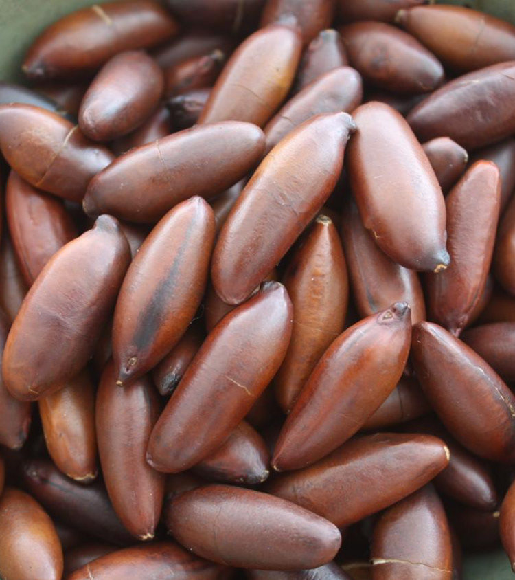
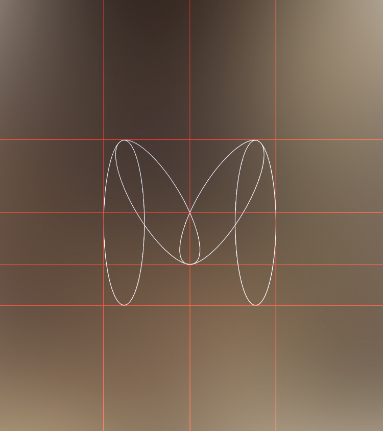
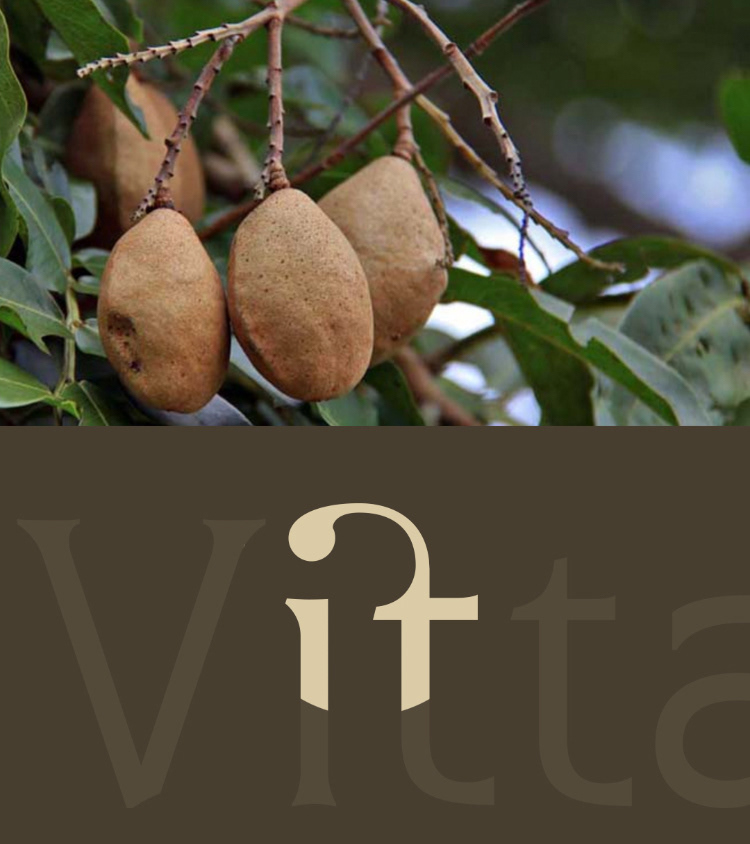
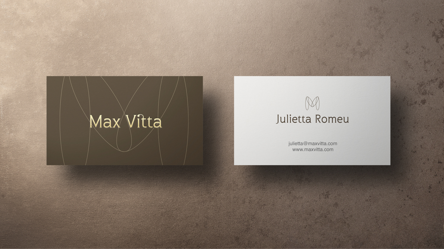
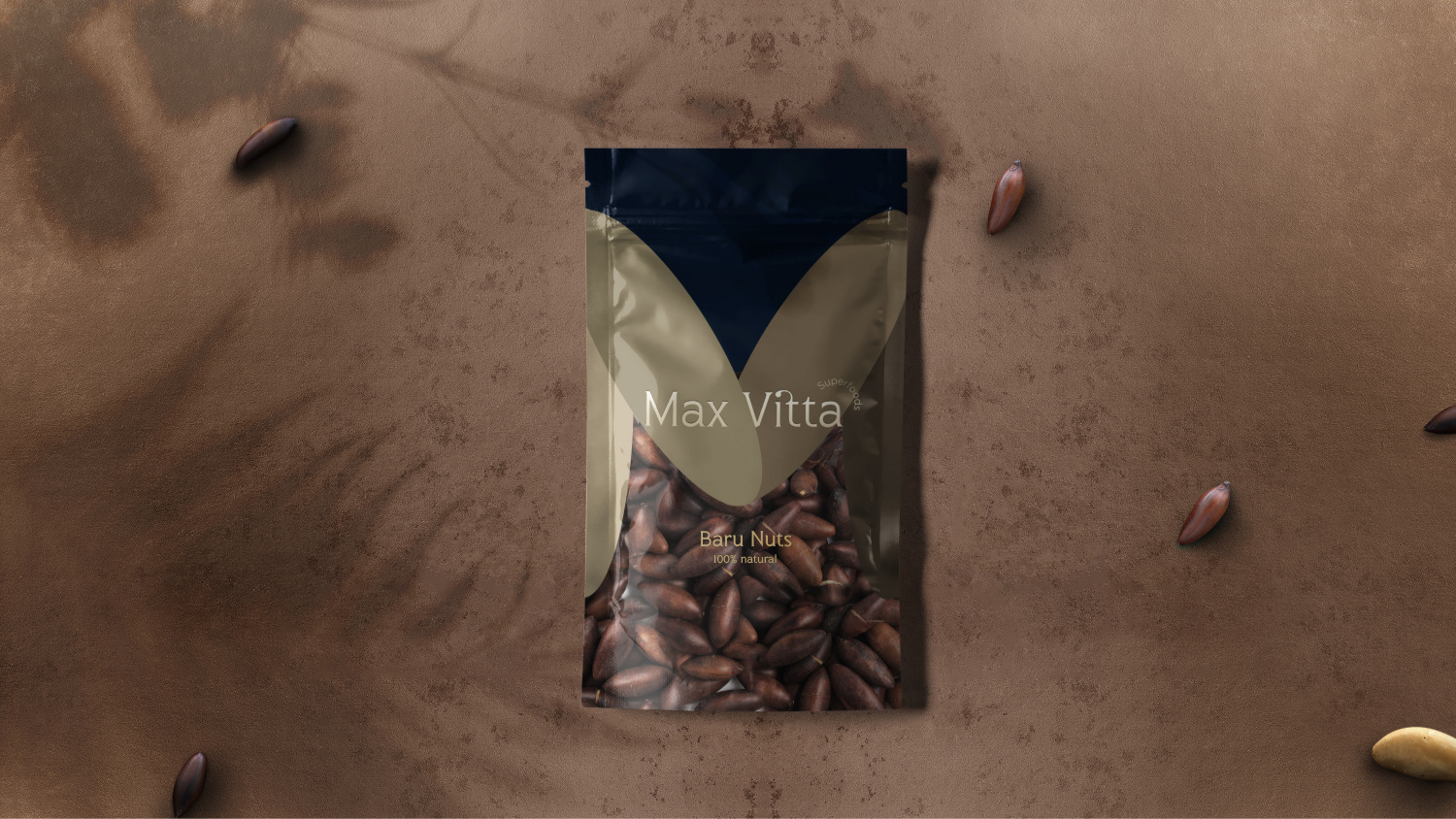
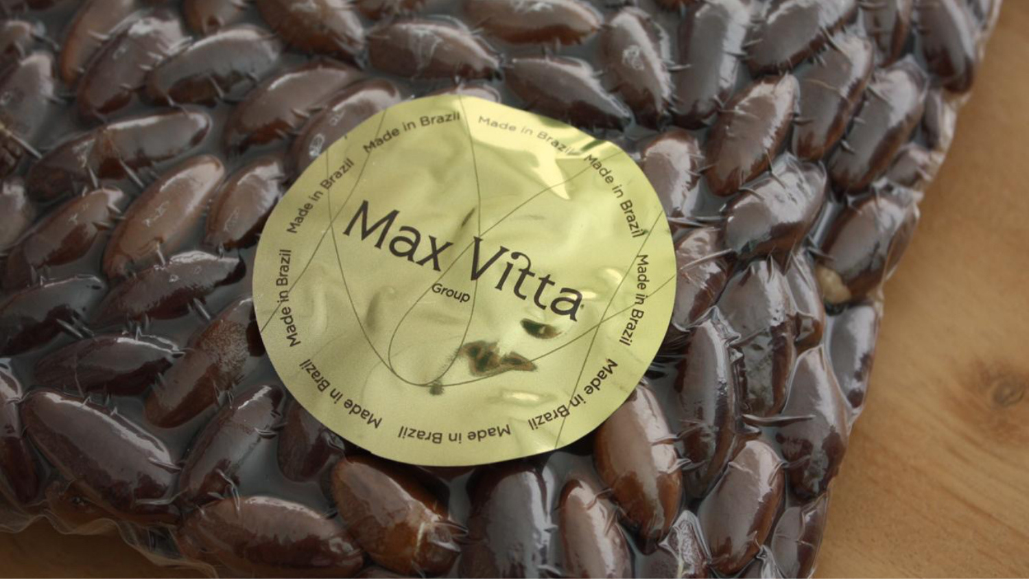
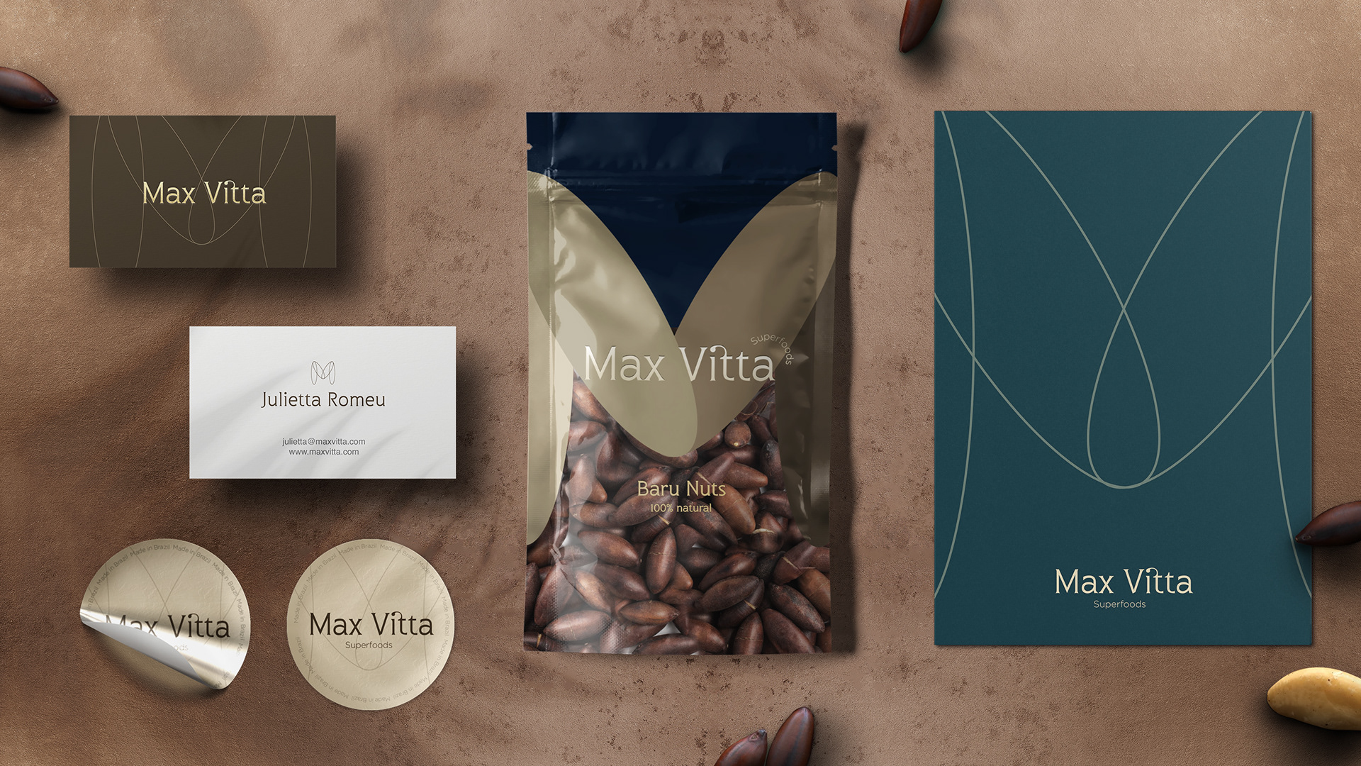
We started the creation of the logo from organic forms, referring directly to the nuts, bringing the core elements of Max Vitta to the foreground.
The oval shapes helped us build a 4-element, 4-tone pillar, bringing the idea of each family member (it’s a family business) into the logo
The individuality of the partners is preserved, in different organic tones, but with strong interconnections that form and strengthen the Max Vitta brand.
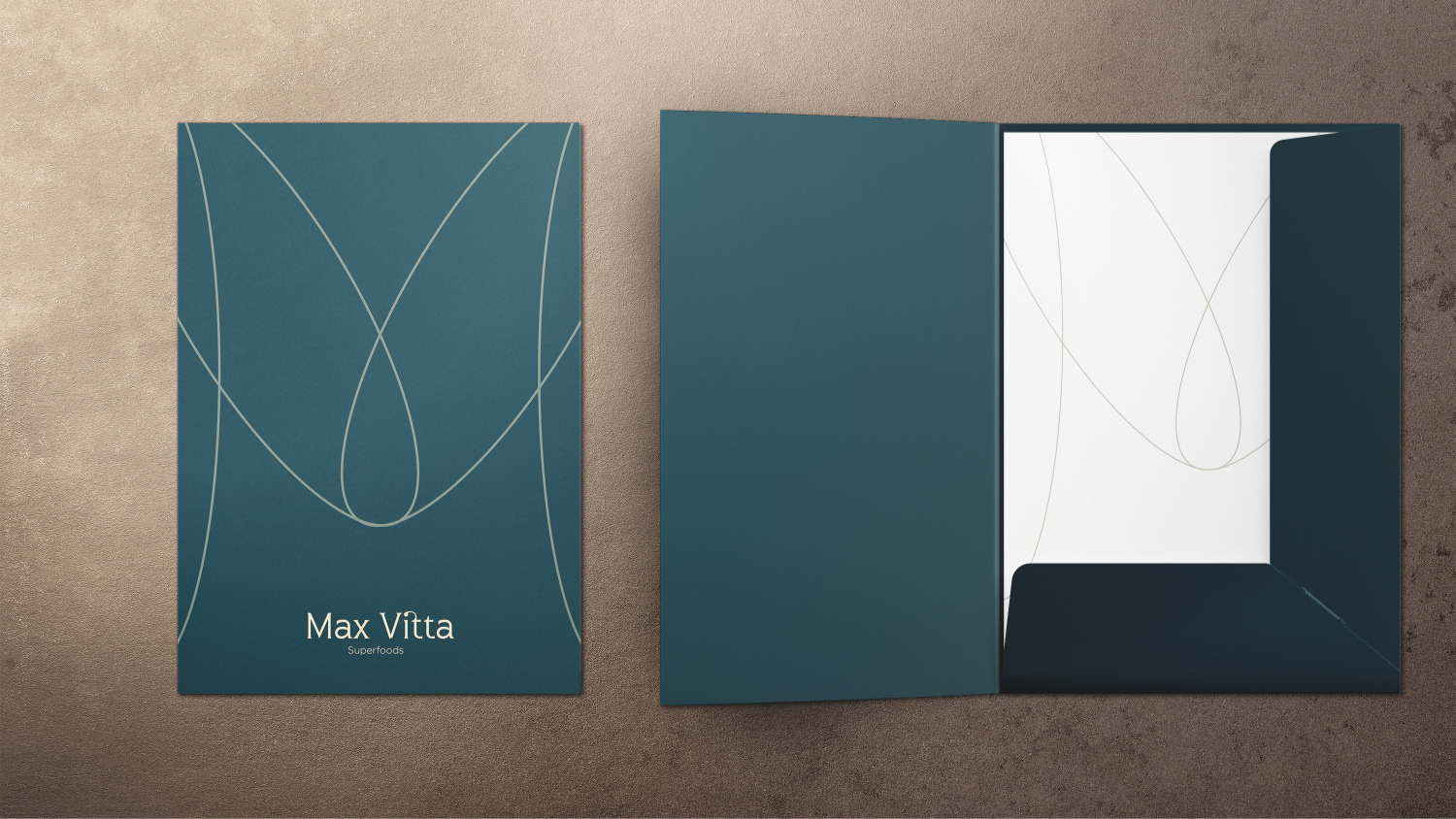
In type, the font is simple, easy to read and elegant, a brand made to last. The decorative application on the first T brings a little more elegance, but also refers directly to the branches and nuts, especially that of Baru, broadening the organic look and reinforcing the message.
The oval shapes helped us build a 4-element, 4-tone pillar, bringing the idea of each family member (it’s a family business) into the logo
The individuality of the partners is preserved, in different organic tones, but with strong interconnections that form and strengthen the Max Vitta brand.
In type, the font is simple, easy to read and elegant, a brand made to last. The decorative application on the first T brings a little more elegance, but also refers directly to the branches and nuts, especially that of Baru, broadening the organic look and reinforcing the message.
We extend the brand's name with the concept Superfoods, which is applied in an arc in the right corner of the logo, thus presenting the customer with a second layer of information. We have chosen to use the English term for the export markets.
In the color palette, earthy tones dominate the brand and can be combine with other not so obvious neutral tones, such as navy, medium and dark greens or burgundy, as well as metals - silver, gold and copper -, for a classic and premium approach.
In the color palette, earthy tones dominate the brand and can be combine with other not so obvious neutral tones, such as navy, medium and dark greens or burgundy, as well as metals - silver, gold and copper -, for a classic and premium approach.
Client: Max Vitta
Industry / Sector: Food
Discipline: Brand Identity