Challenge
We were introduced to the Caderno Inteligente brand and were delighted with the innovative features and the quality of the product. However, brand identity needed to be renewed and professionalized and its digital presence redrawn from scratch.
Solution
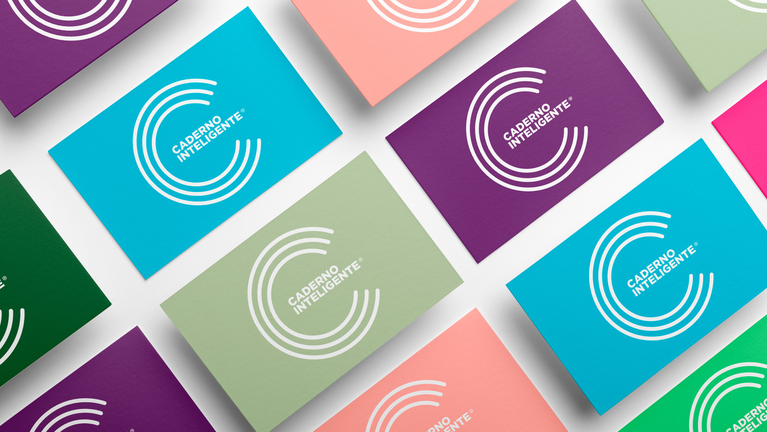
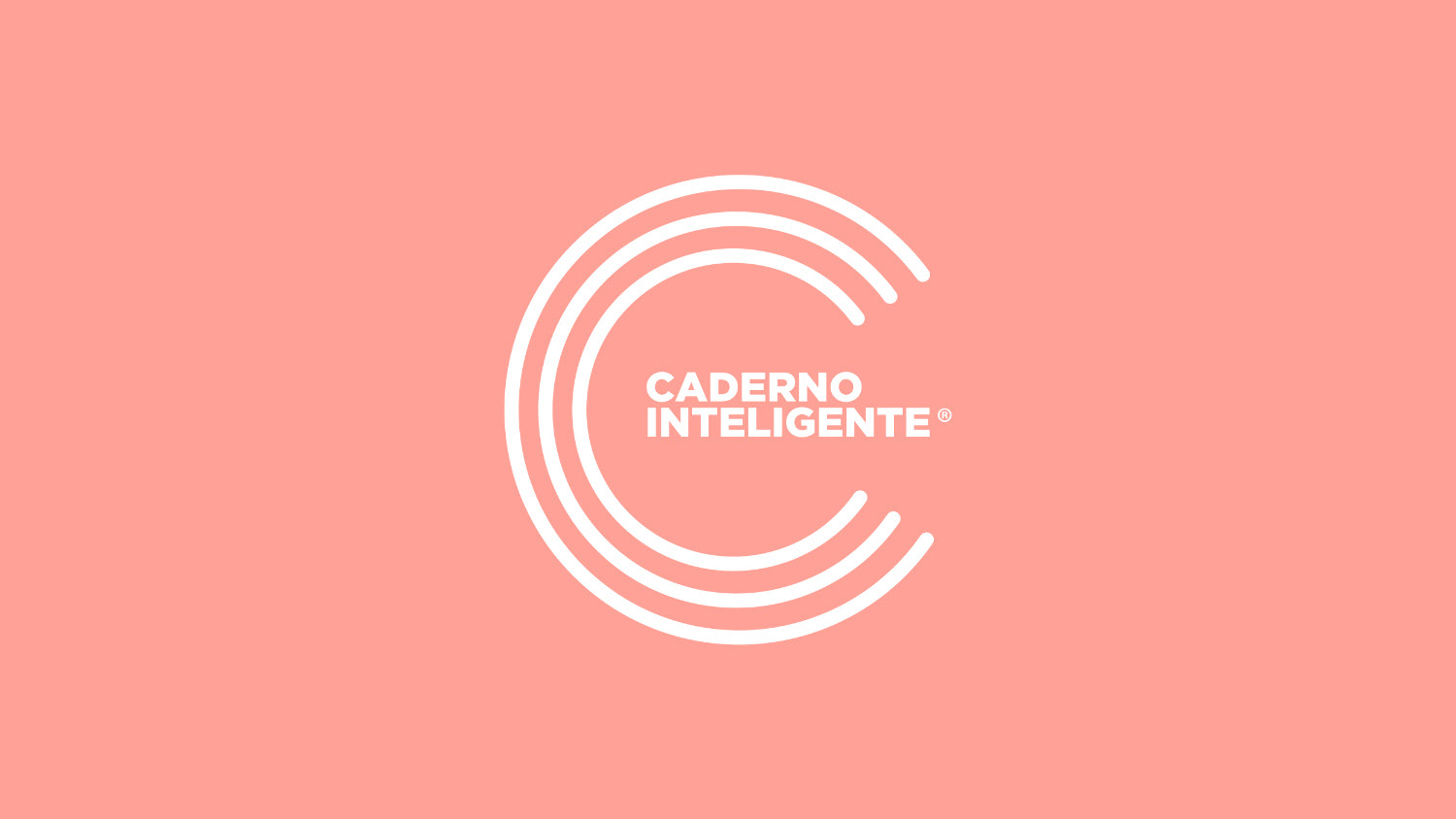
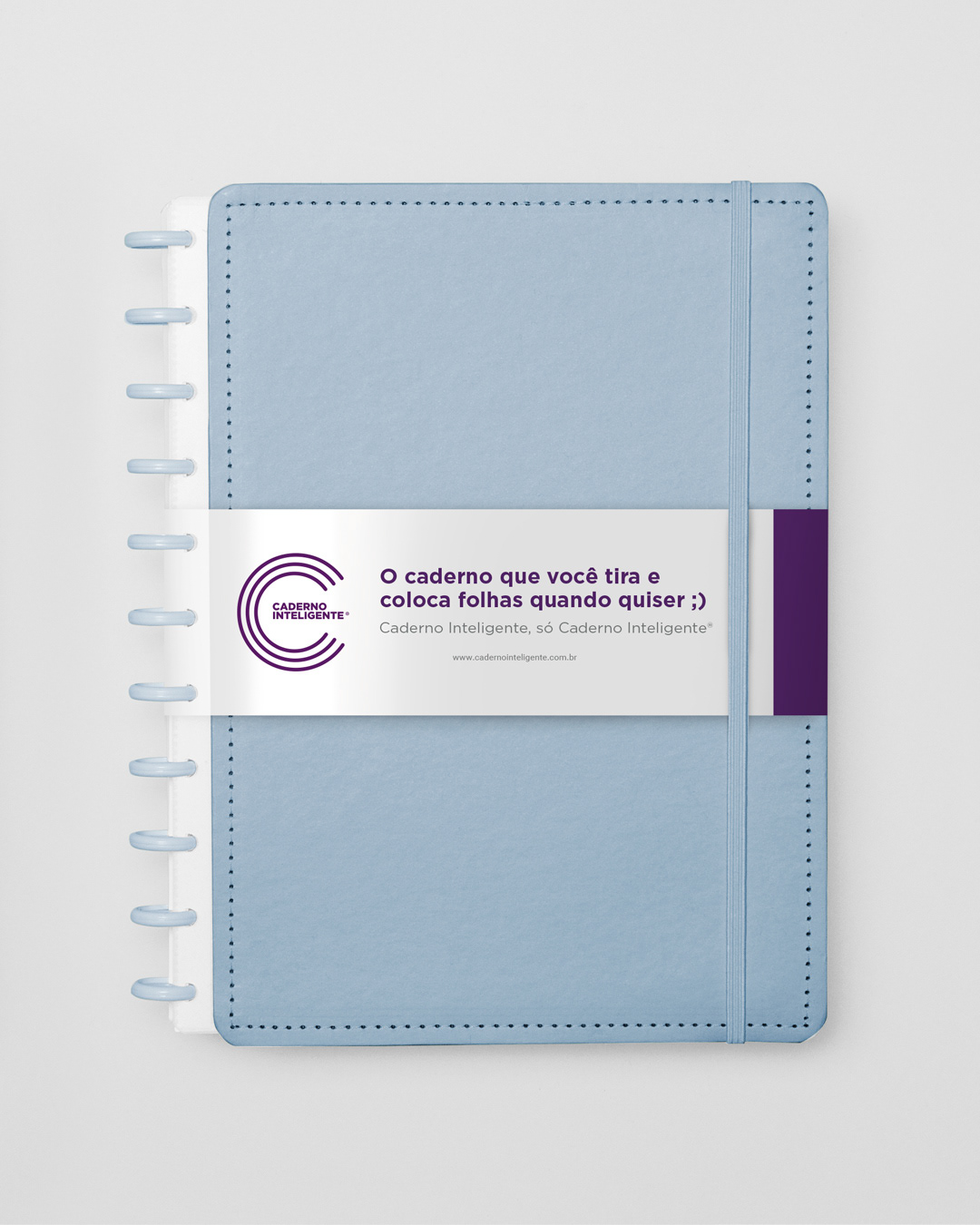
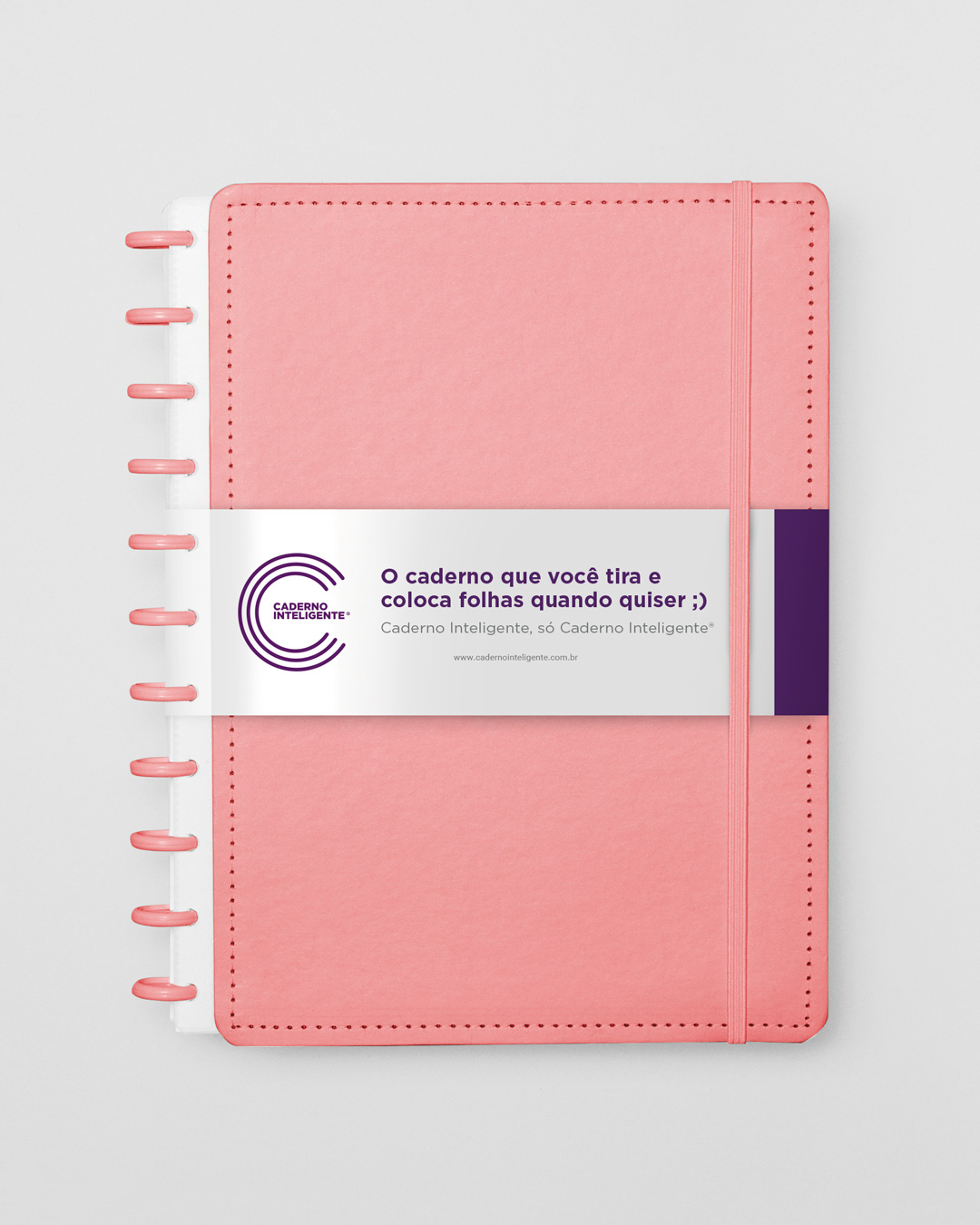
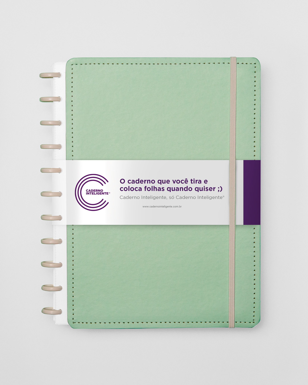
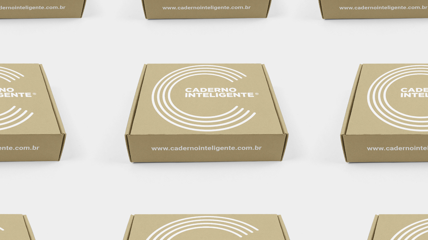
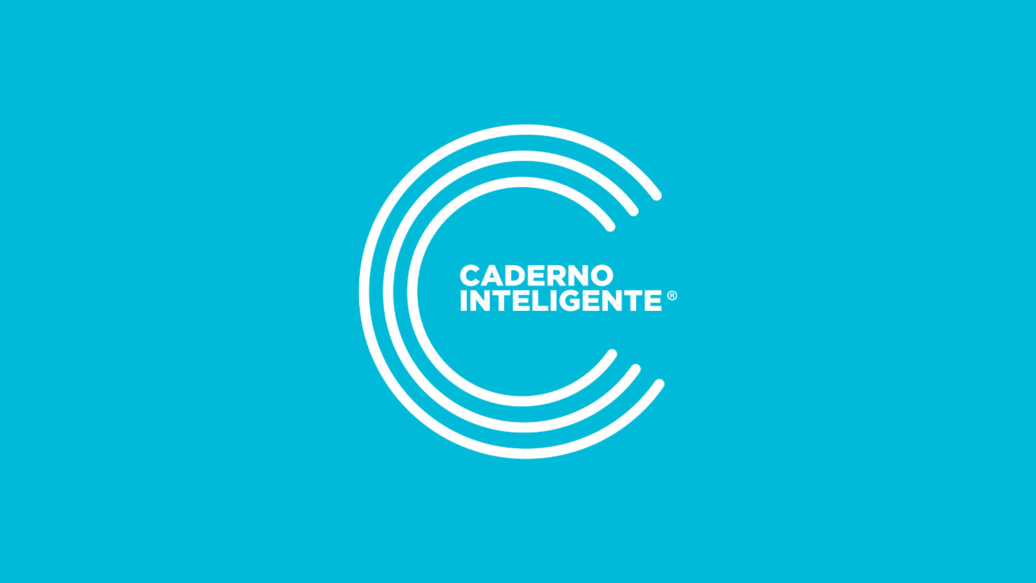
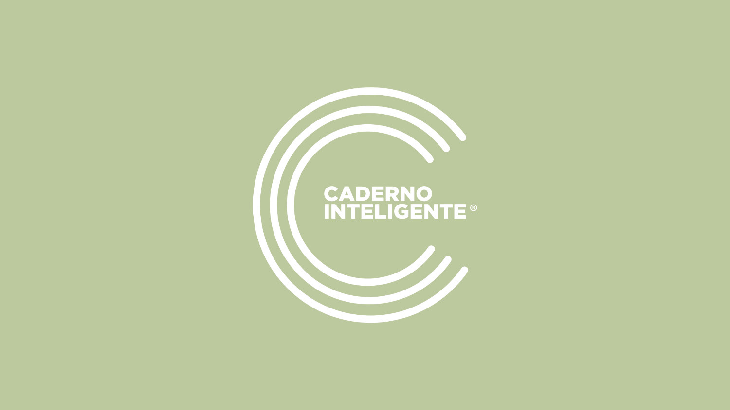
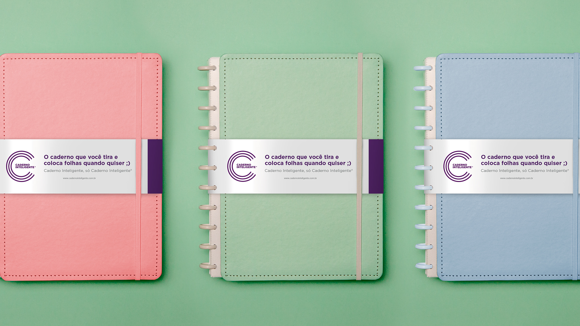
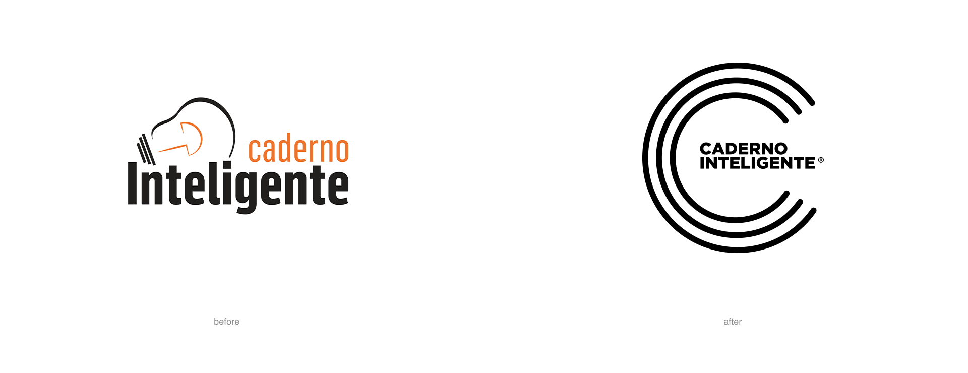
We started from the previous logo, understanding the intentions behind the composition - a first brand still unprofessional, from a small company, in its beginning, but with clear symbolic intentions - and we began the reformulation. For this, we created a variable palette in gradients, which refers to the colors of the products, to follow the graphic identity of the brand. The letter \"c\" stands out, supporting the presence of the type logo. The brand as a whole gave up the excess of detail, opting for a more minimalist and elegant approach. The lamp, rather clear reference, became an intuition, when looking at the logo laterally. The type fit perfectly within the graphic structure of the C, bringing smoothness and enabling virtually endless applications.
We were introduced to the Caderno Inteligente brand and were delighted with the innovative features and the quality of the product. However, brand identity needed to be renewed and professionalized and its digital presence redrawn from scratch.
Solution
We started from the previous logo, understanding the intentions behind the composition - a first brand still unprofessional, from a small company, in its beginning, but with clear symbolic intentions - and we began the reformulation. For this, we created a variable palette in gradients, which refers to the colors of the products, to follow the graphic identity of the brand. The letter \"c\" stands out, supporting the presence of the type logo. The brand as a whole gave up the excess of detail, opting for a more minimalist and elegant approach. The lamp, rather clear reference, became an intuition, when looking at the logo laterally. The type fit perfectly within the graphic structure of the C, bringing smoothness and enabling virtually endless applications.
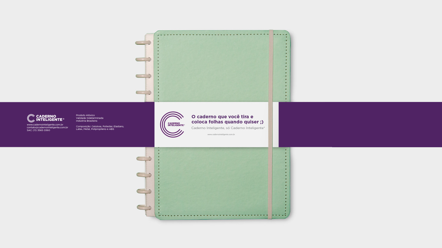
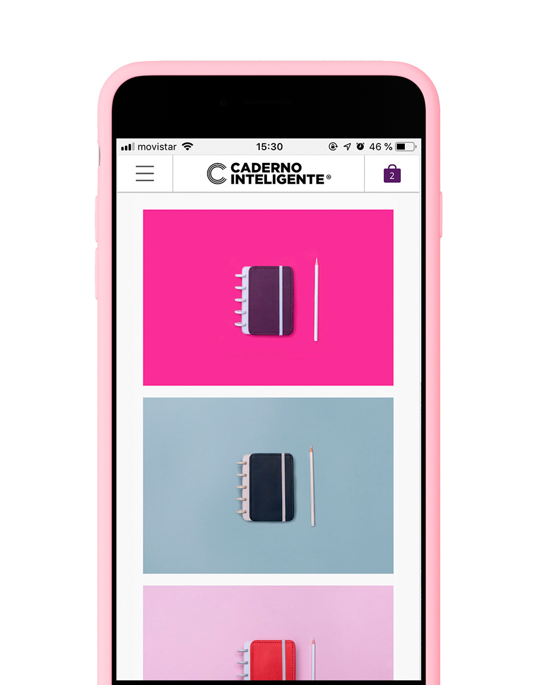
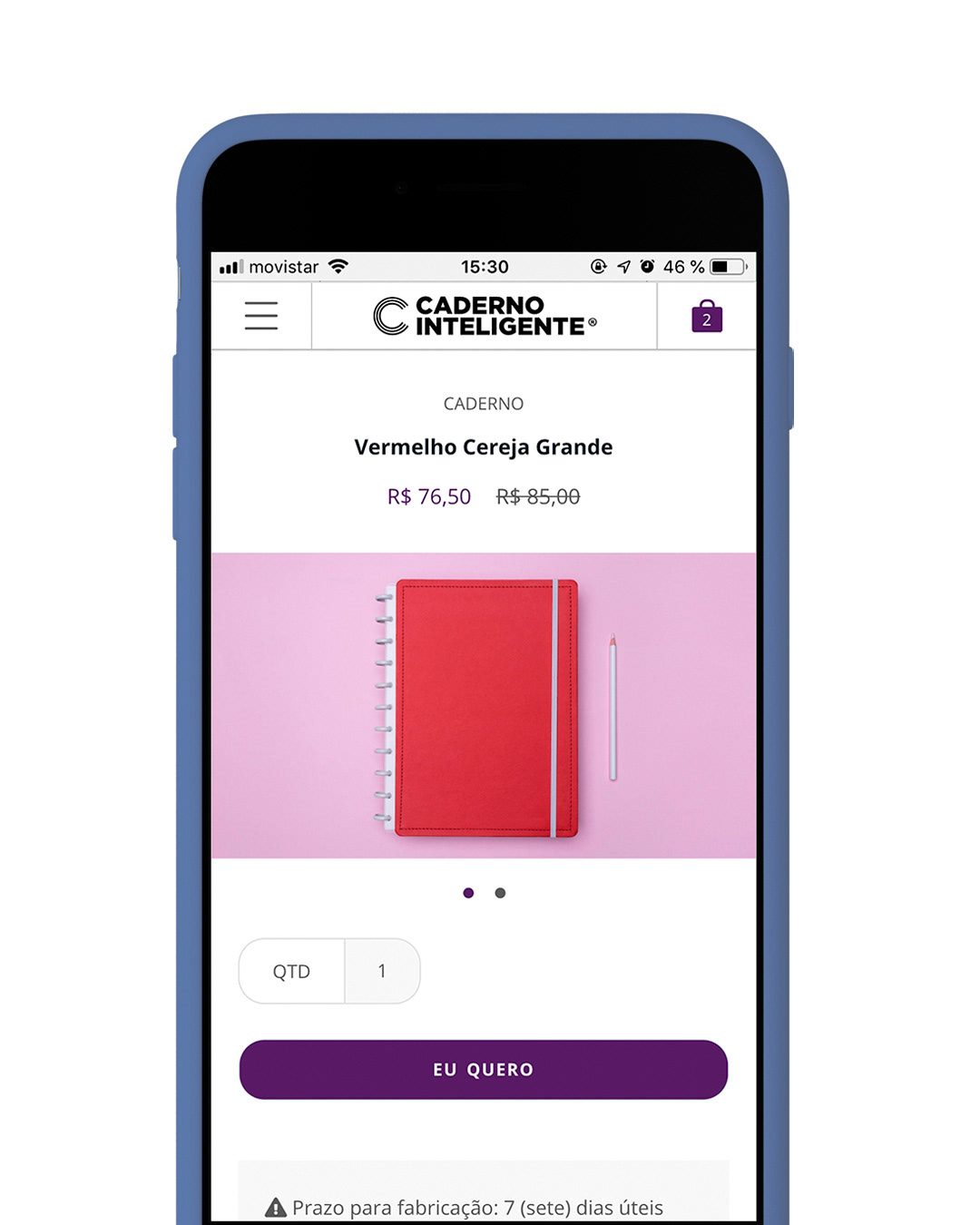
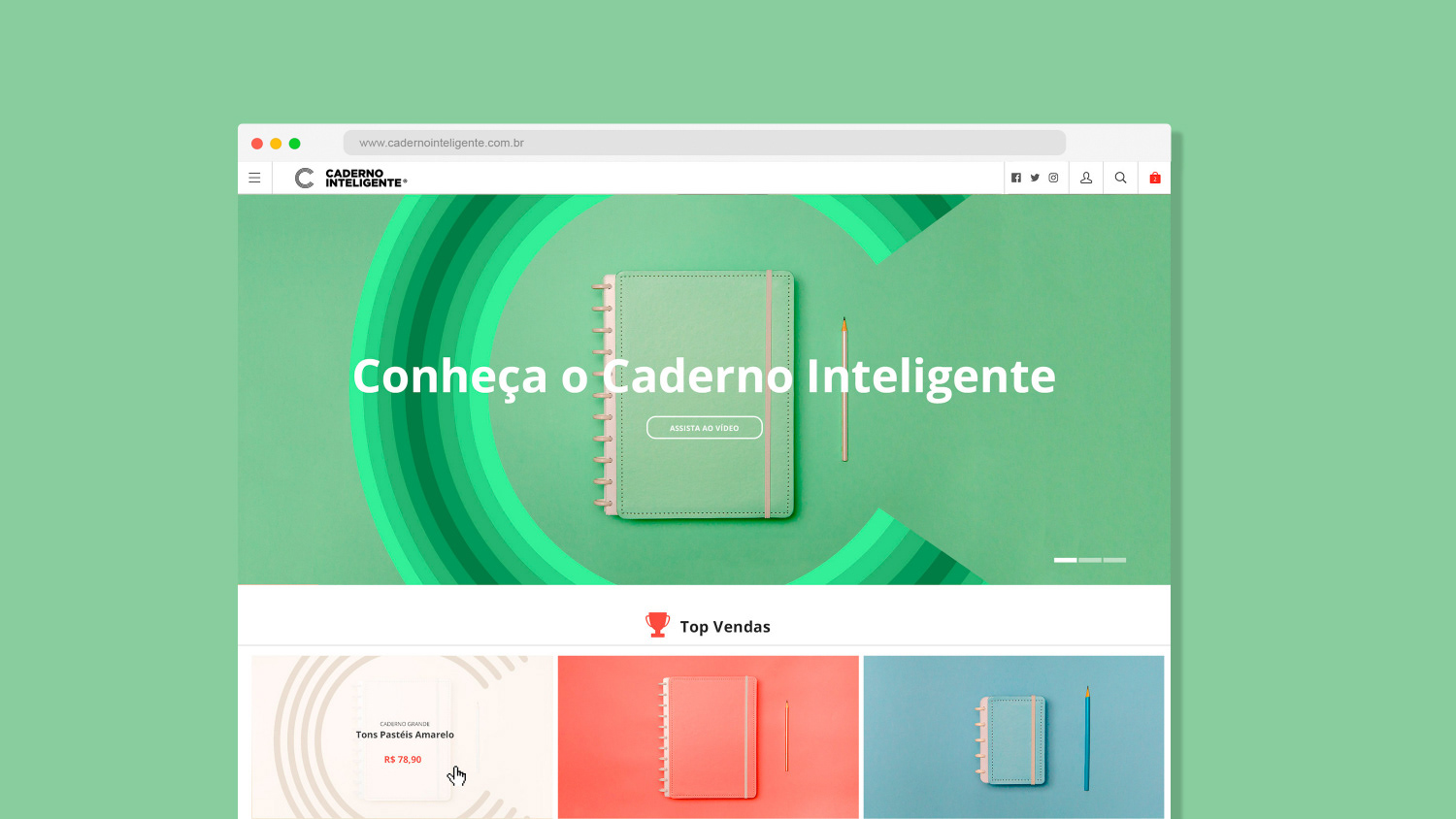
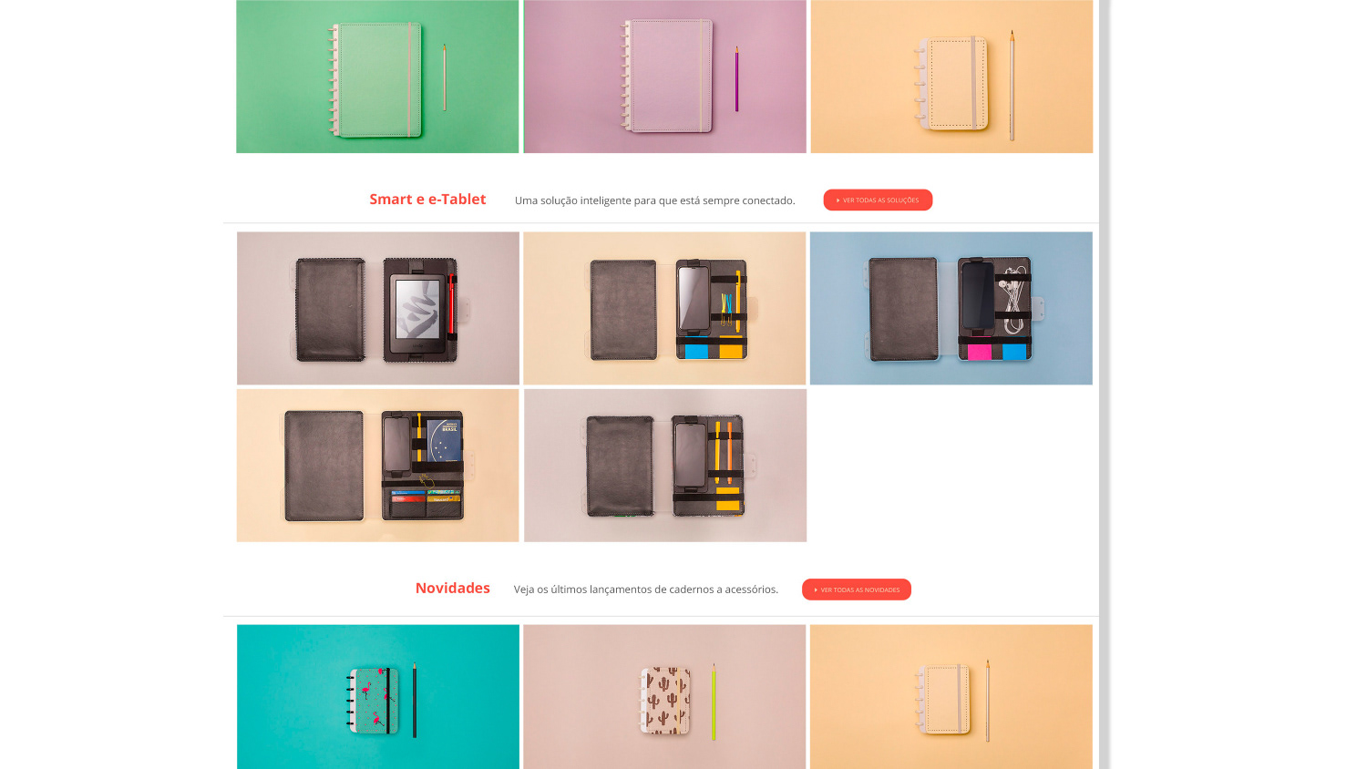
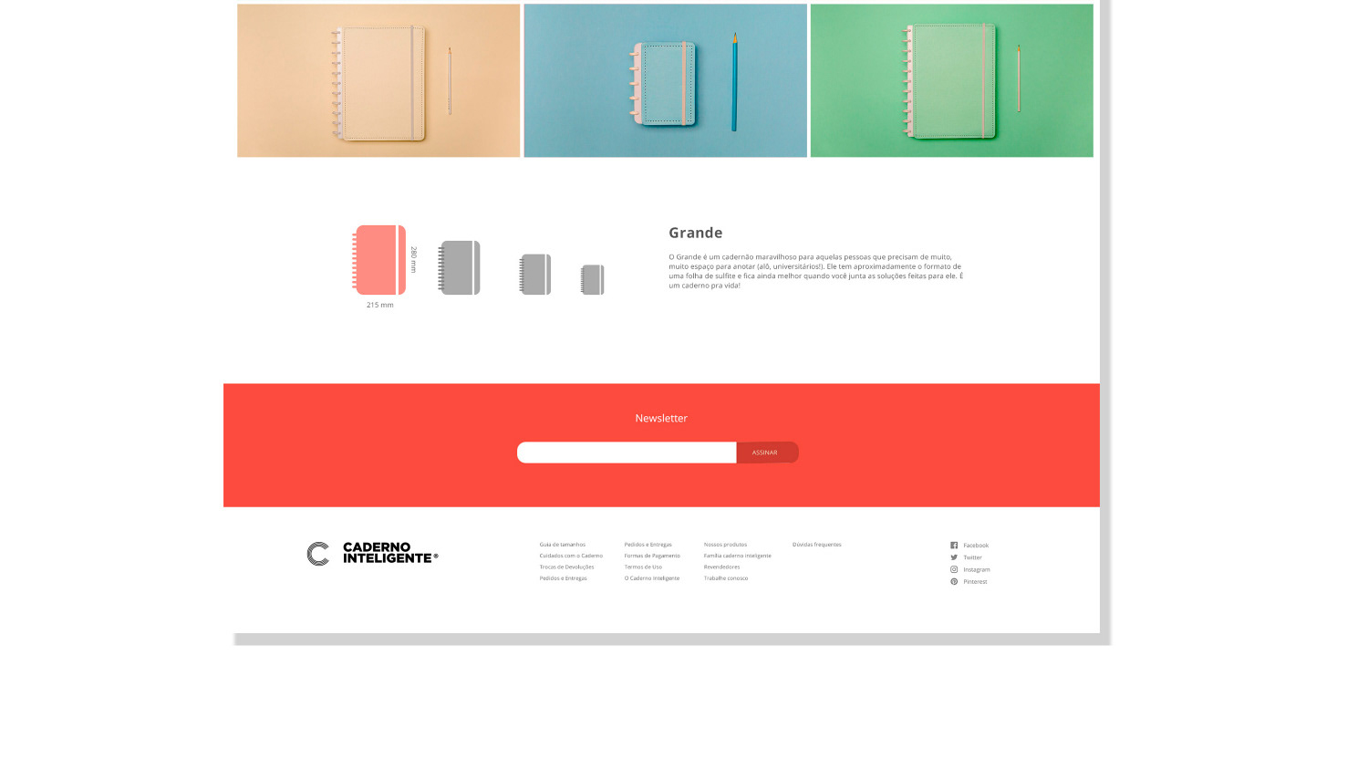
The new brand identity, now professionalized and timeless, called for a complete redesign in its digital presence, to update and also clearly bring the premium element of the handmade, with individually tailored notebooks. We opted for a ton sur ton solution in chromatic scale already in the direction of photography and that accompanies the evolution of the site. The lightness of choice enhances the product, but without polluting the site with too many colors. The organized palette also broadens the consumer's understanding of their choices, showing variety of products and also consistency in the choice of collections.
The site's texts have also been updated, using a lighter and more dynamic language, which speaks directly to the target audience, creating links in the connection and expanding the sell possibilities.
The site's texts have also been updated, using a lighter and more dynamic language, which speaks directly to the target audience, creating links in the connection and expanding the sell possibilities.
Client: Caderno Inteligente
Industry: Stationary
Discipline: Identity and Digital
Industry: Stationary
Discipline: Identity and Digital